A body of work that help define the Rimac Automobili brand together with the hypercar
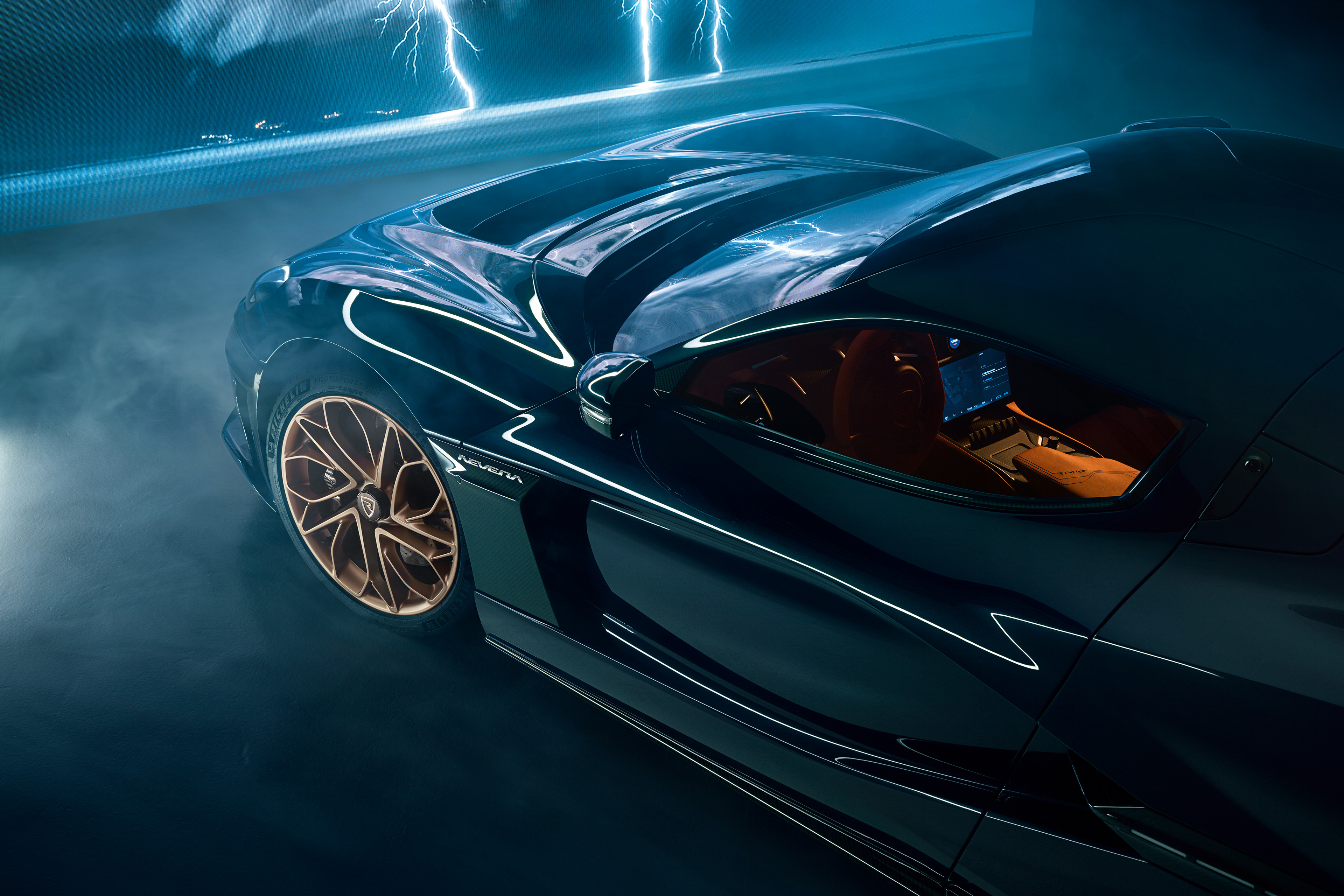
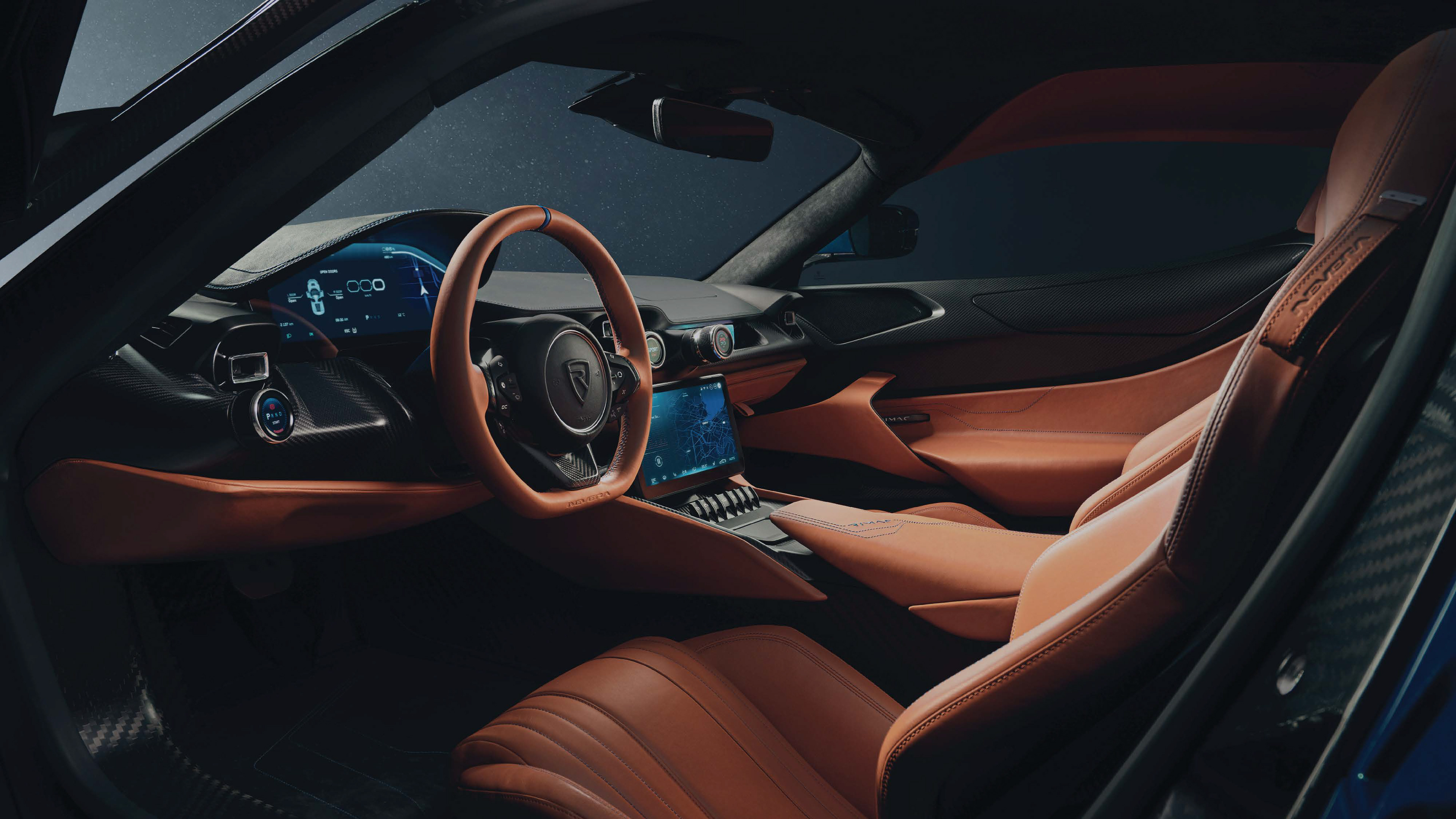
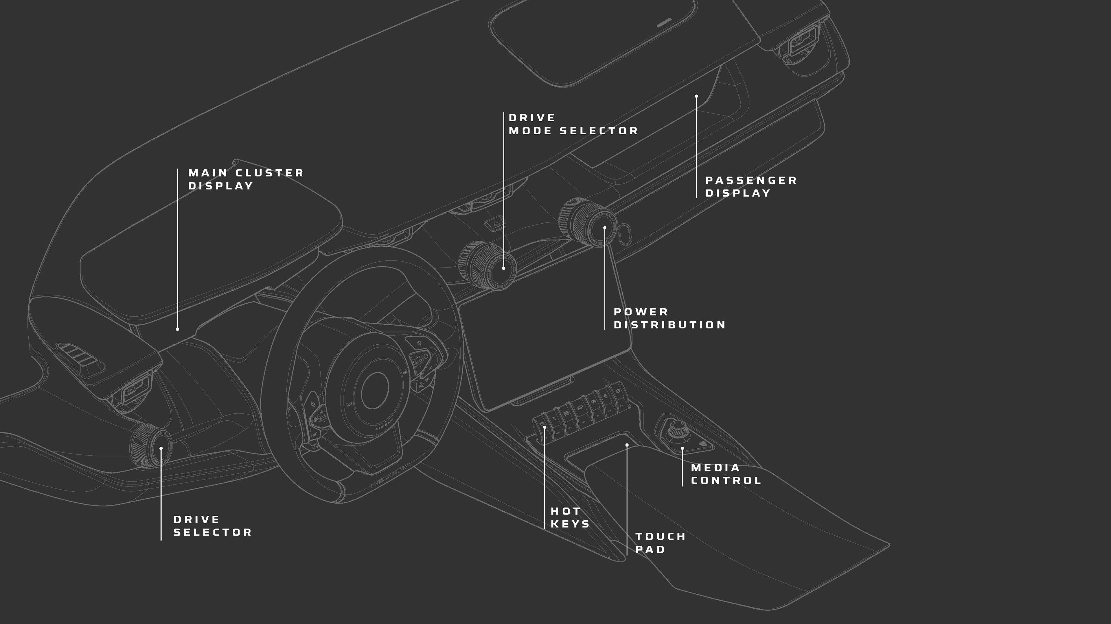
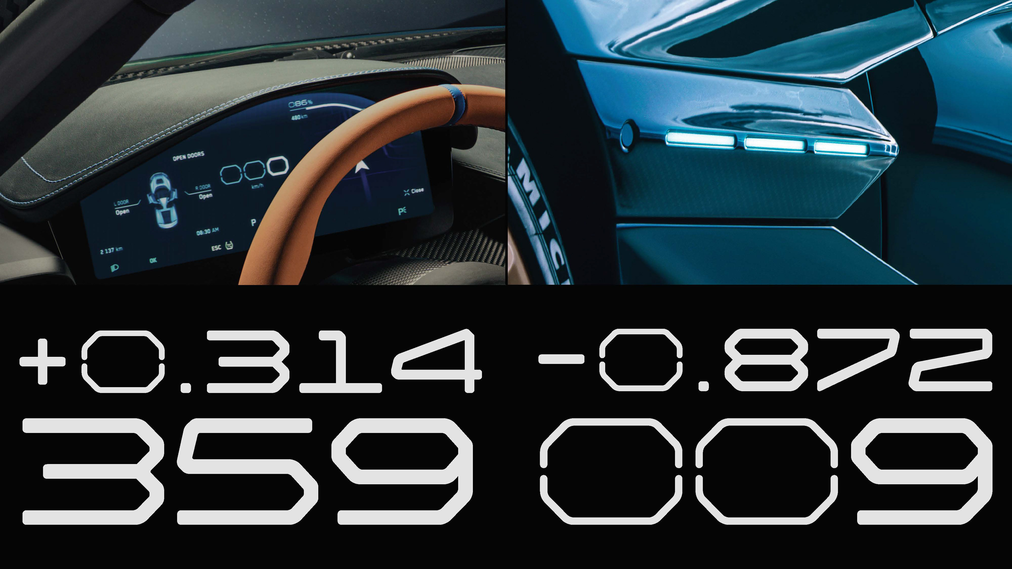
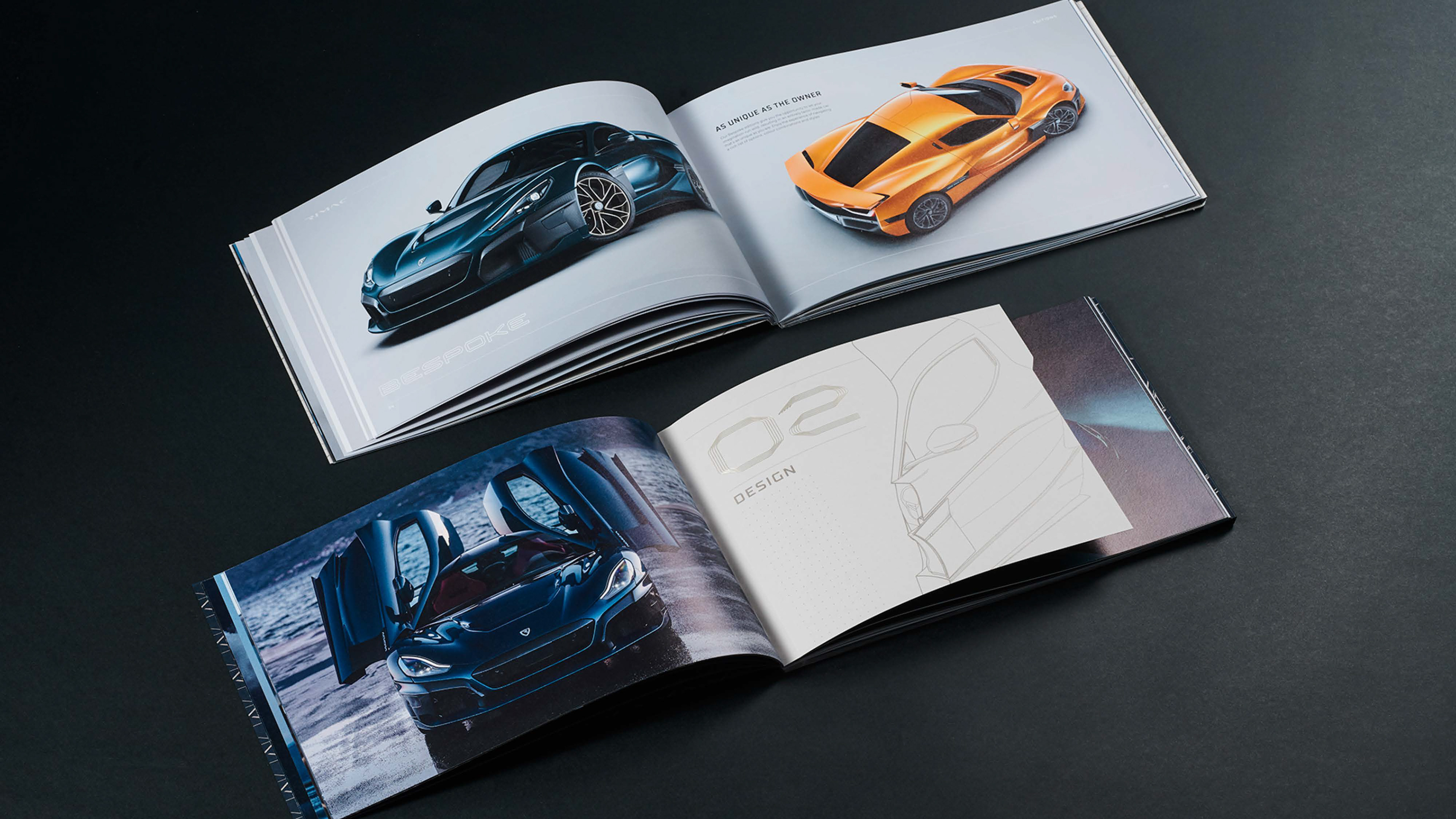
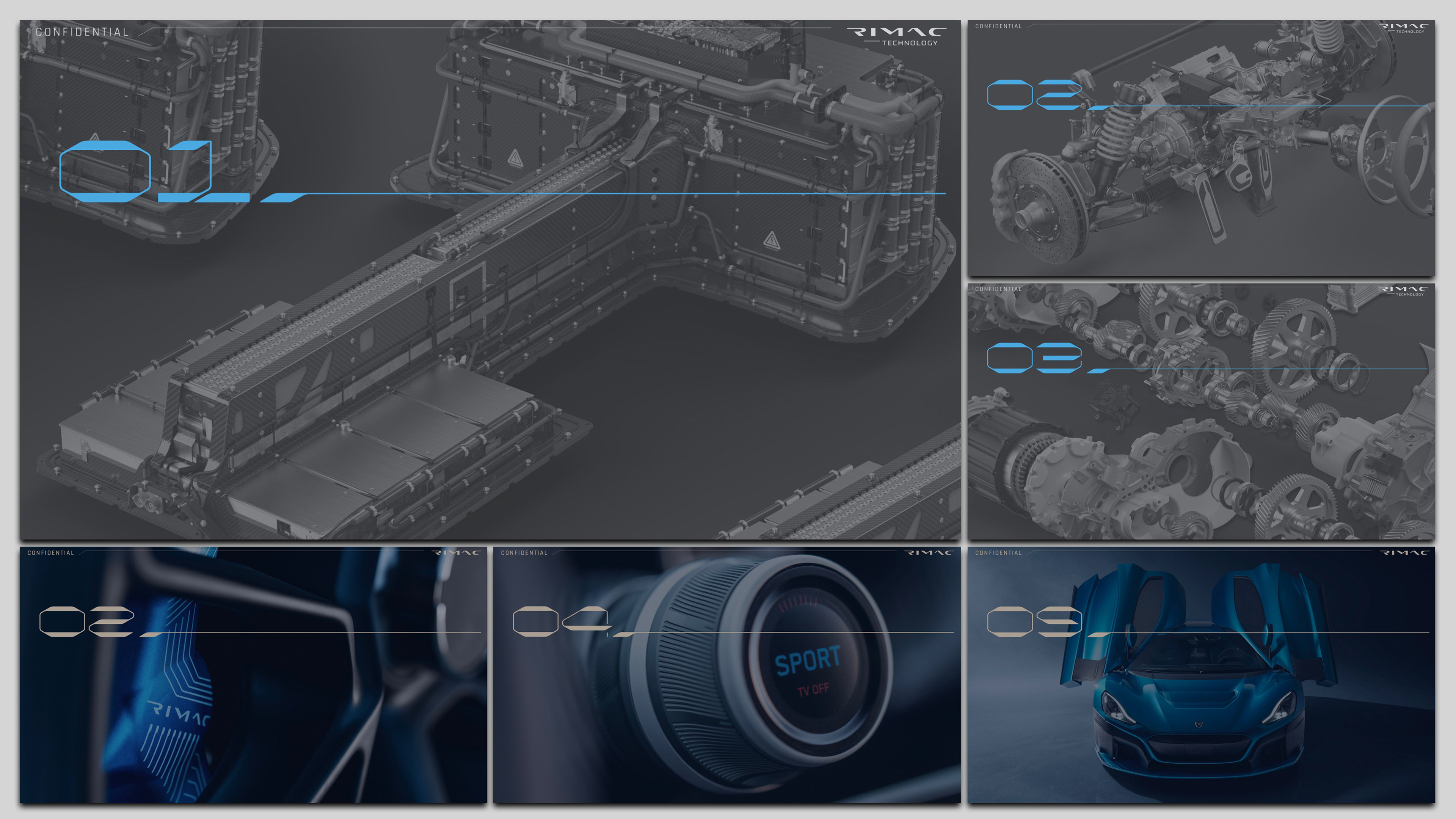
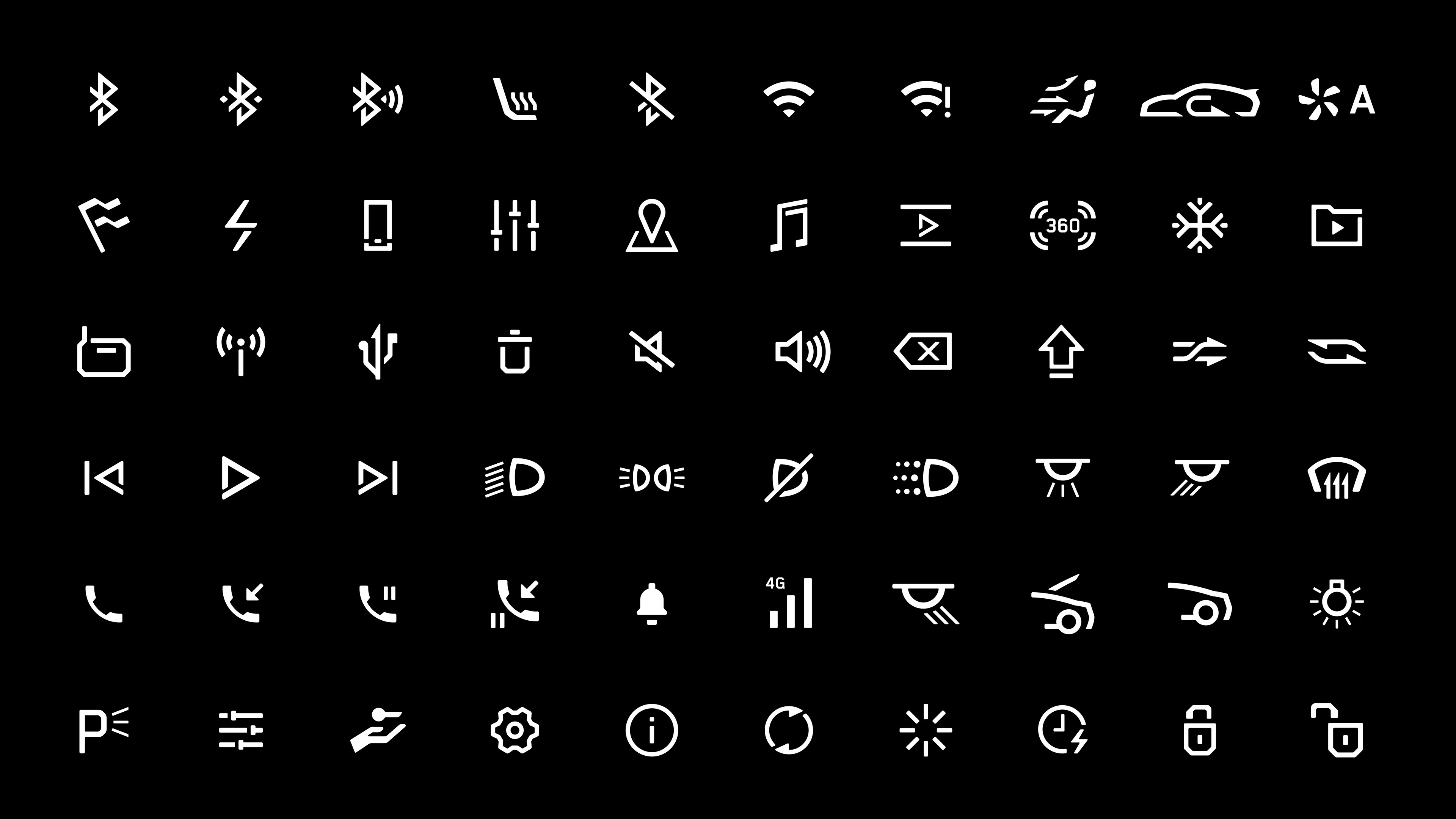
the Rimac Nevera. The development hypercar was pushing the limits of what a sports car stood for. It was only fitting to try and visually communicate this within the UI concept, the visual and experience branding of this unique product. In the process it was decided that it was important to correlate the exterior design cues within the user interface to maximise the car's design philosophy.
the Rimac Nevera. The development hypercar was pushing the limits of what a sports car stood for. It was only fitting to try and visually communicate this within the UI concept, the visual and experience branding of this unique product. In the process it was decided that it was important to correlate the exterior design cues within the user interface to maximise the car's design philosophy.

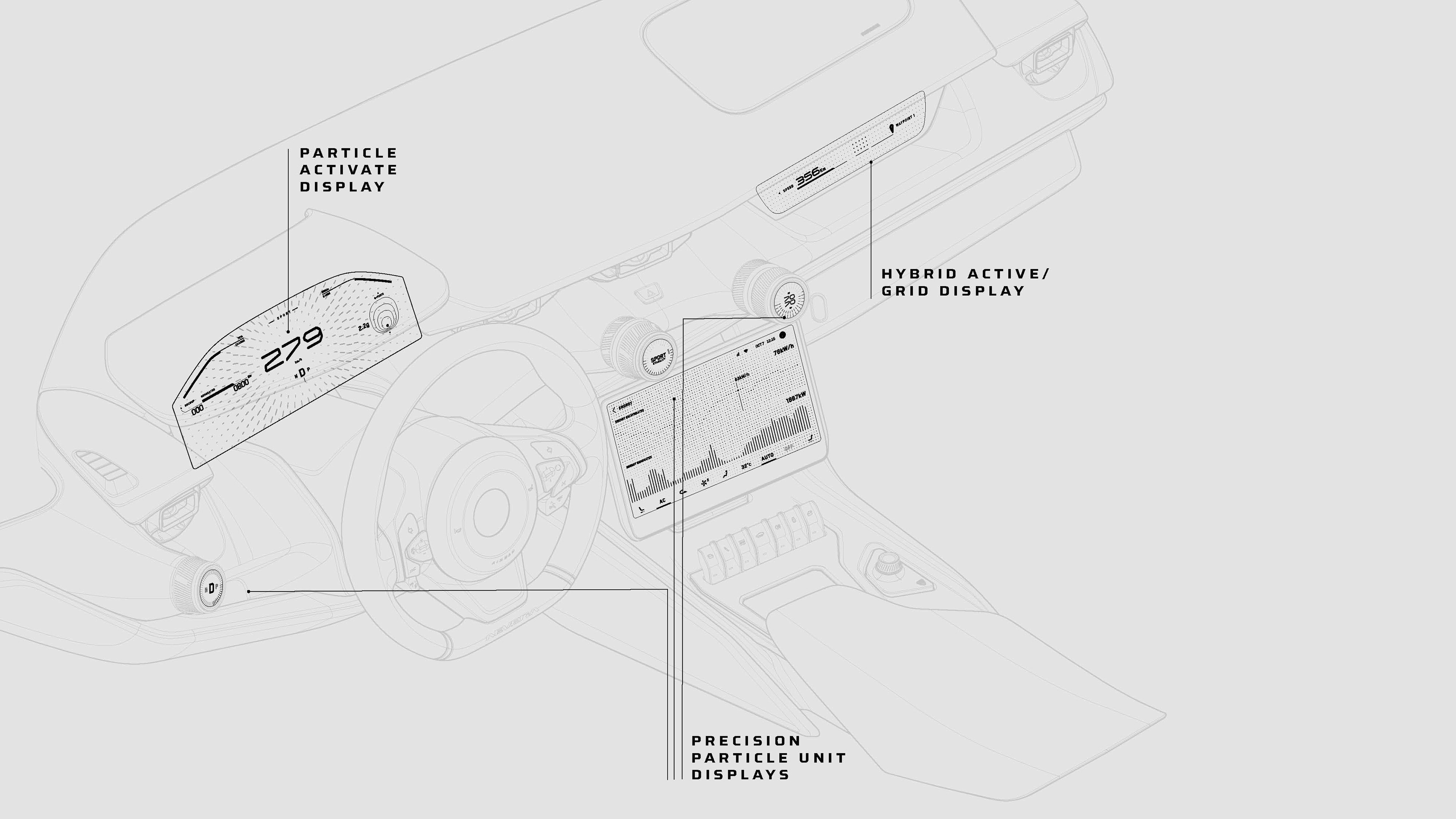
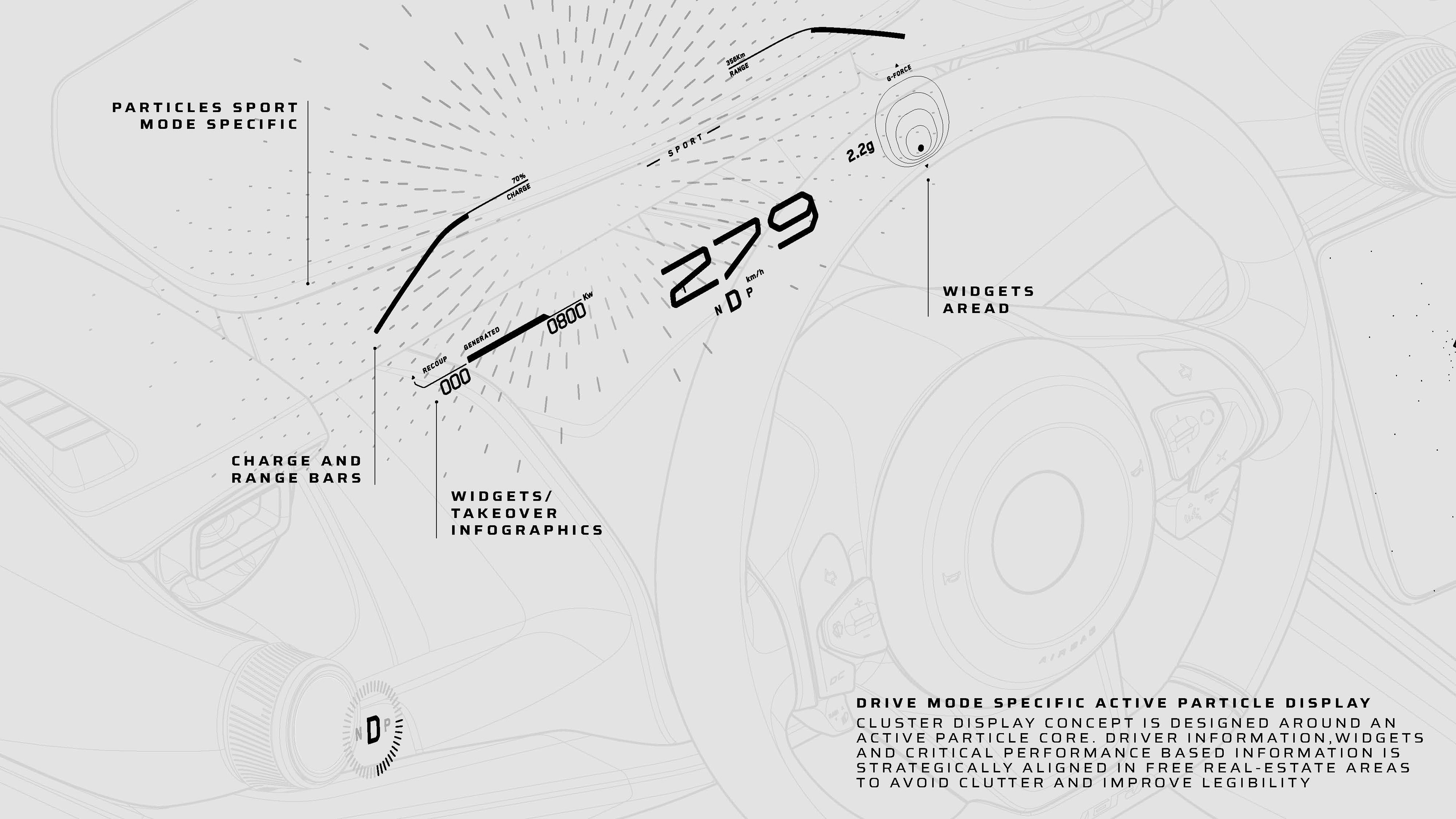
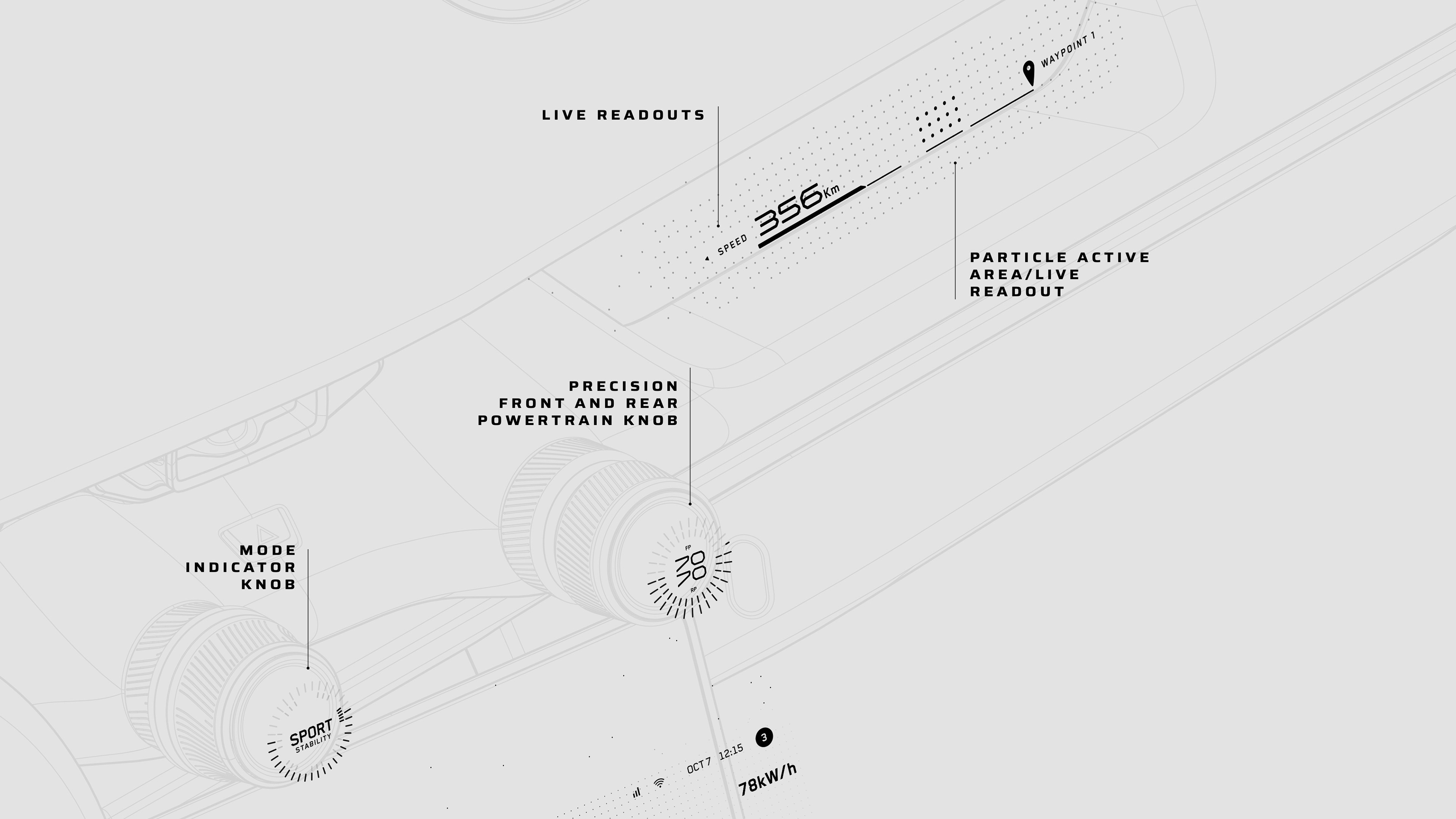
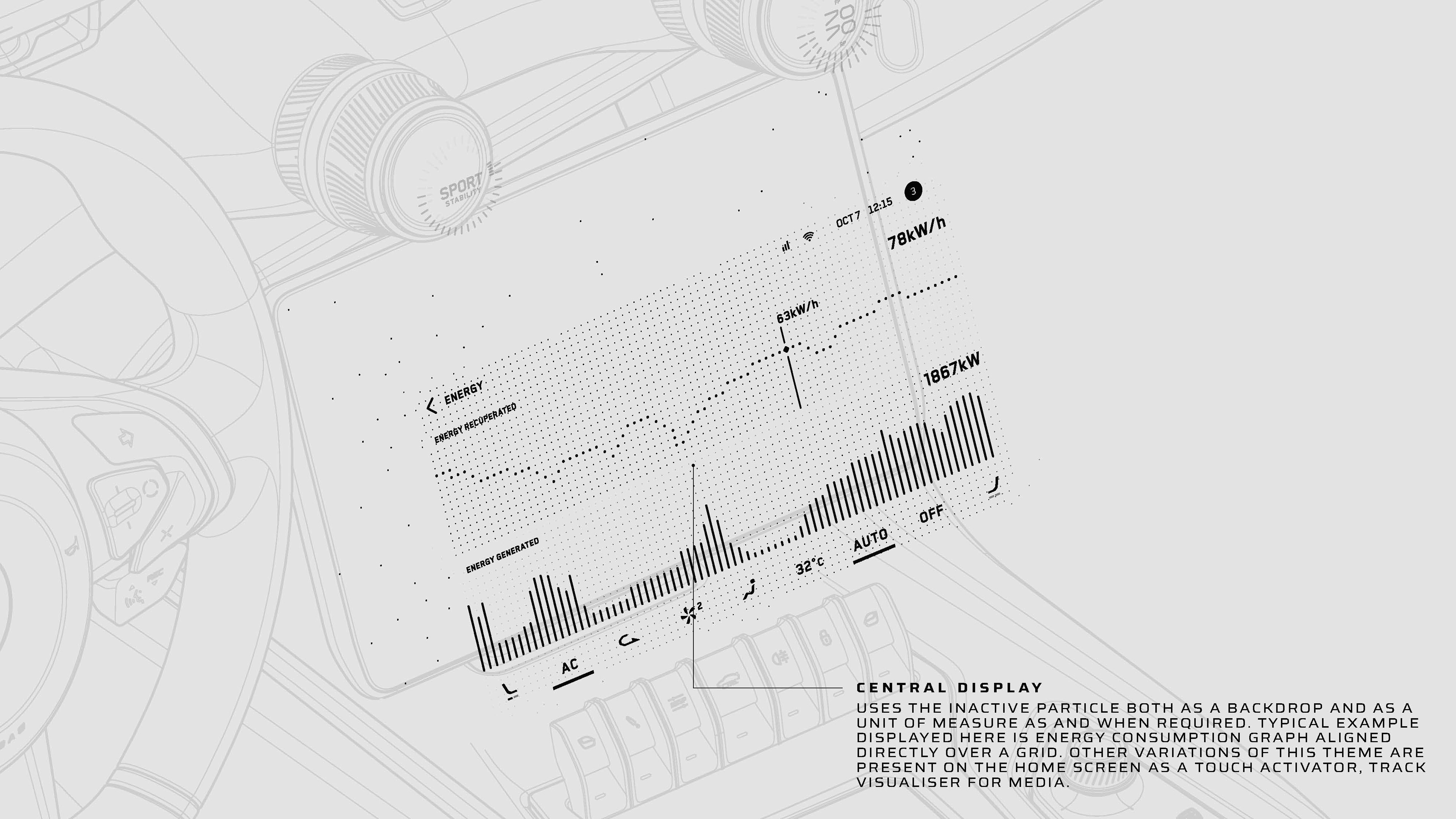
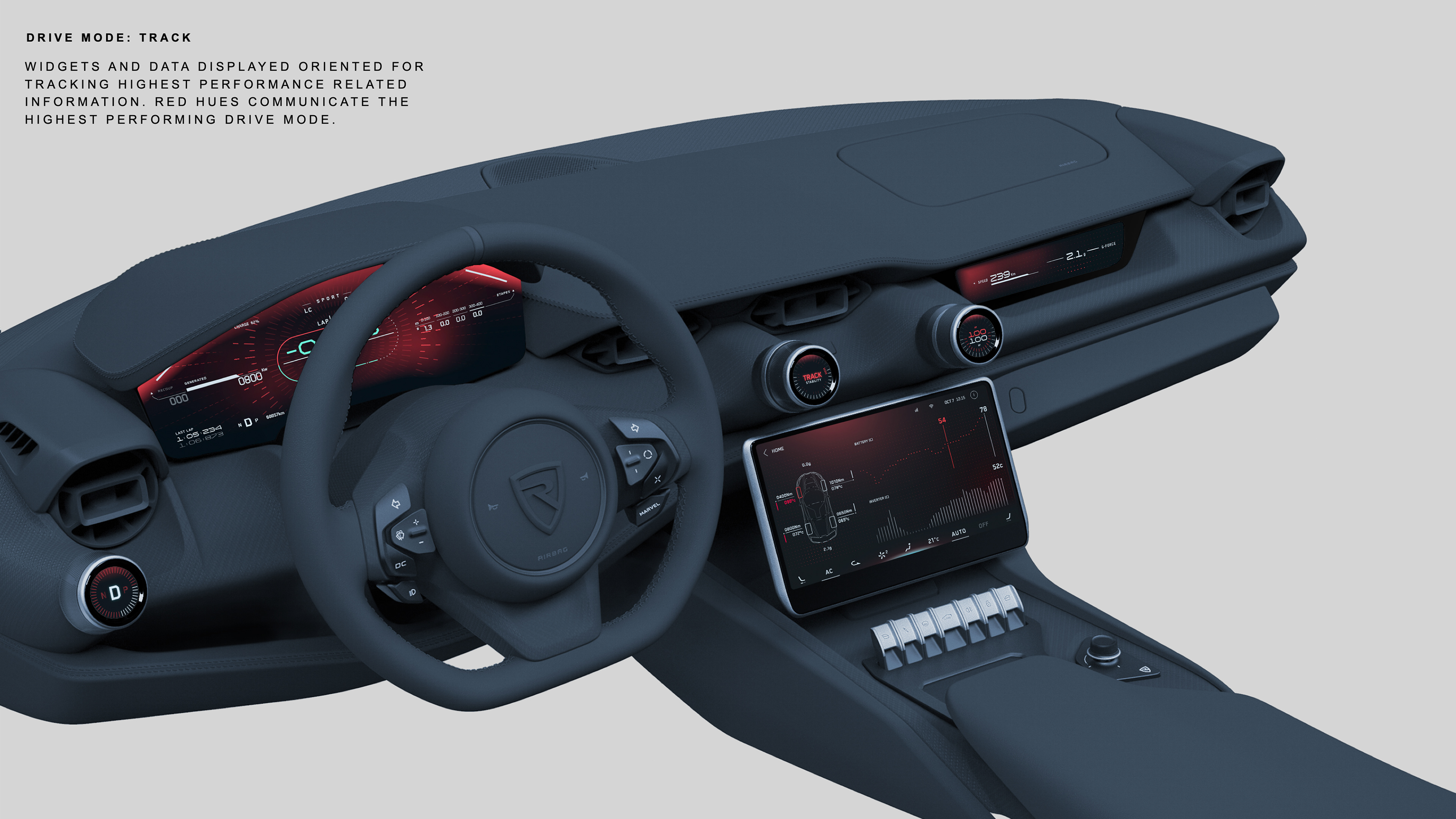
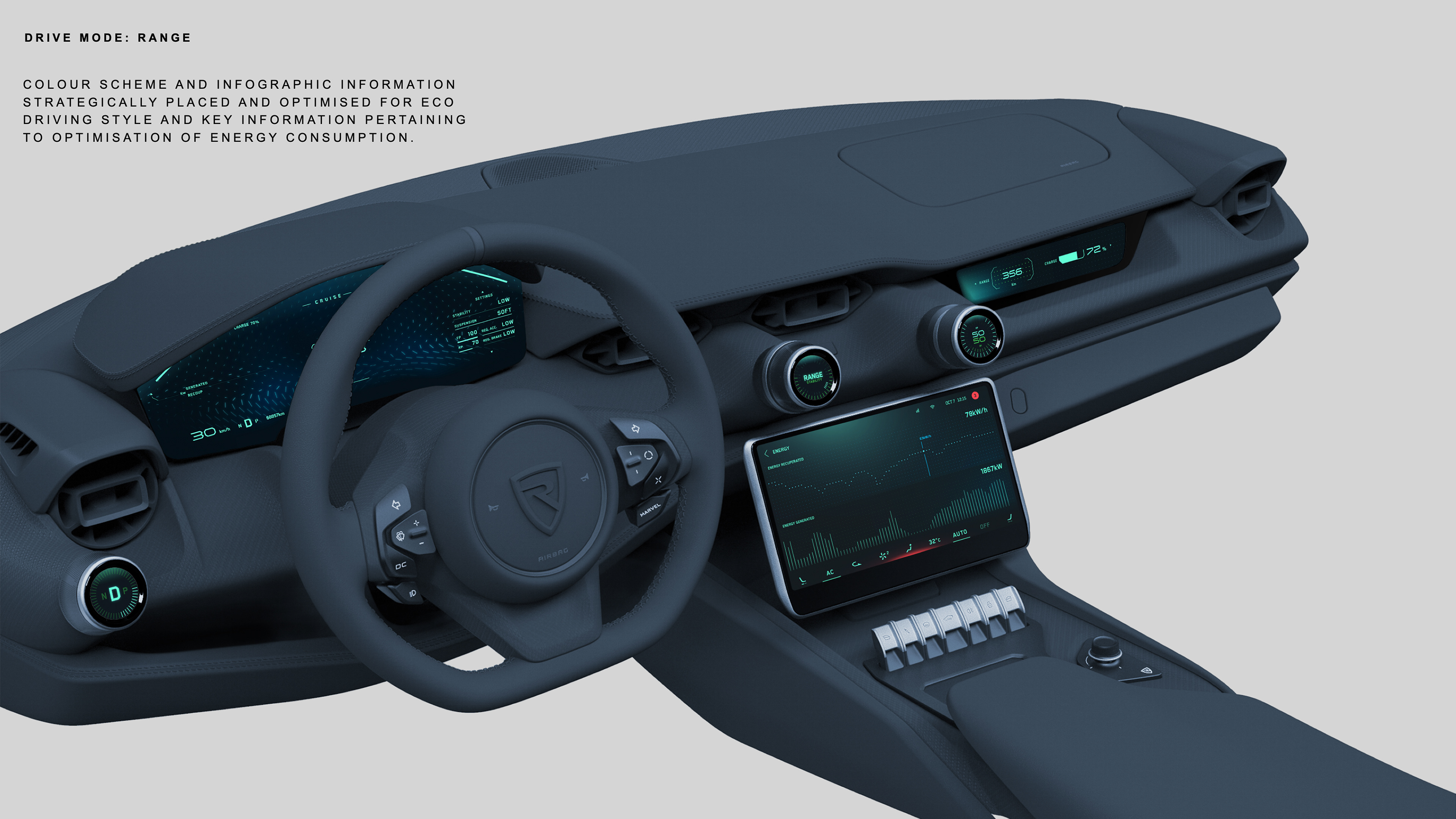
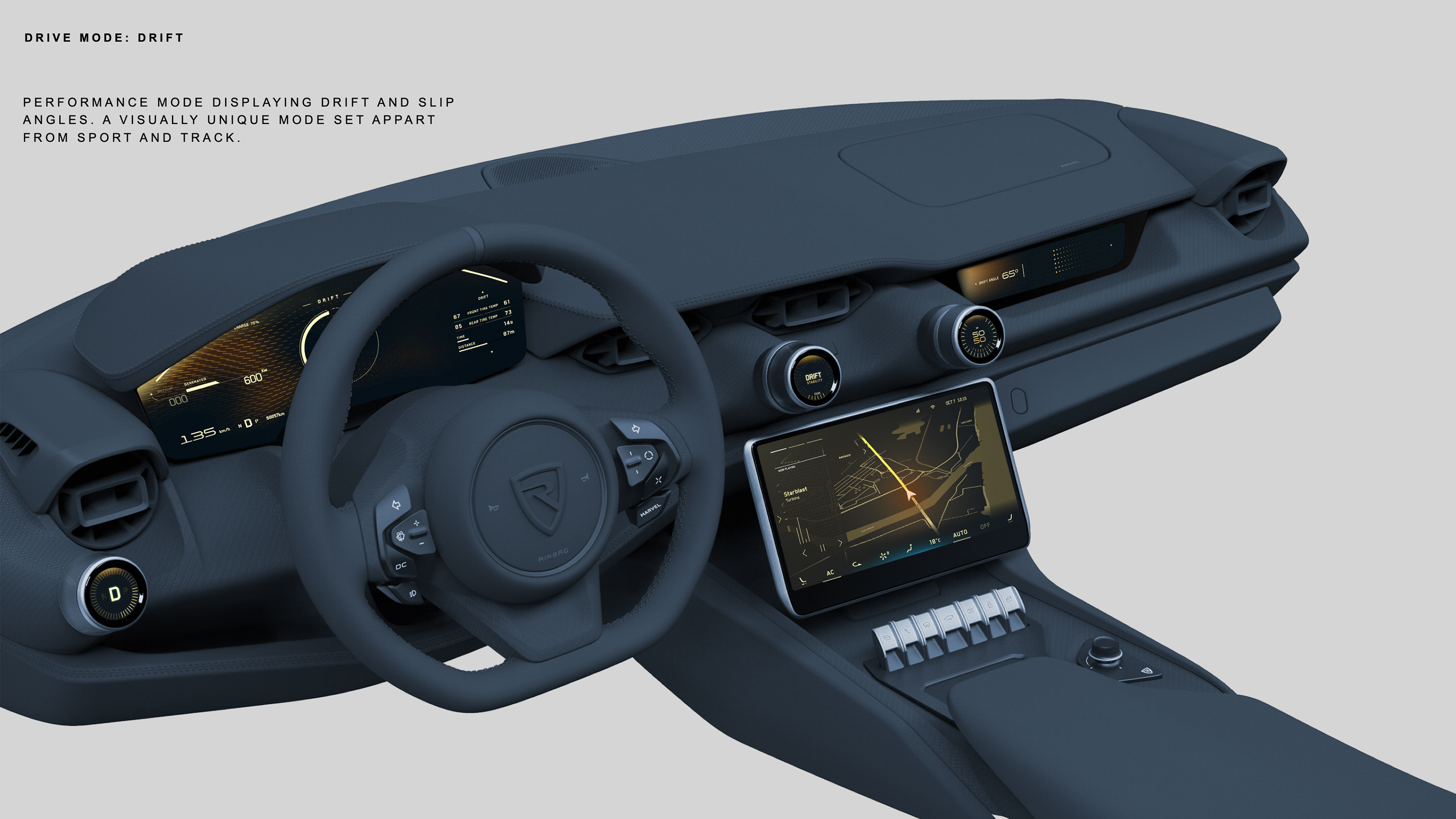
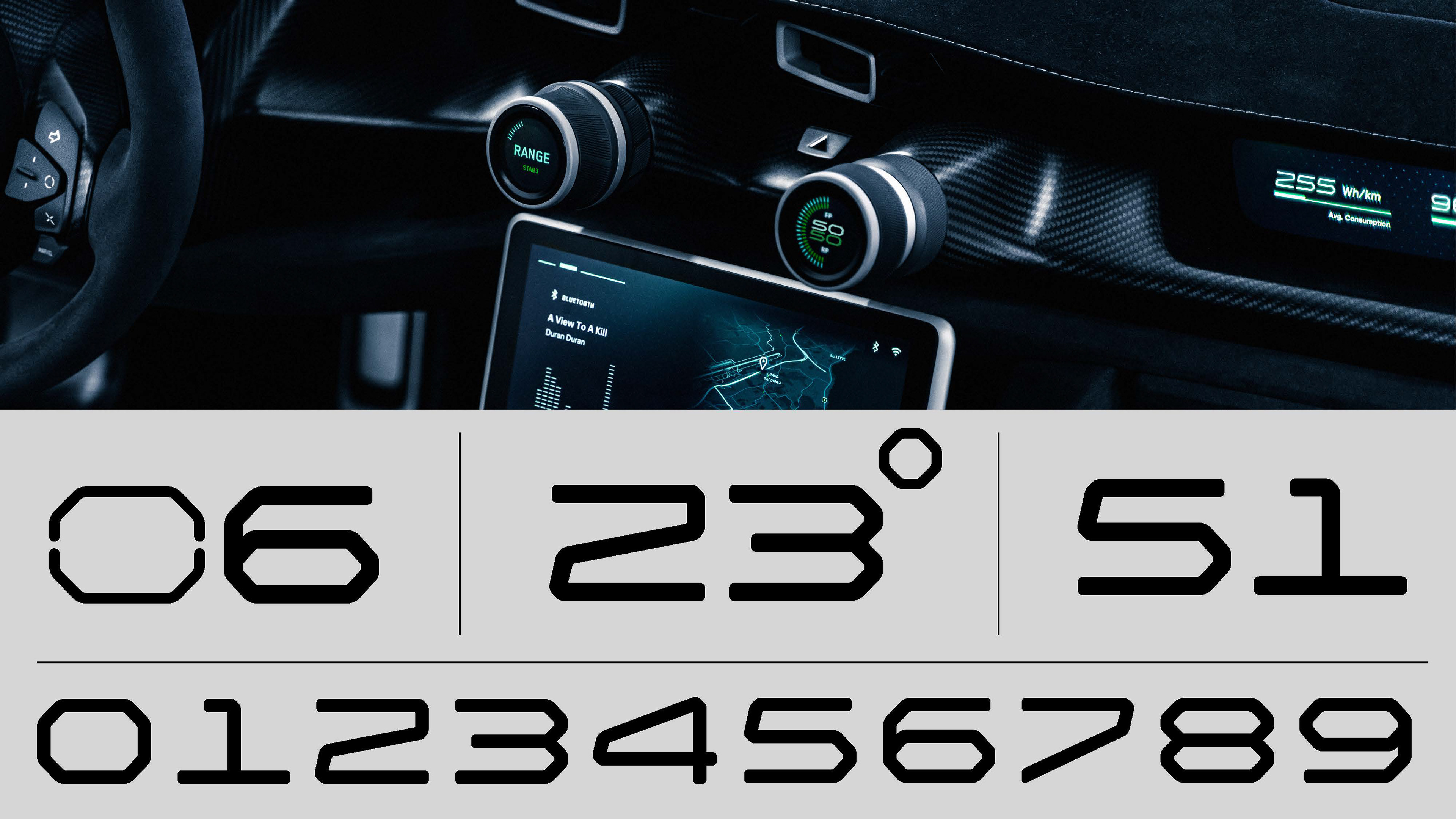
All drive modes where uniquely coloured to aid the driver to differentiate them correctly. This ensured a completely unique driving experience.


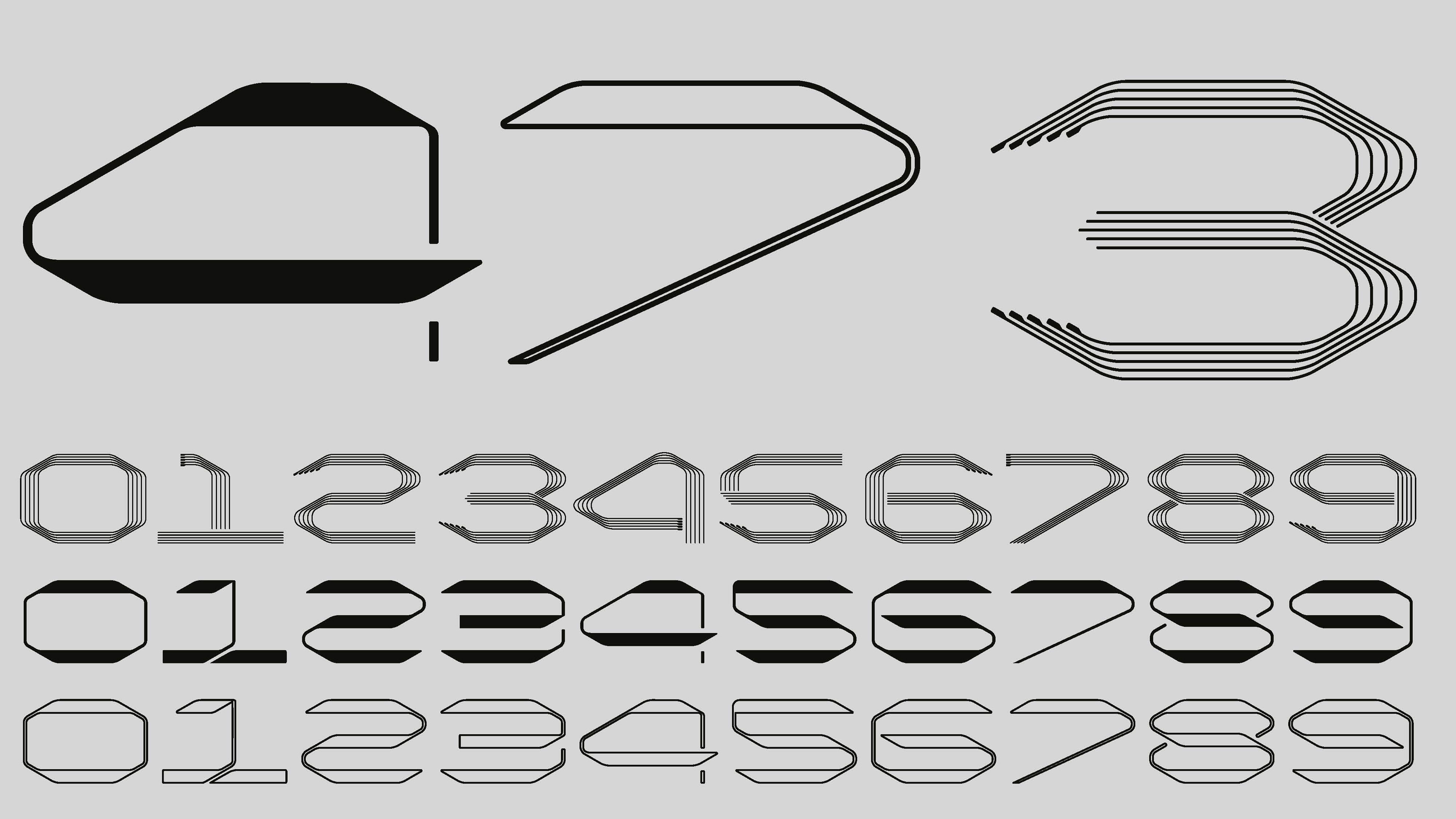
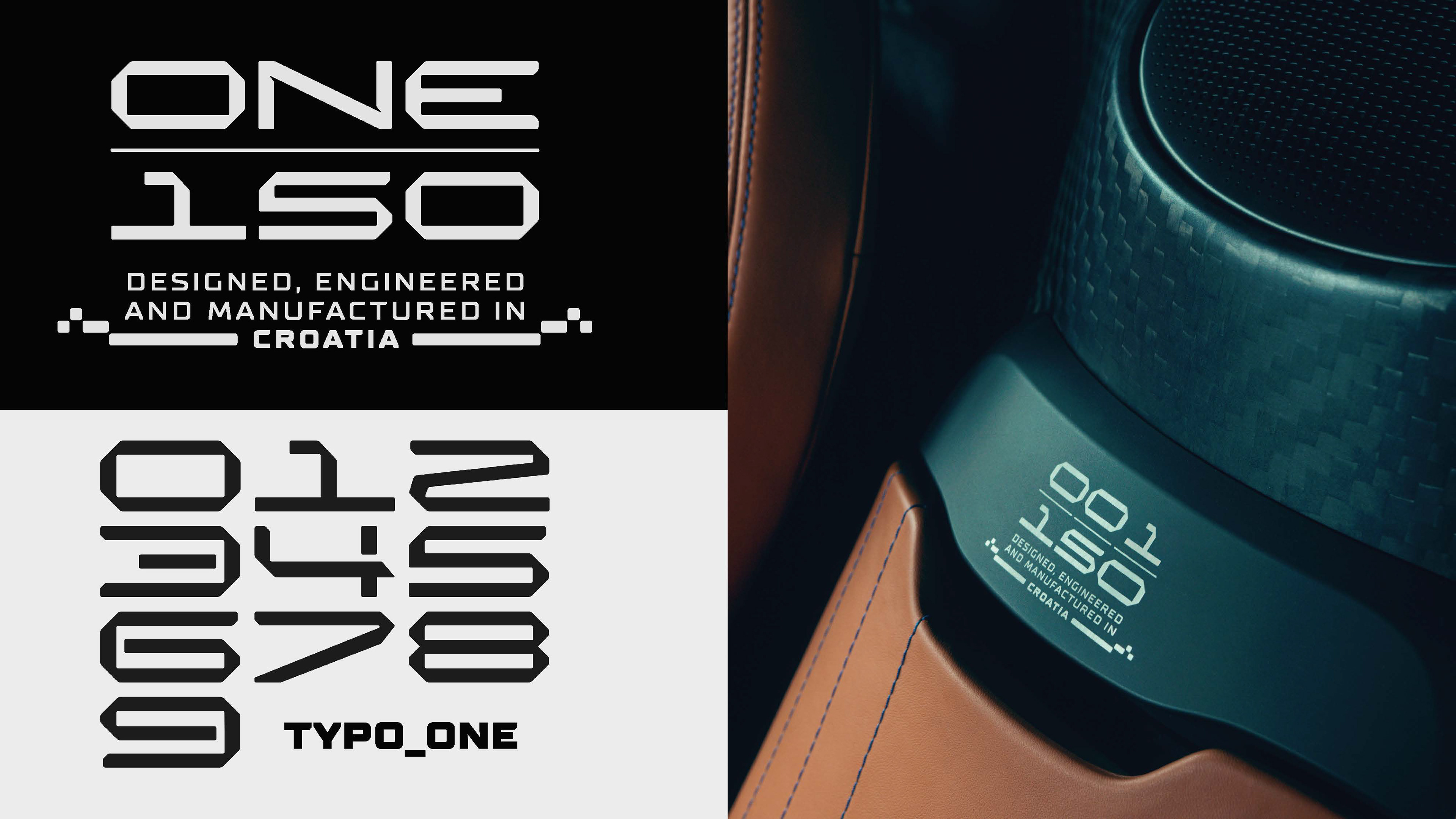
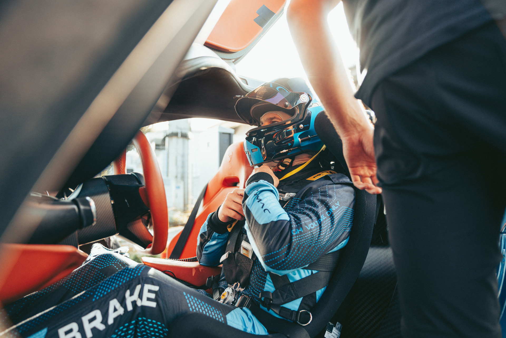
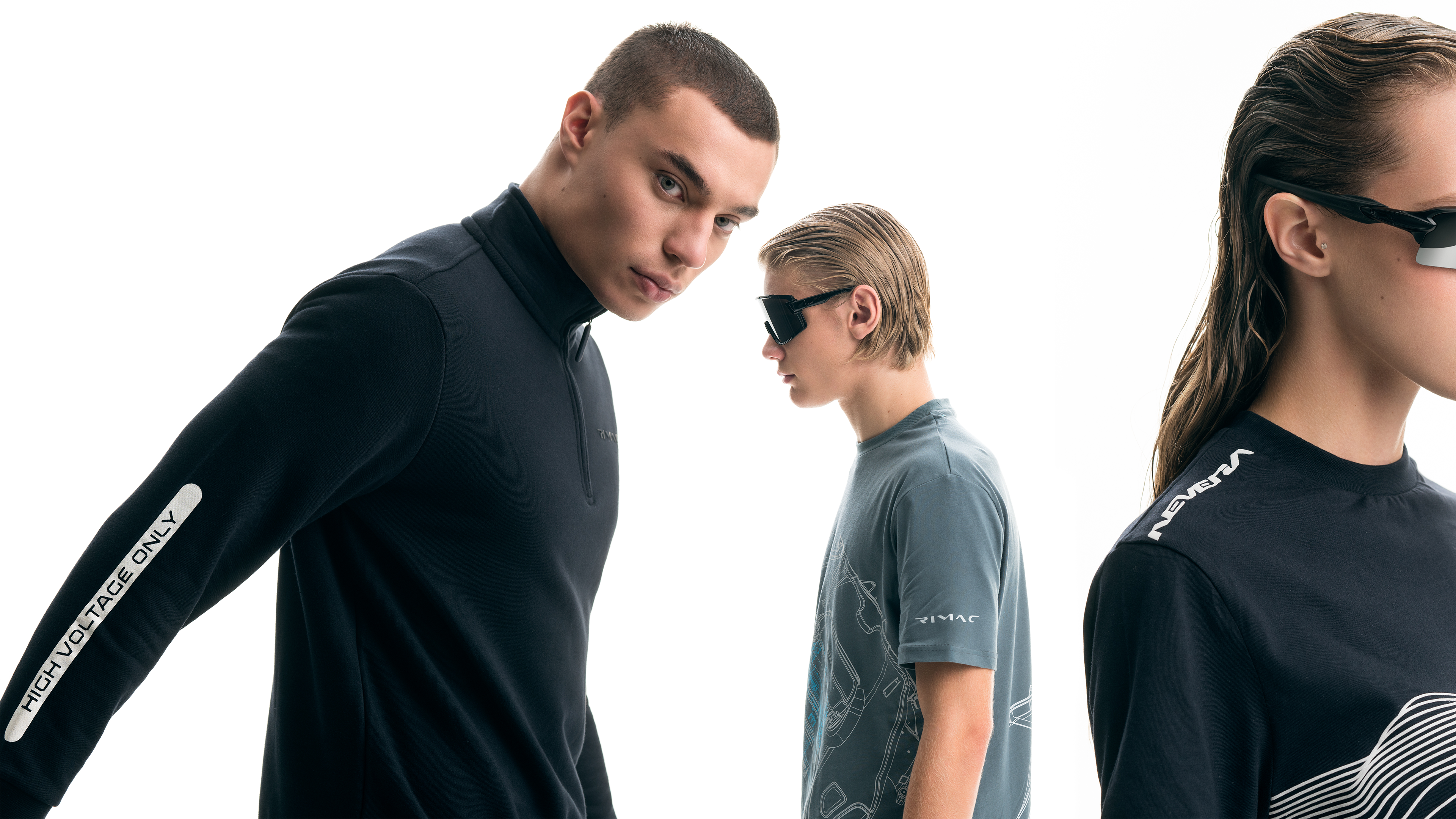
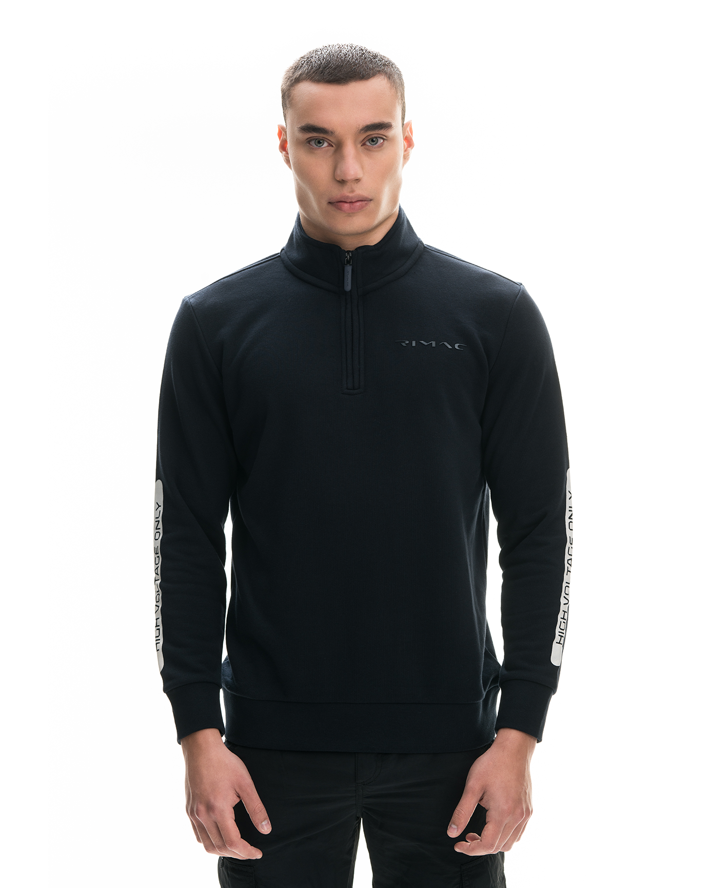
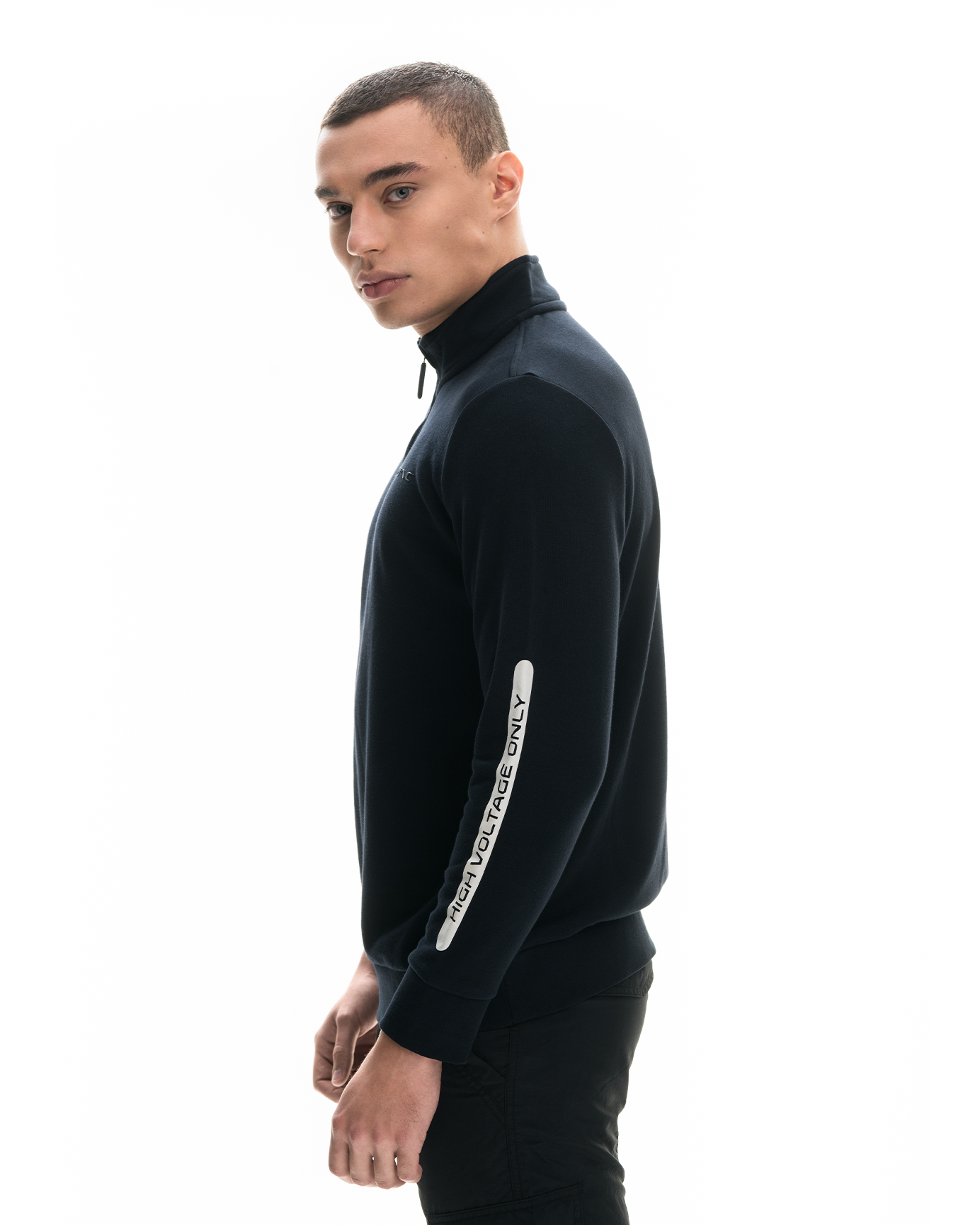
Bespoke typography played a crucial role in differentiating oneself from the competition.
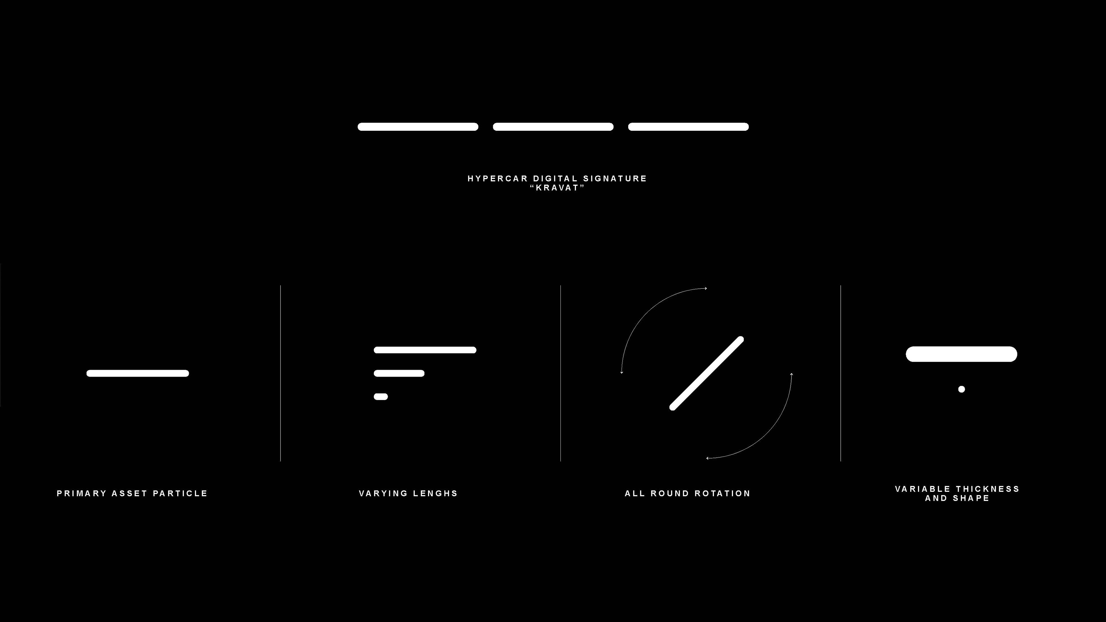
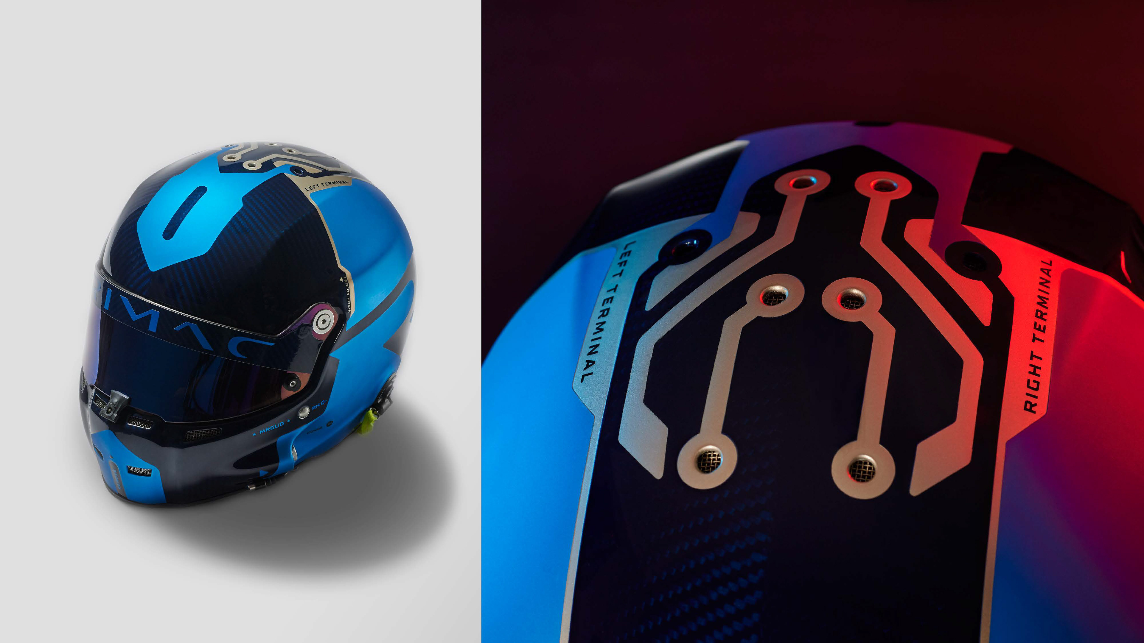
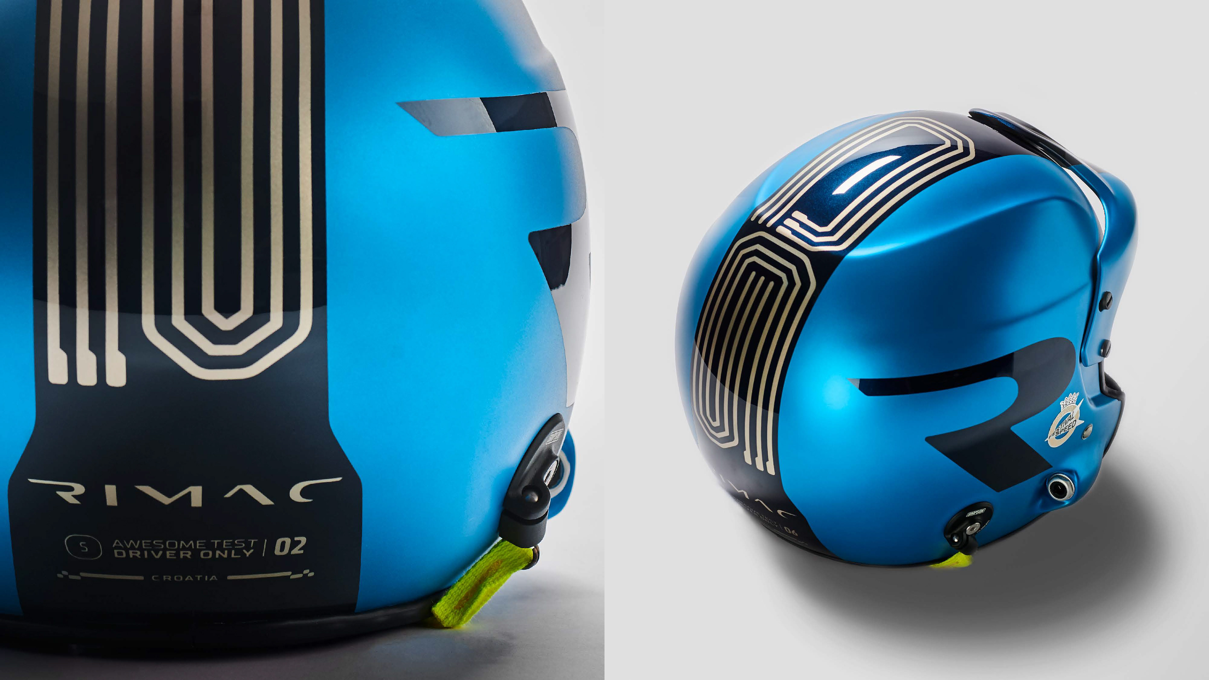
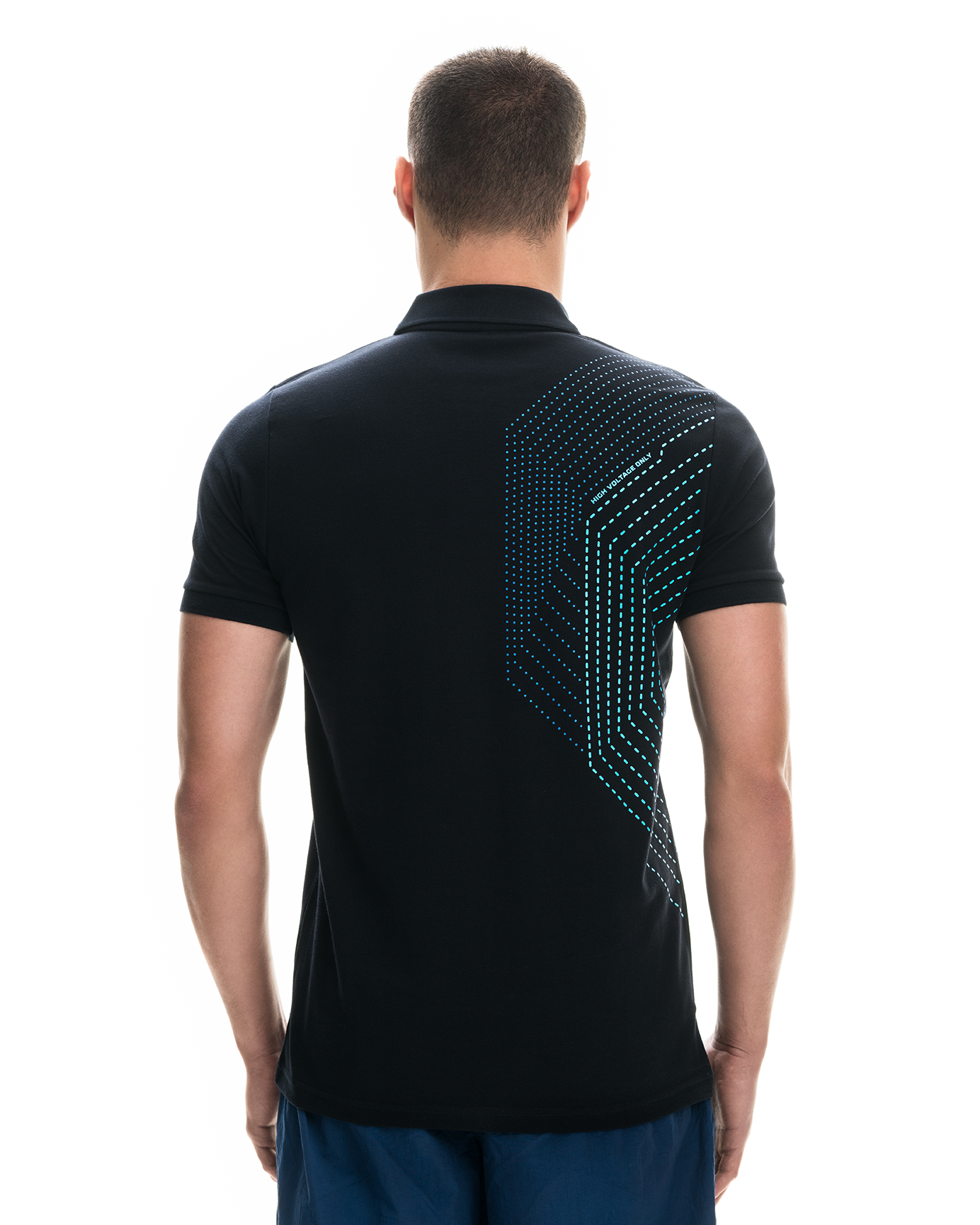
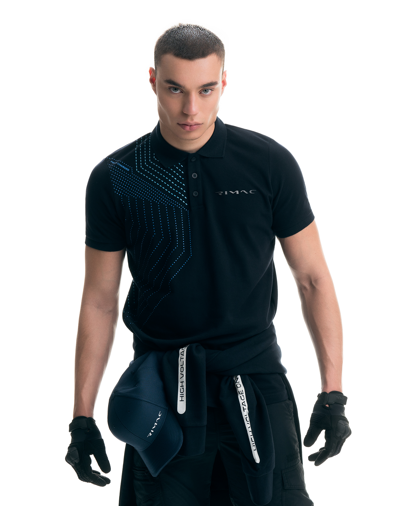
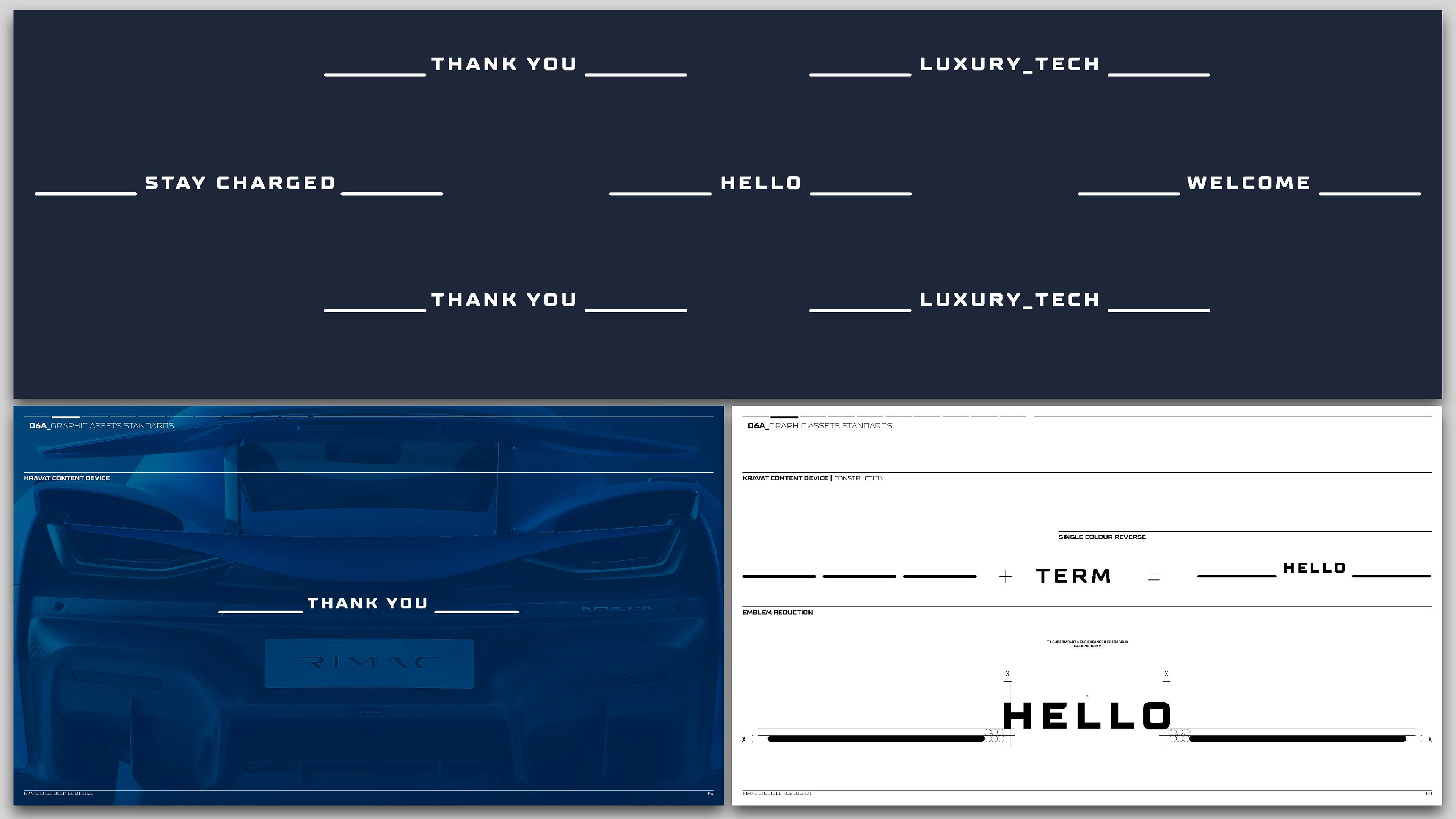
Several typefaces have been designed from scratch all serving a unique purpose. From a digital presence to sheer bold and display type families it was key to engage with the audience on all visual communication levels. "Kravato" a typeface that drew heavy inspiration from the geometric qualities of the "cravat" whilst Typo_One, Two and Three where used primarily as a typographic expression of the unique PCB graphic quality.
Several typefaces have been designed from scratch all serving a unique purpose. From a digital presence to sheer bold and display type families it was key to engage with the audience on all visual communication levels. "Kravato" a typeface that drew heavy inspiration from the geometric qualities of the "cravat" whilst Typo_One, Two and Three where used primarily as a typographic expression of the unique PCB graphic quality.
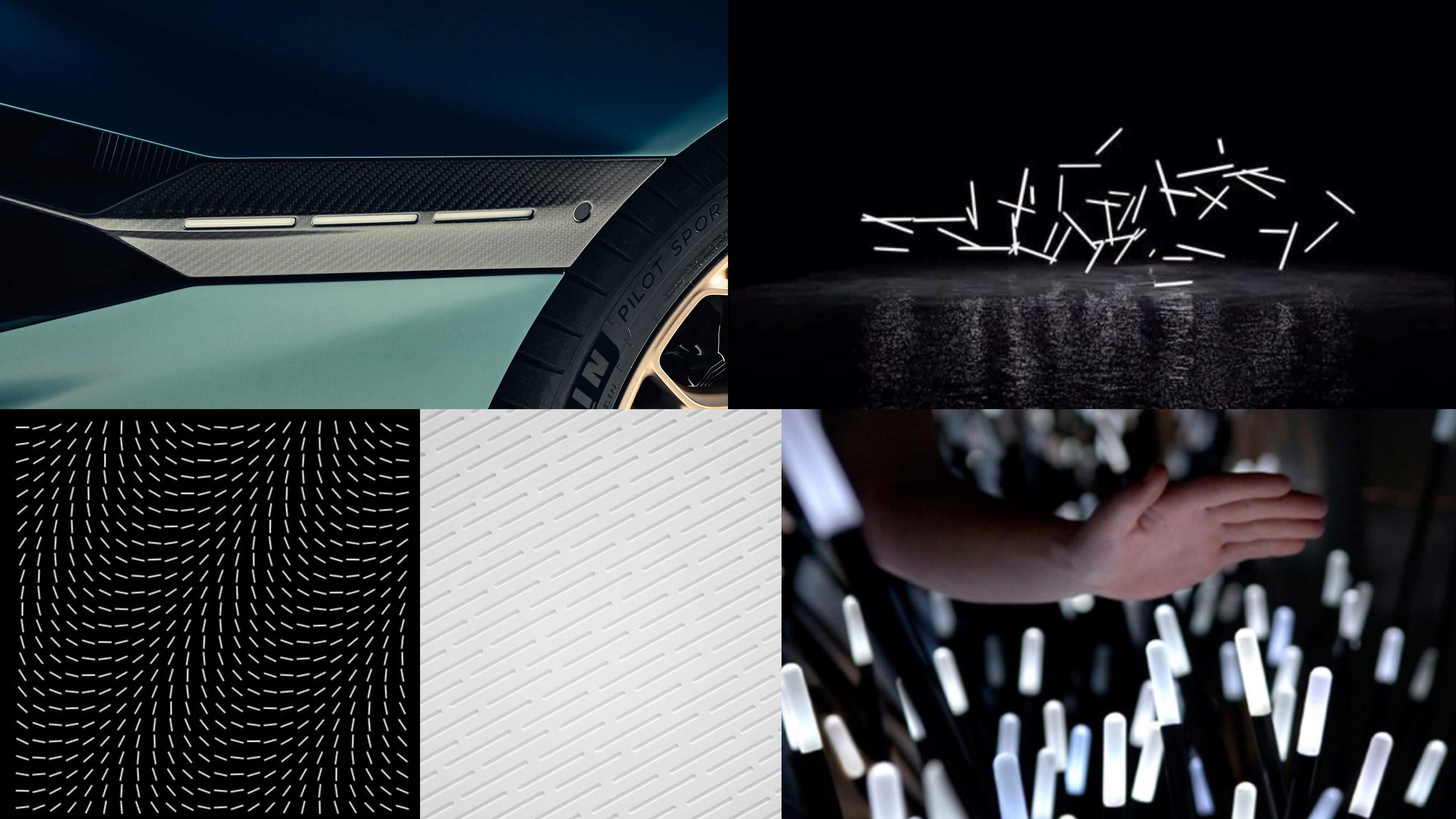
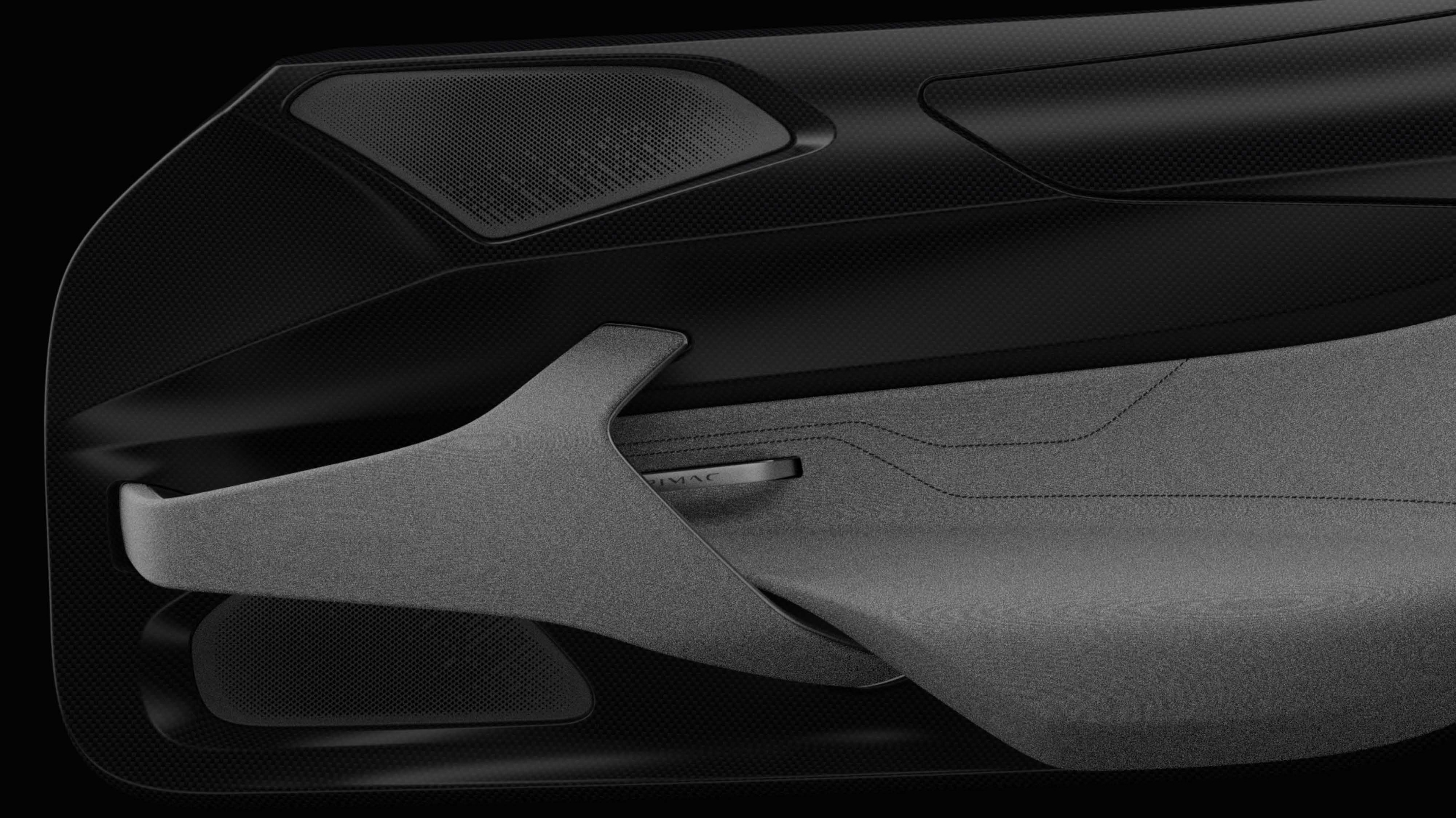
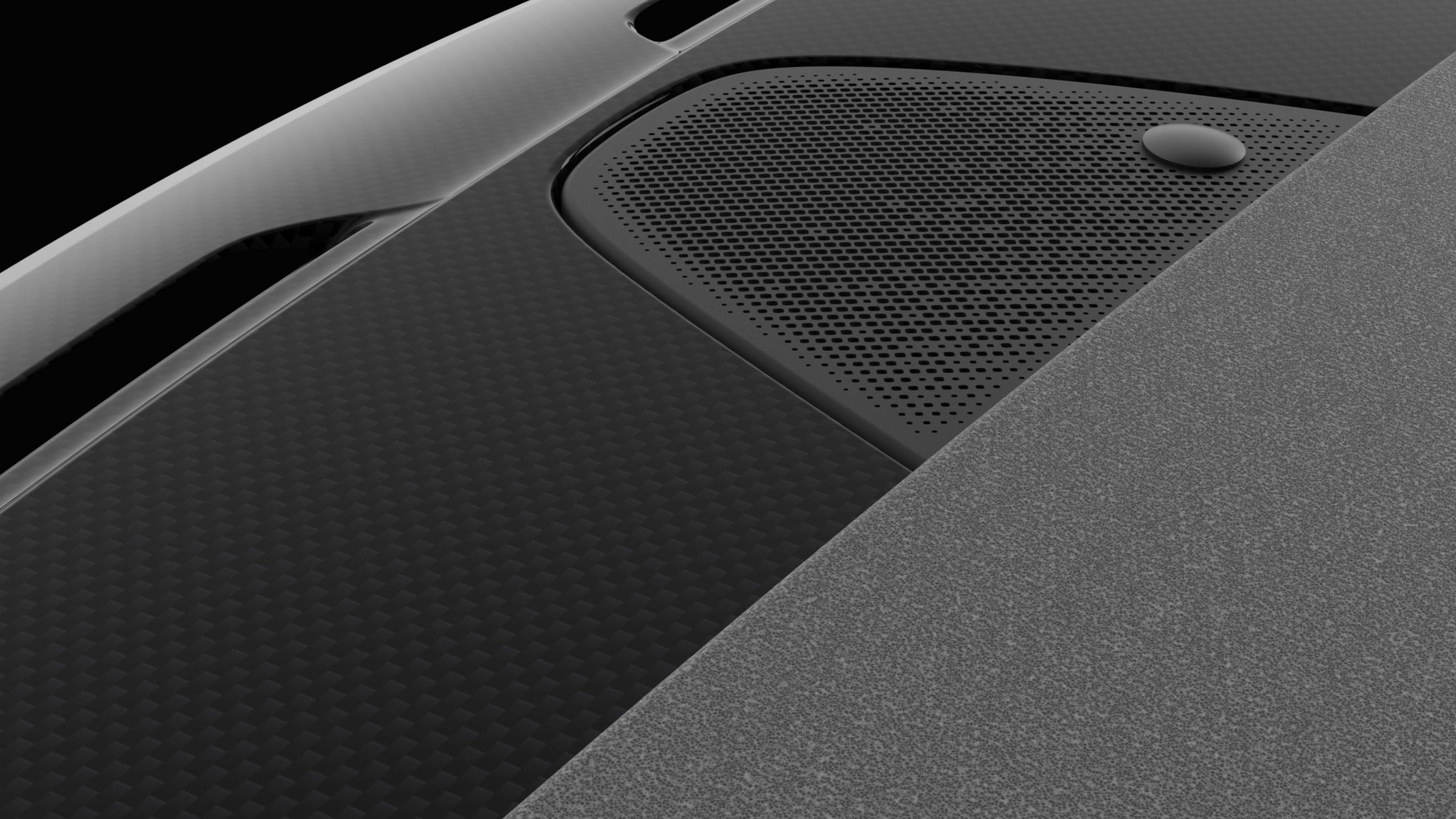
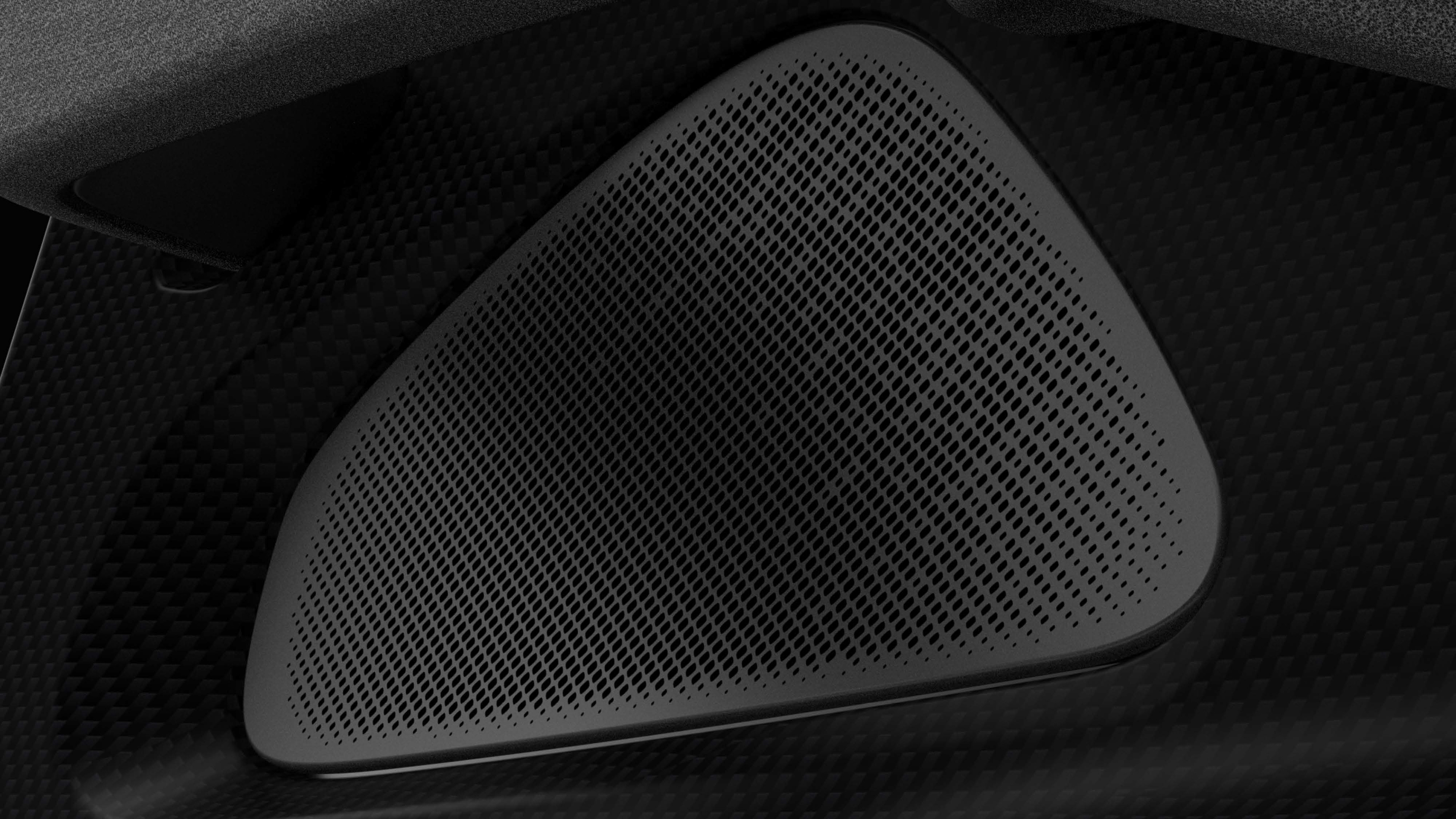
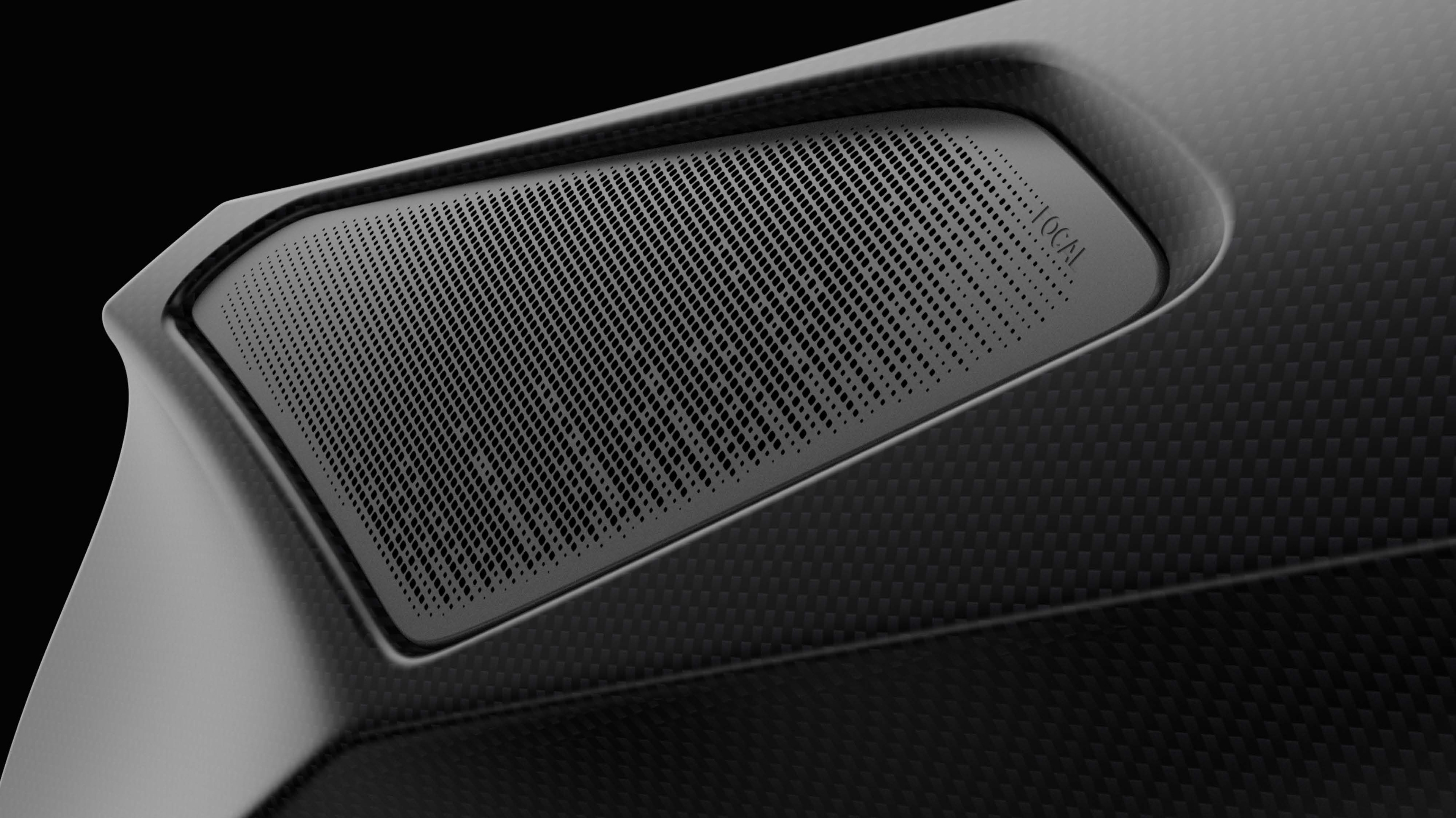
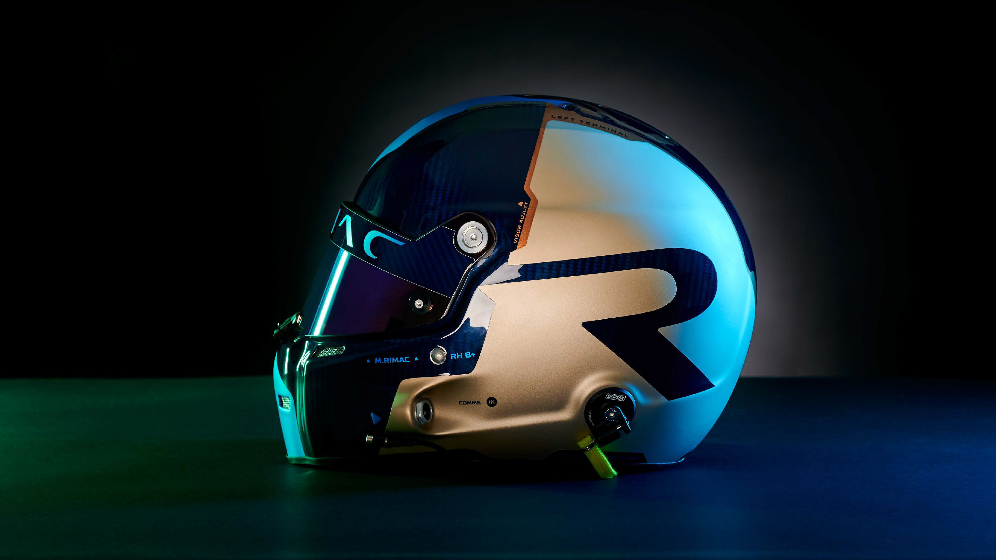
Fine tuning and designing the speaker mesh designs proved to be highly challenging.
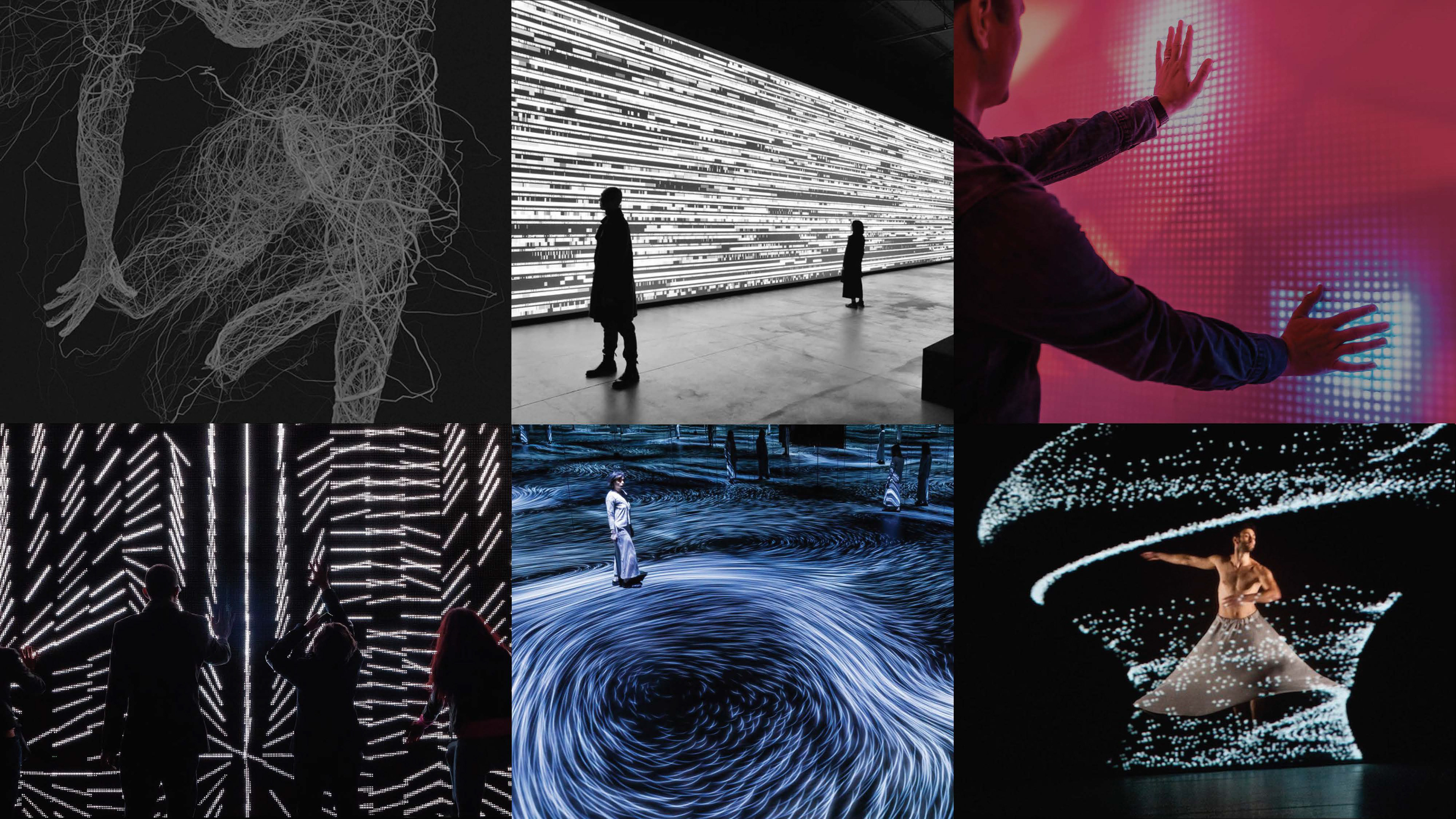
Having to respect the open rate of each speaker to above 50% it was crucial to maintain the design language of a digital signal signature.


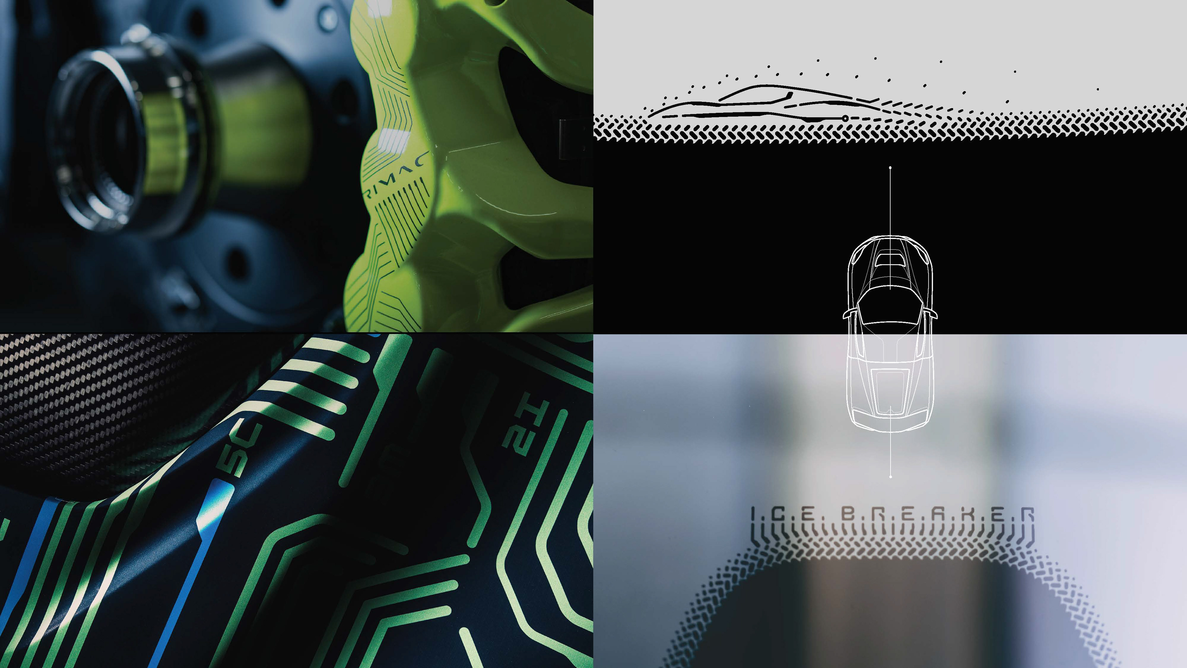
Subtle hidden messages where prominent even on the final car. The front windshield black-print features a highly stylised Nevera silhouette whilst the rear window black print features the play on the word I.C.E. B.R.E.A.K.E.R. or Internal Combustion Engine Breaker.


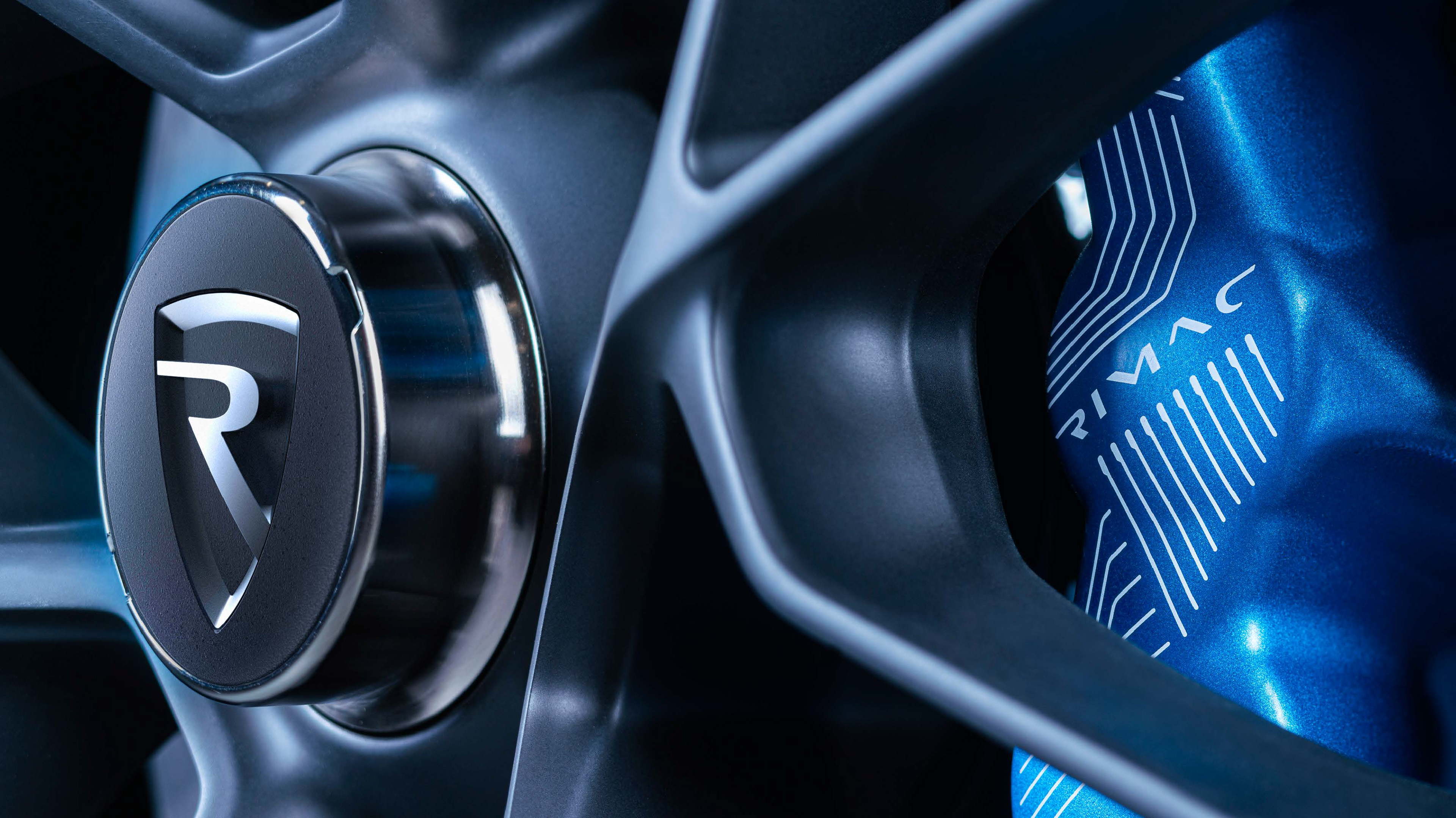
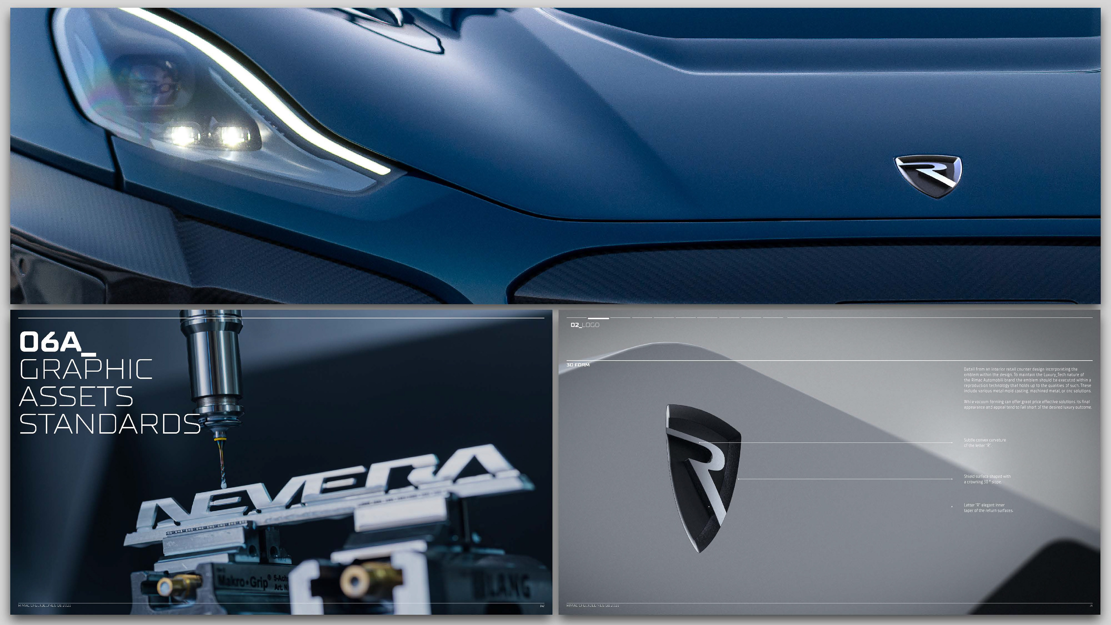
The re-designed shield geometry allowed for a more sculptural and contemporary interpretation of the shield emblem. Thus creating a cleaner and purposefully chiseled
new profile.
new profile.
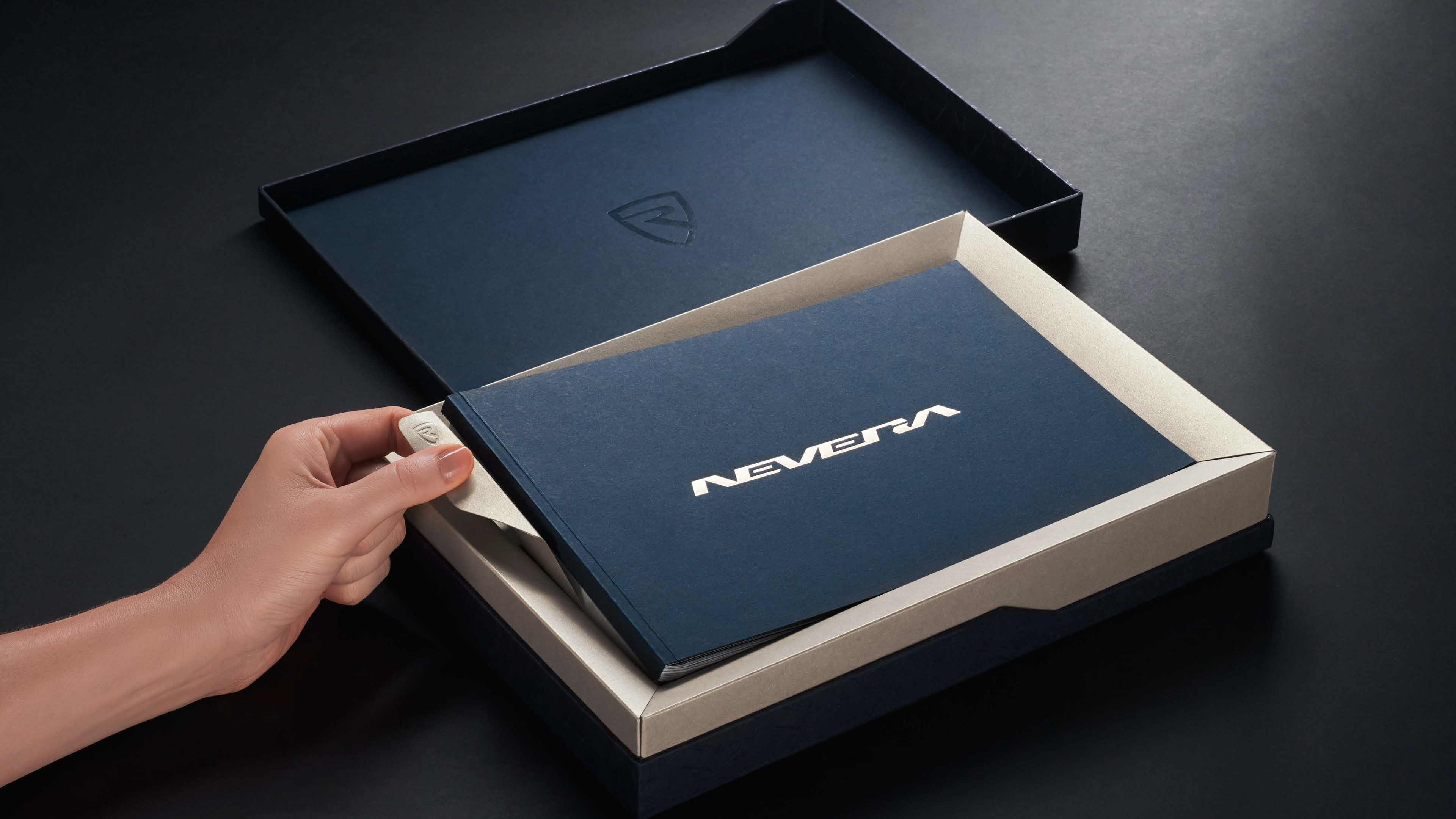
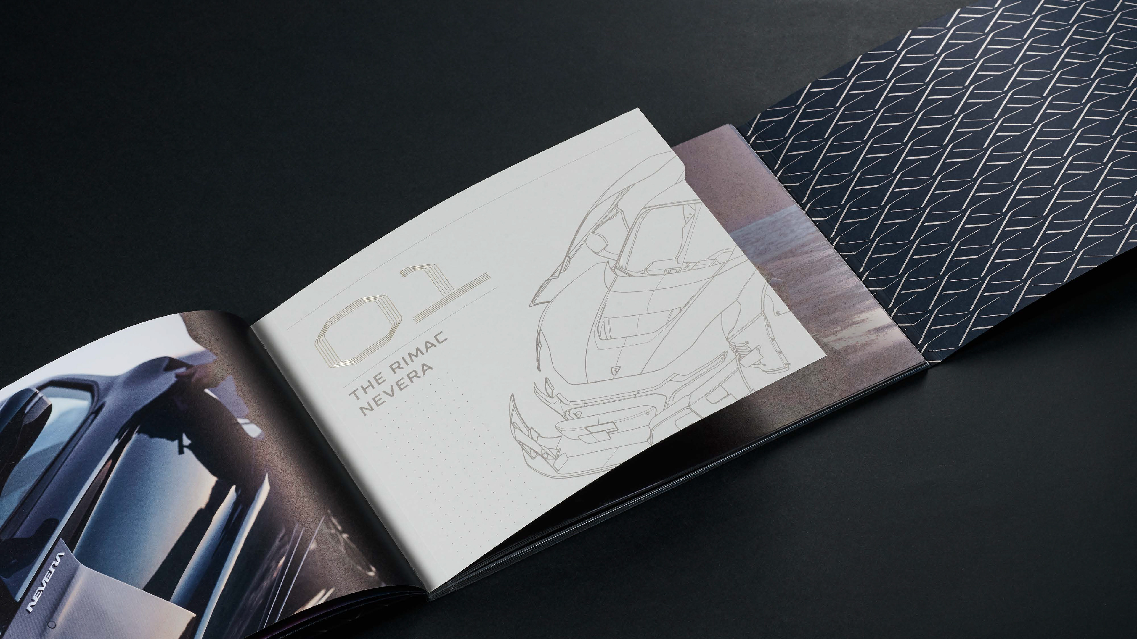
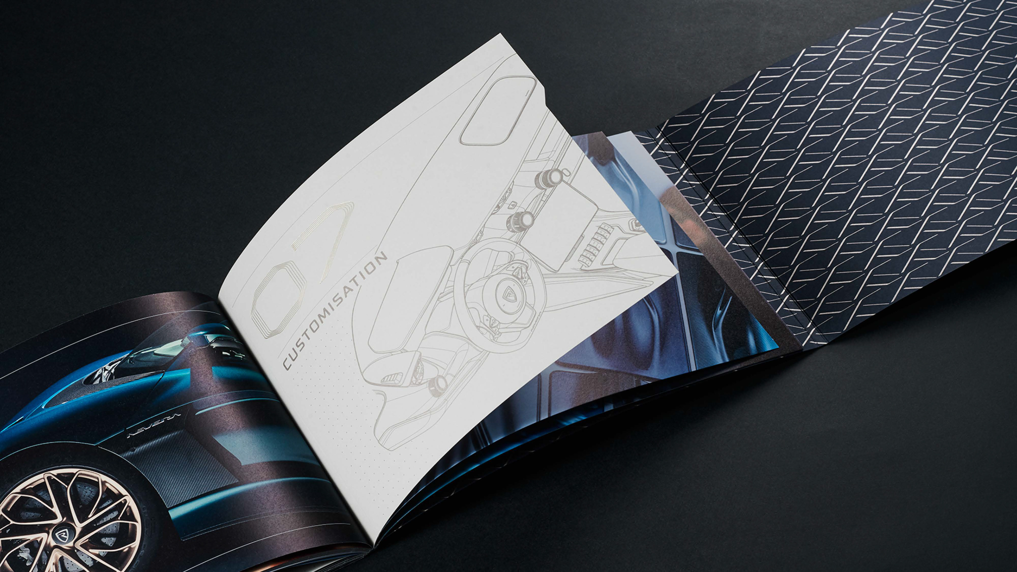
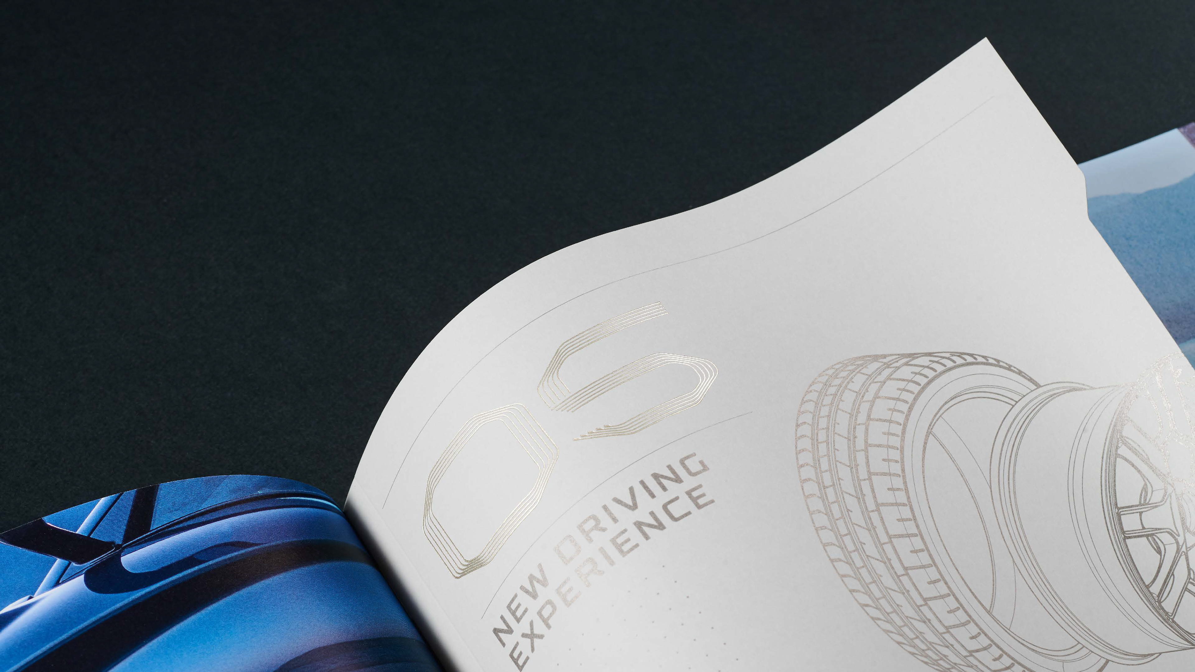
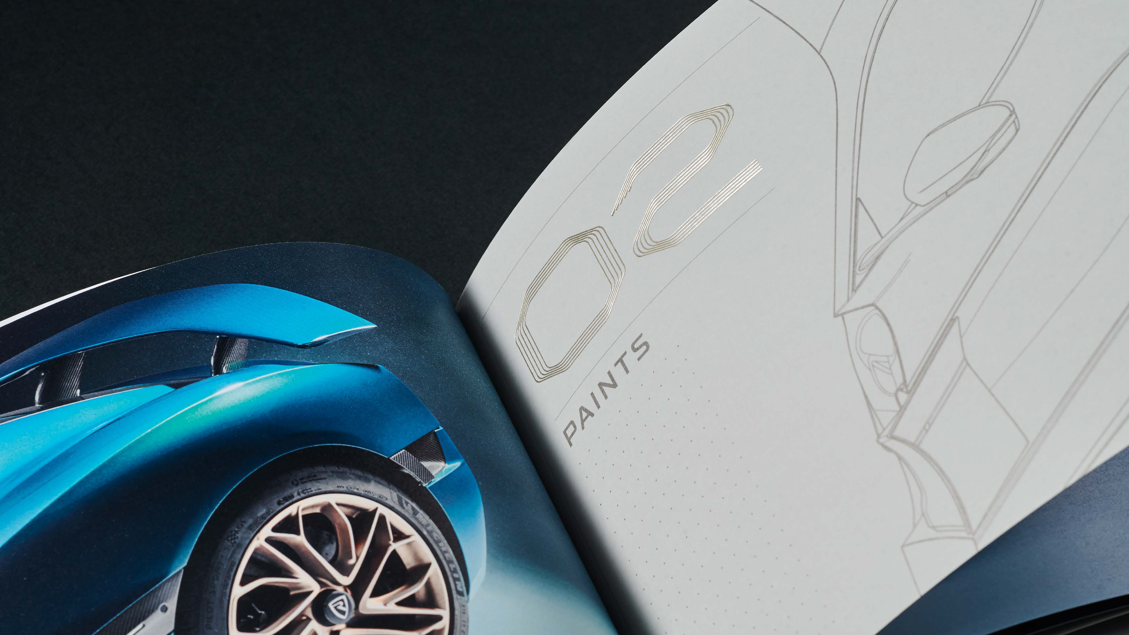
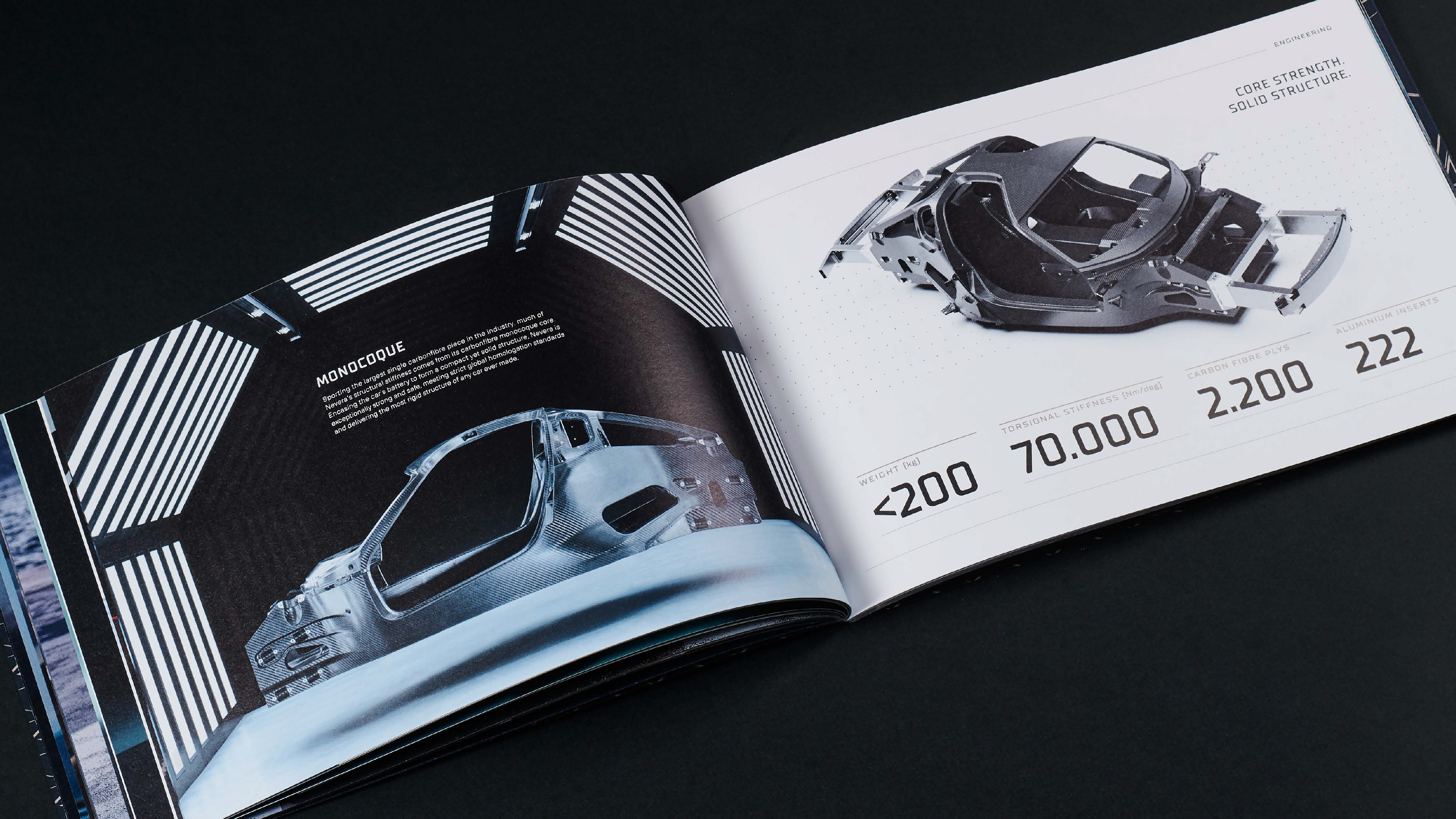
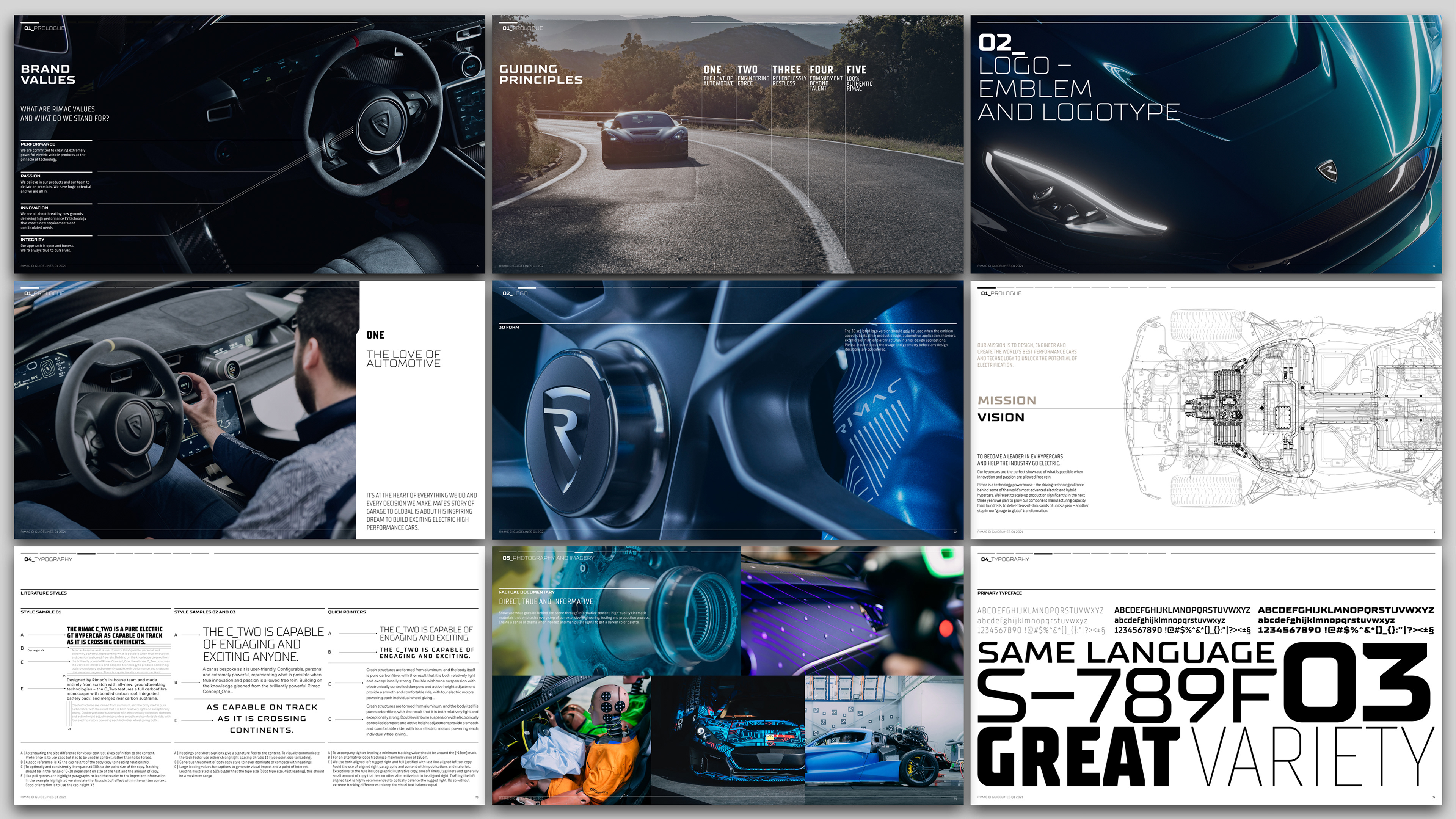
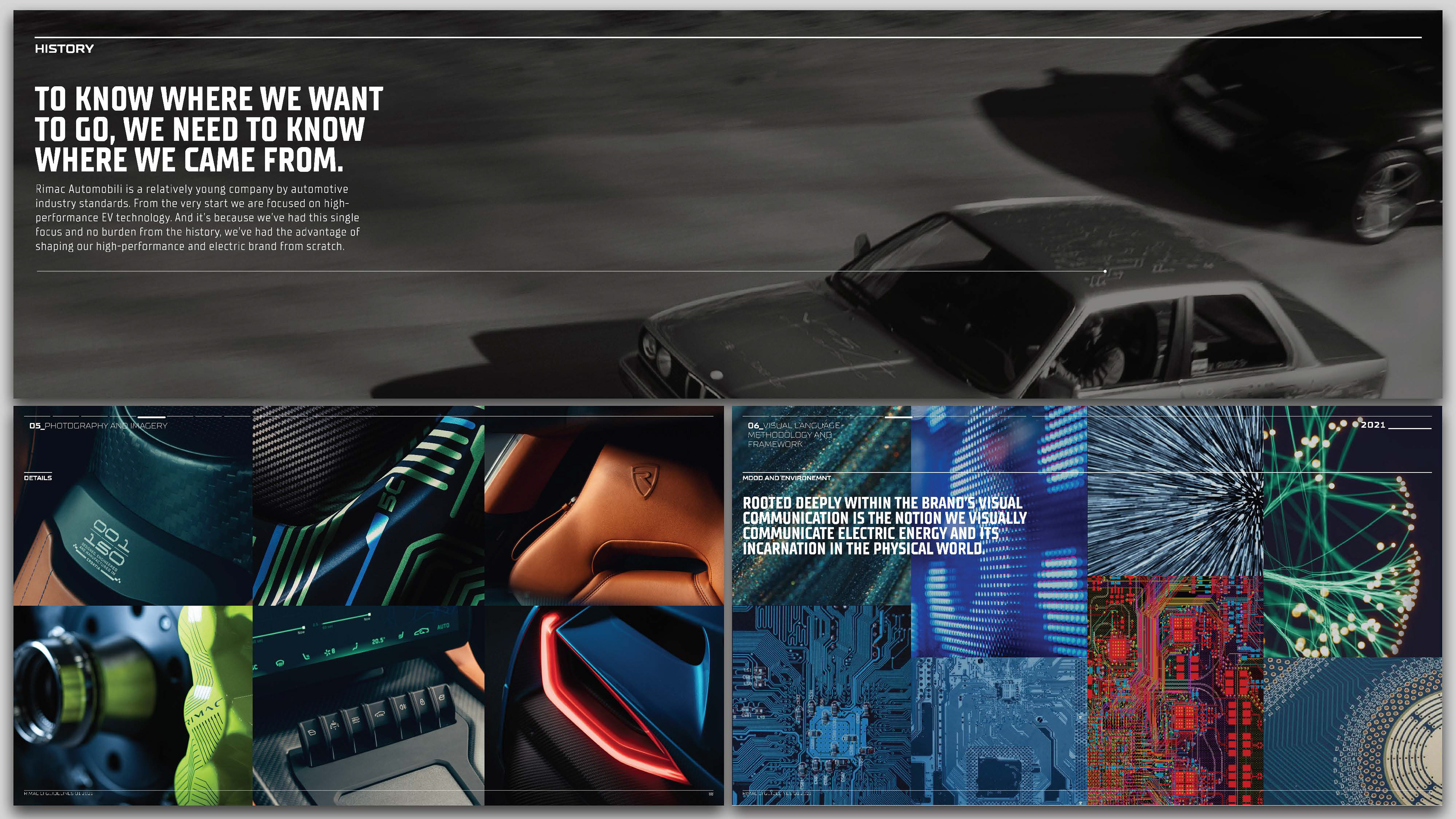
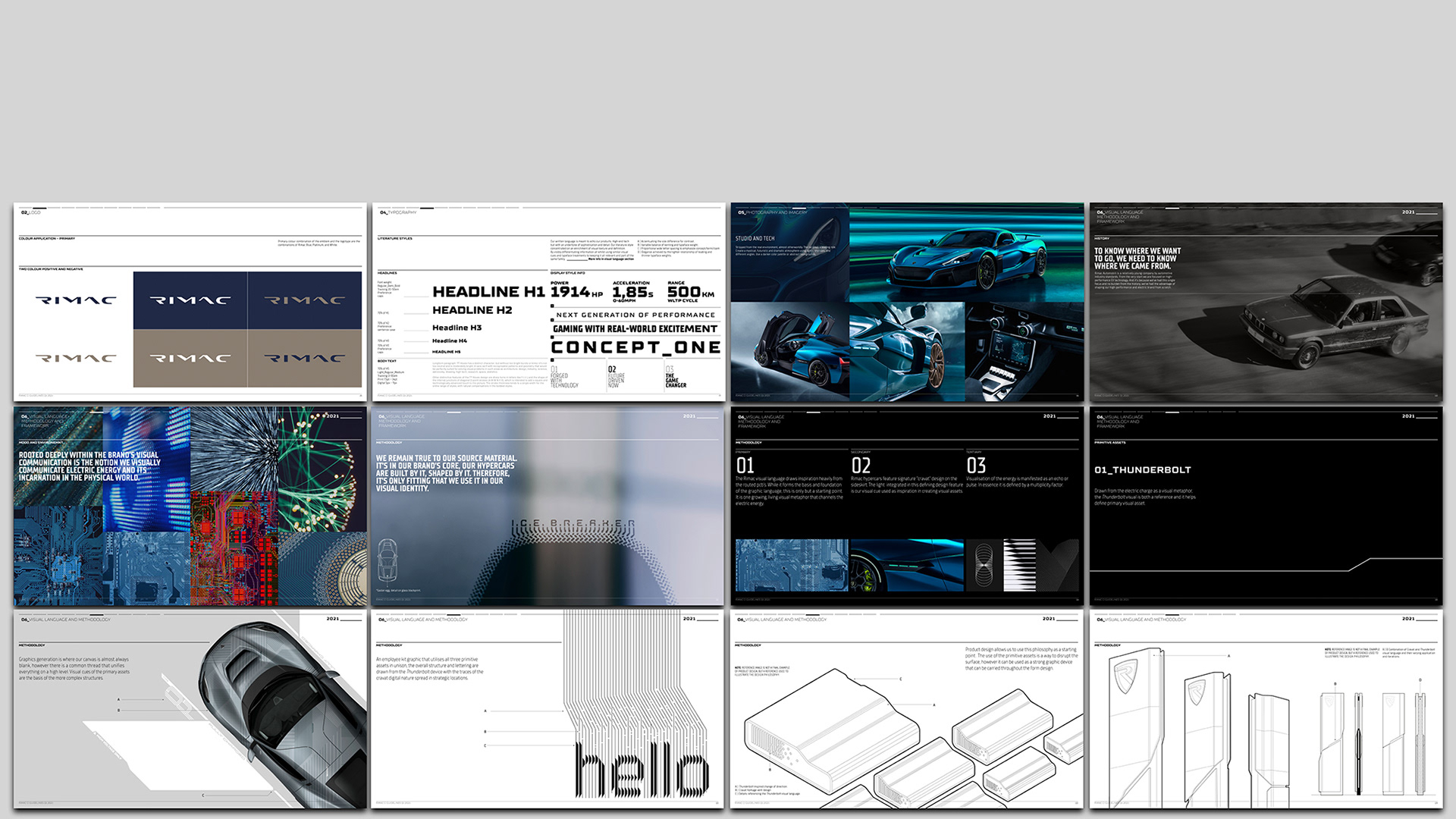
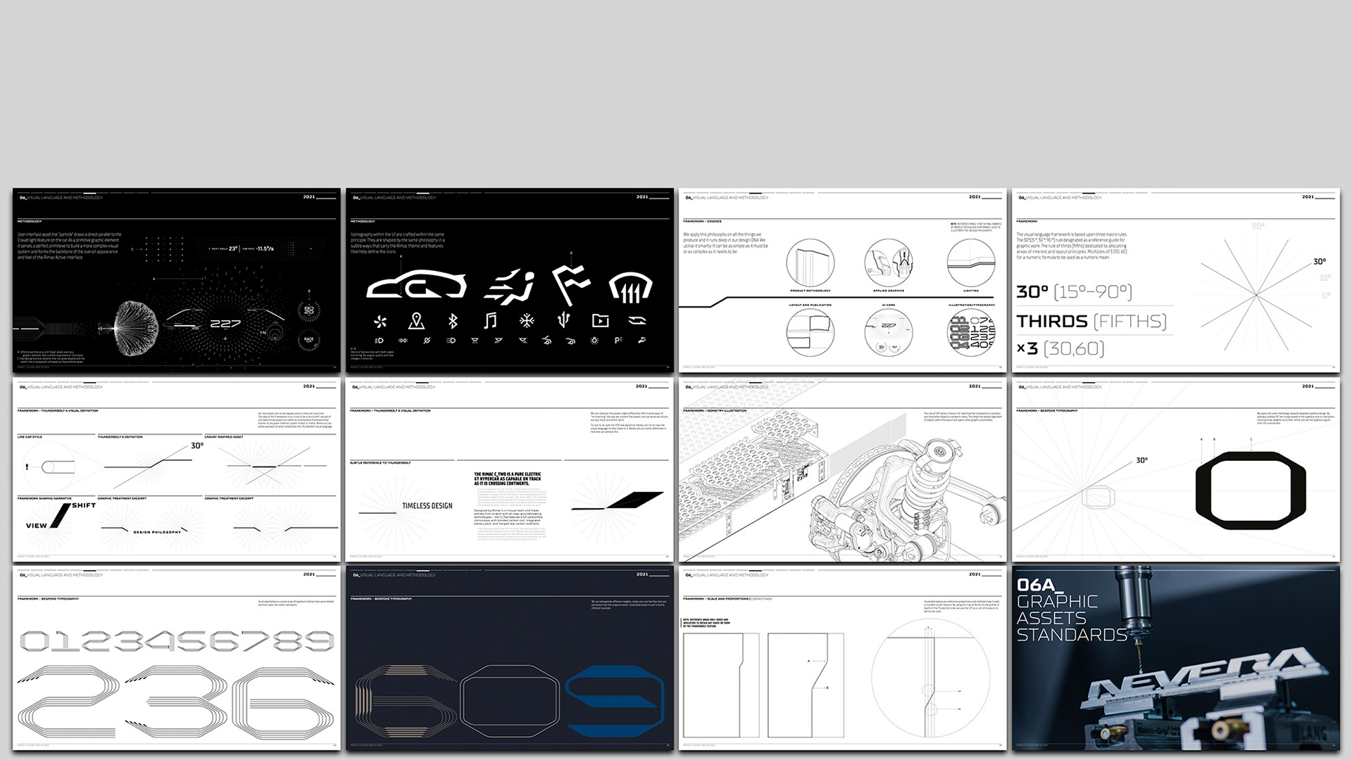
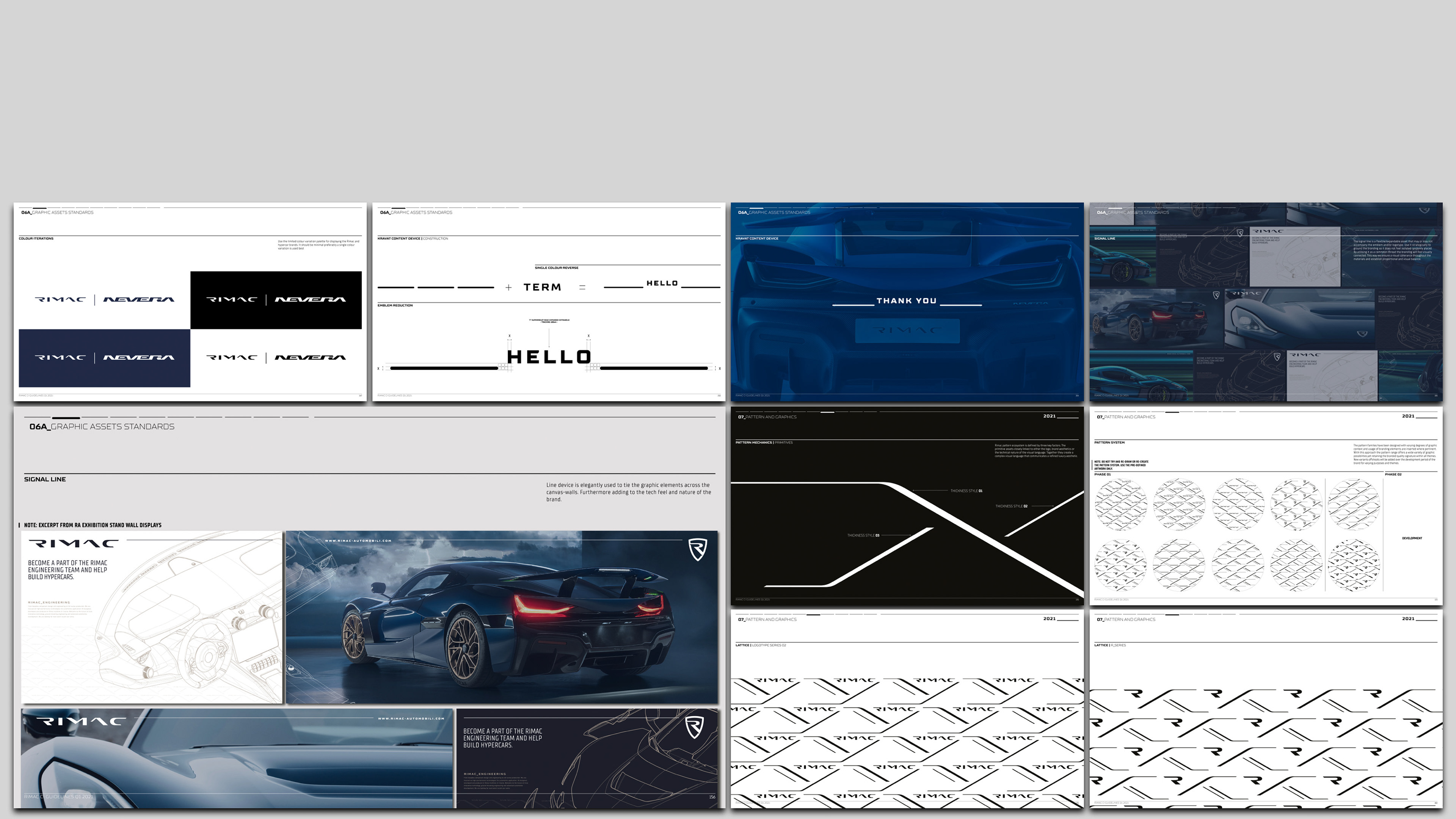
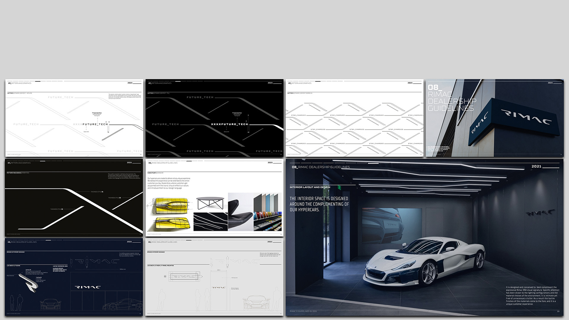
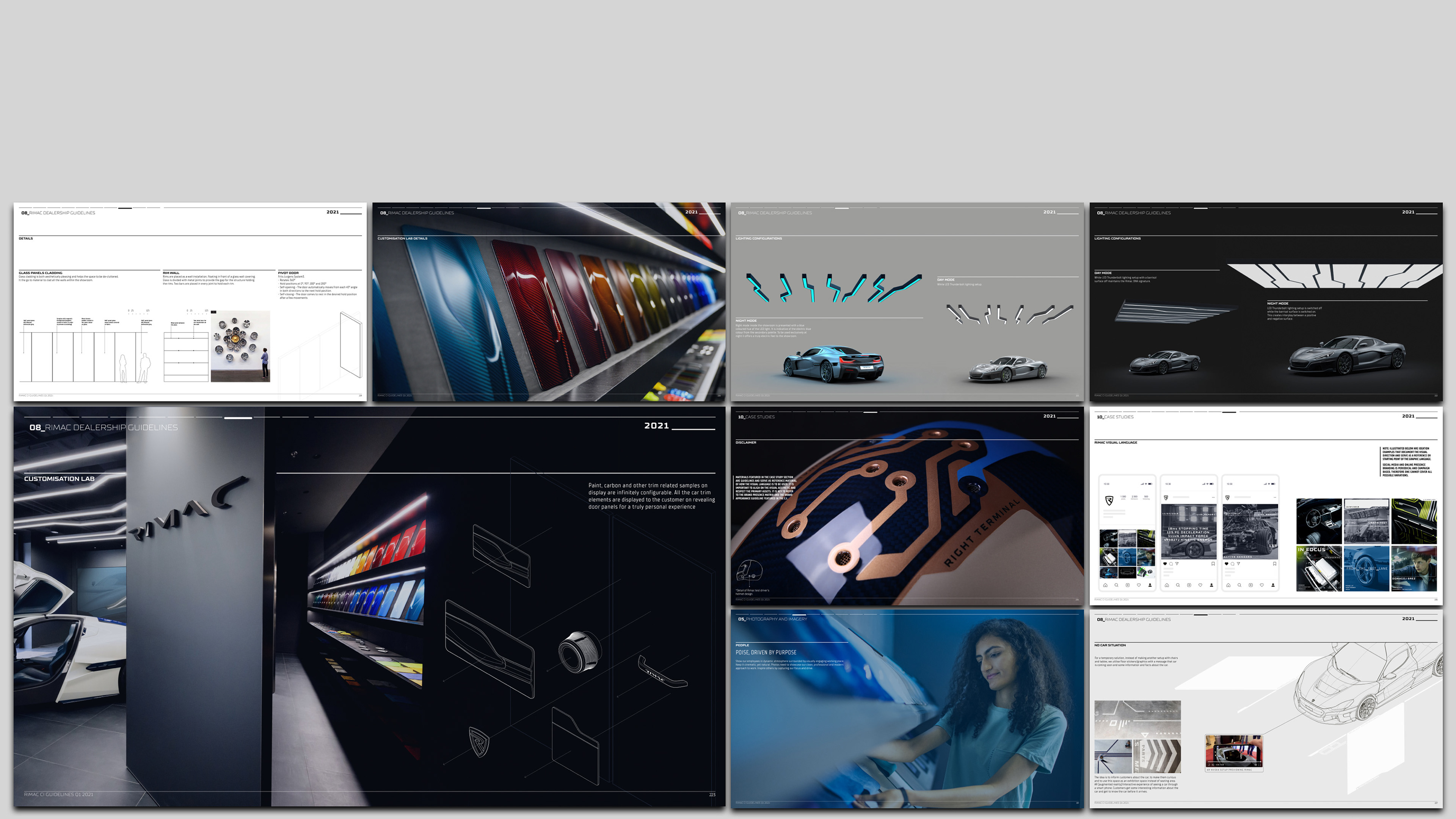
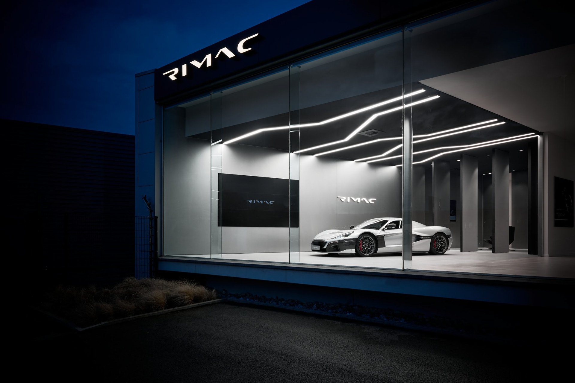
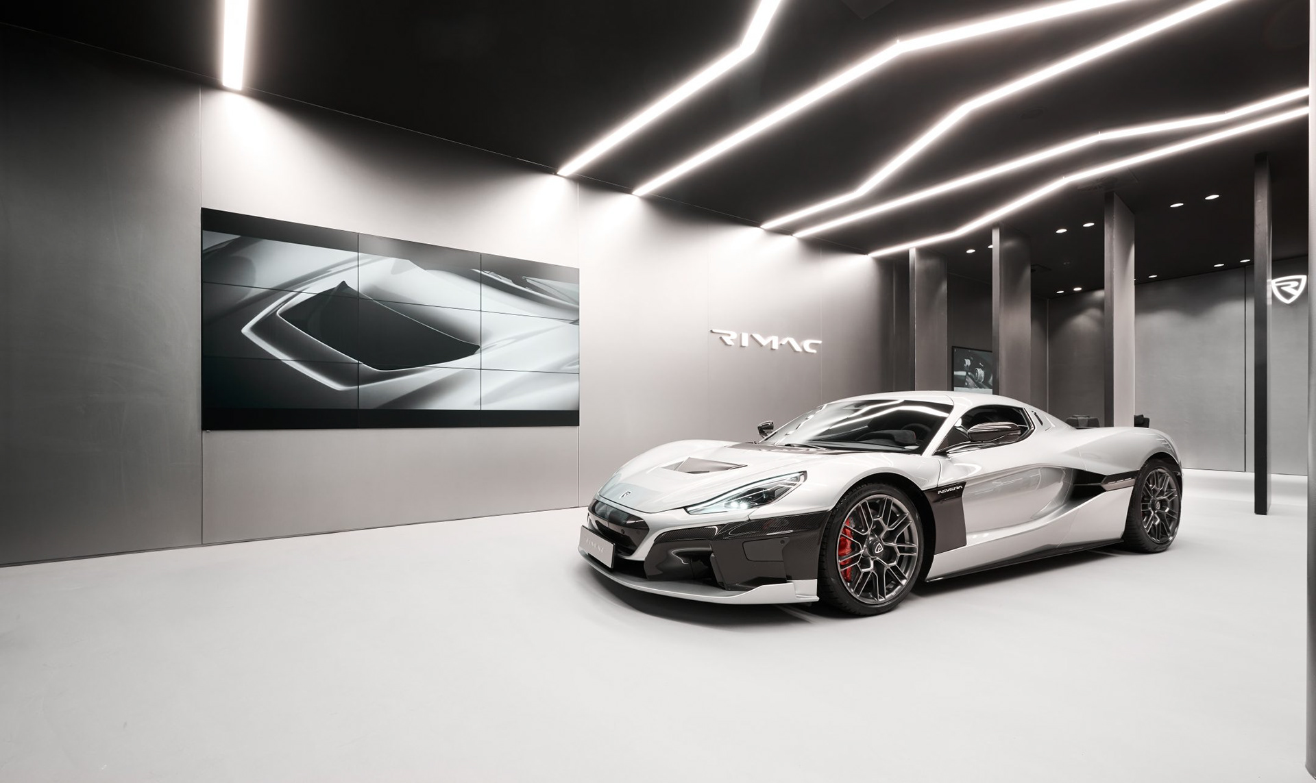
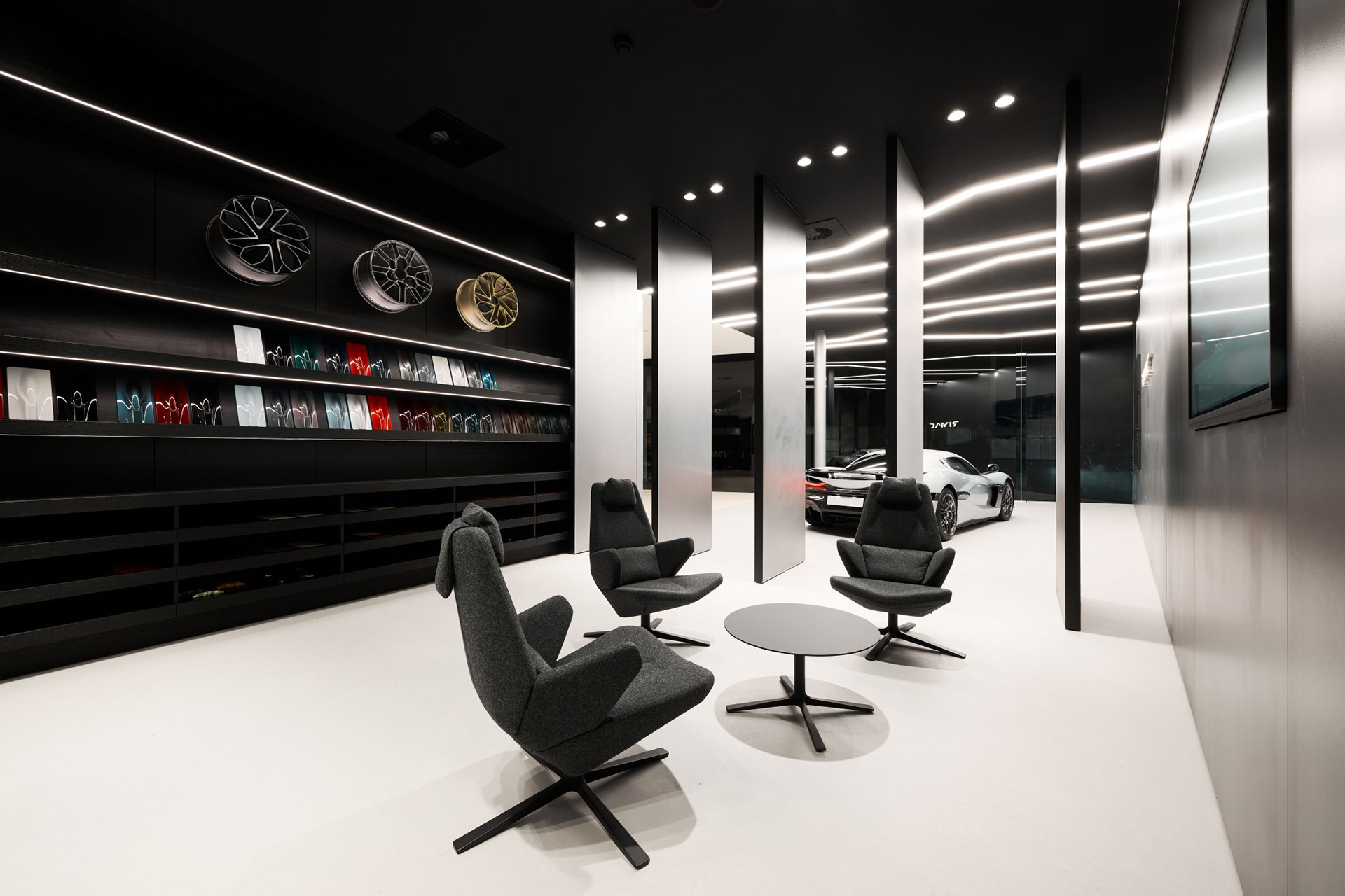
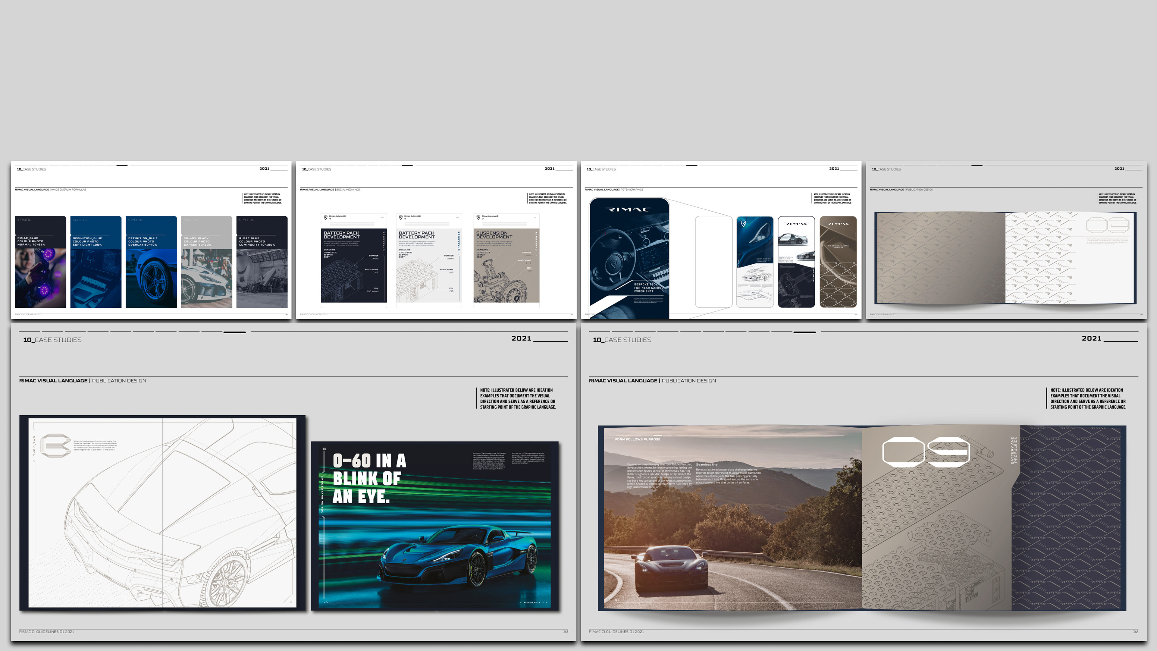
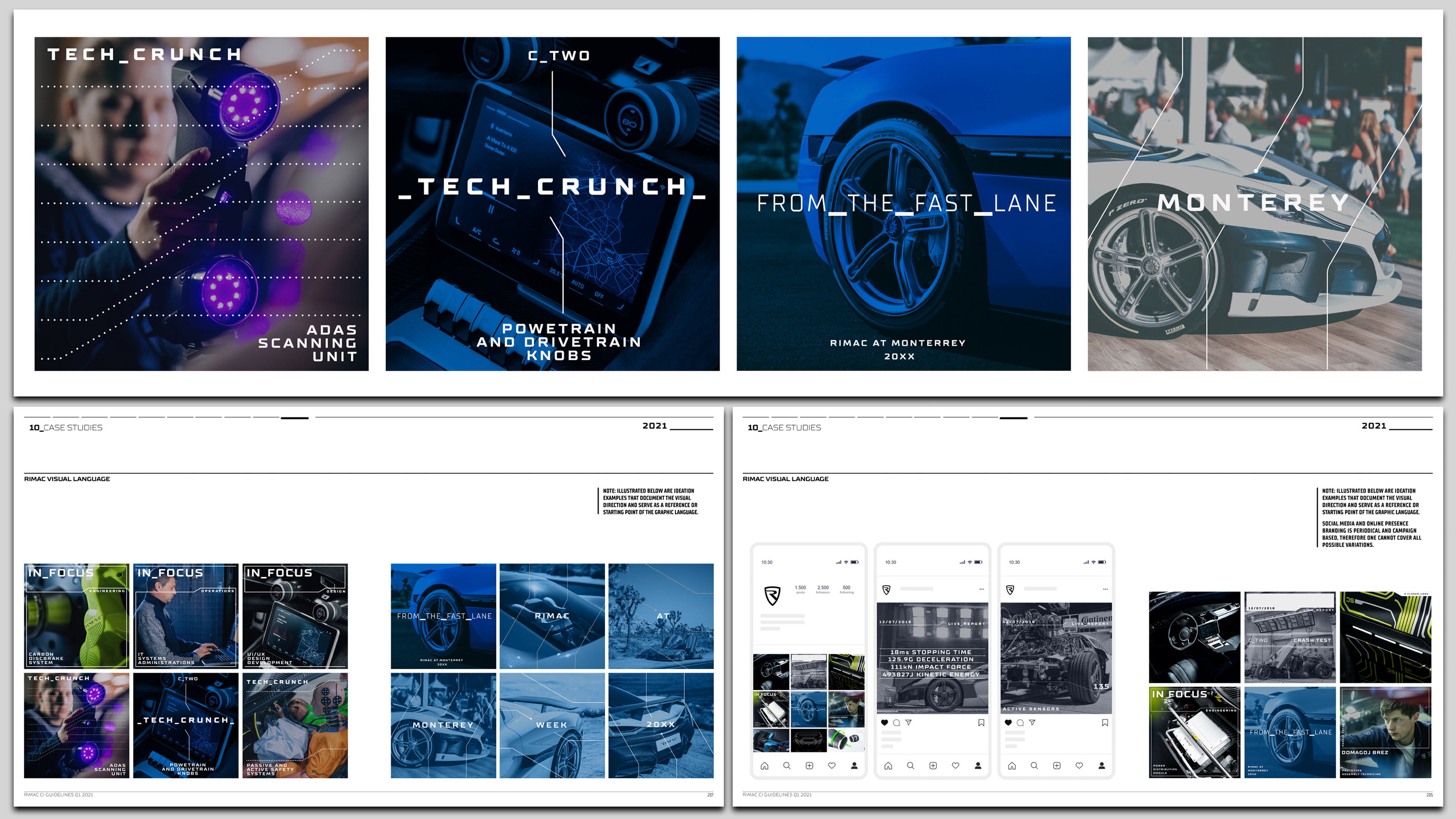
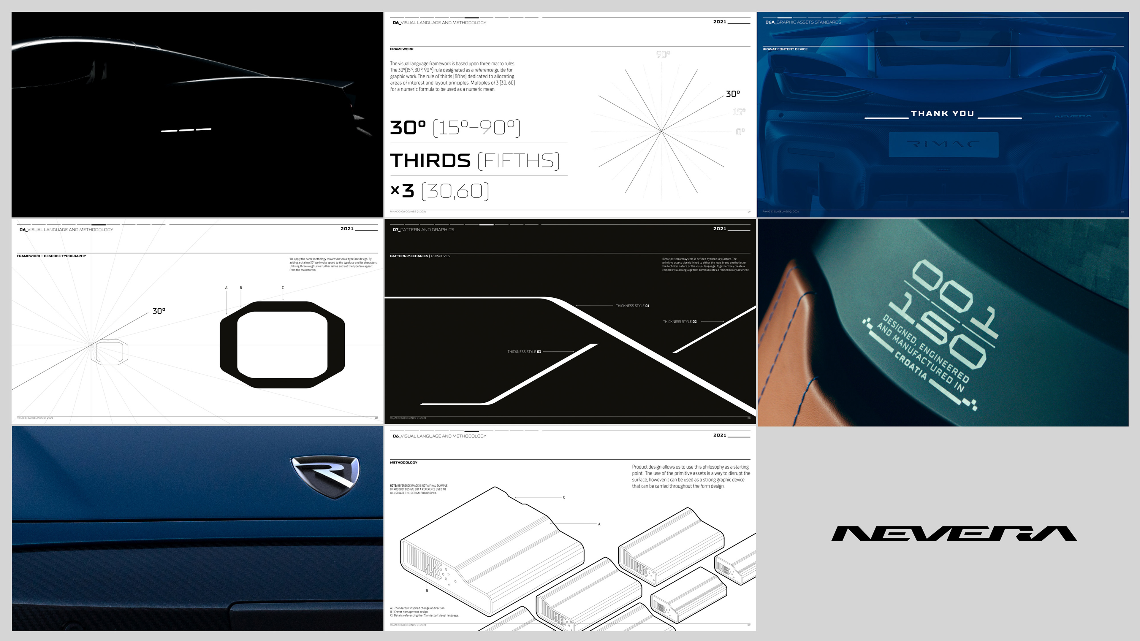
Highlights and excerpts from a 250+ page corporate identity manual which defined branding, graphic design, product design methodology, typography principles, interior design, signage, illustration styles, photographic guidelines etc.
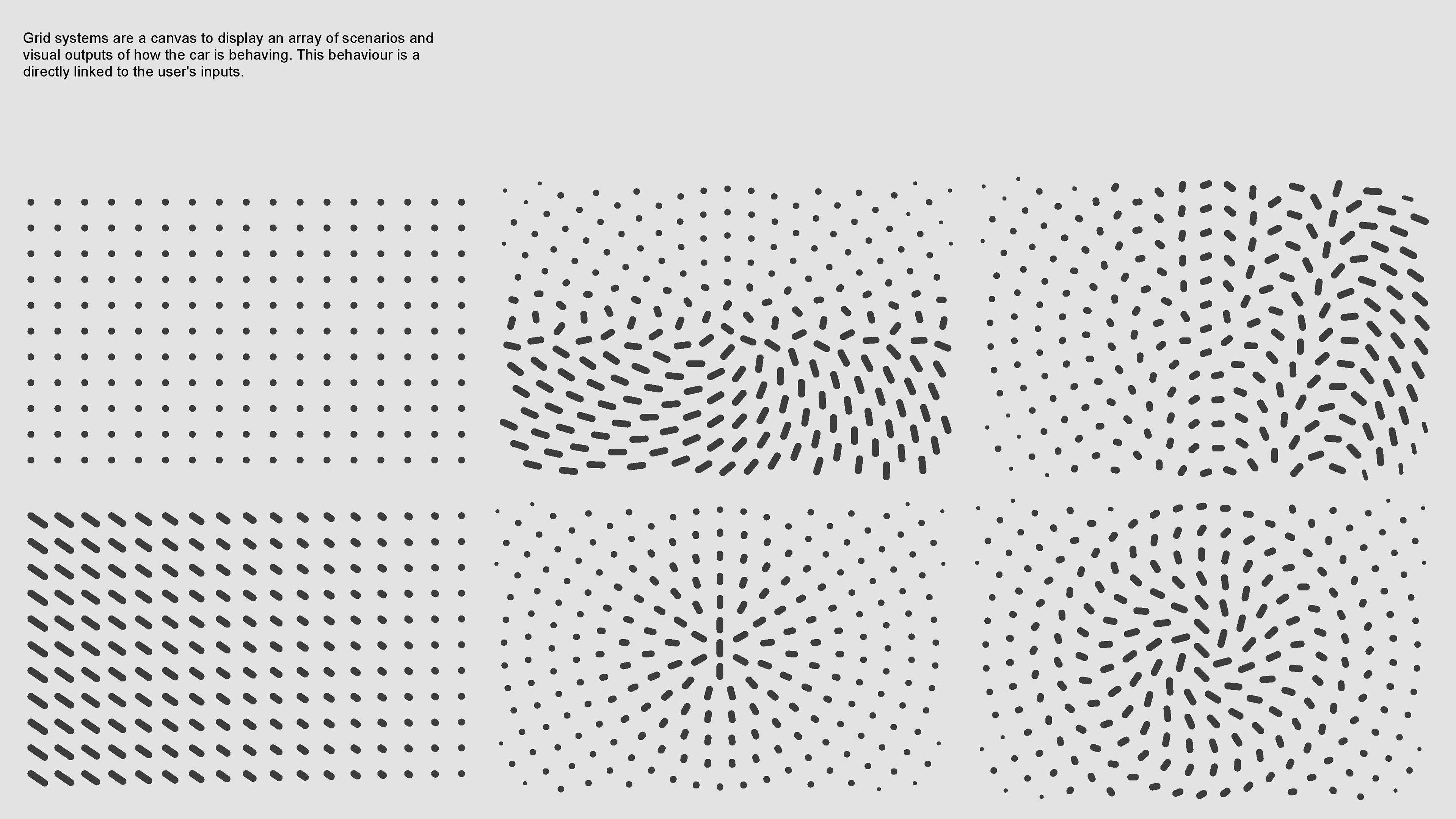
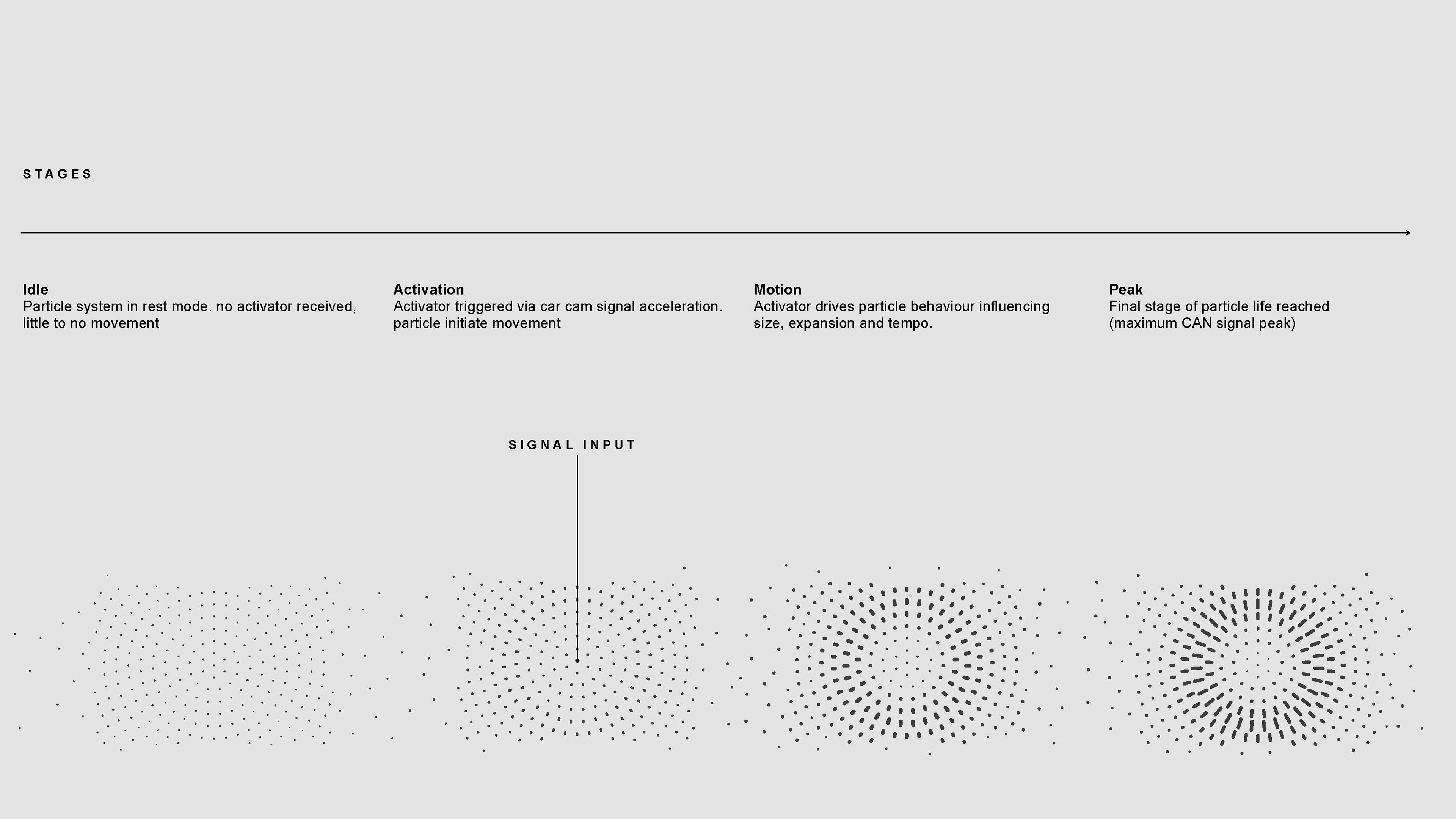
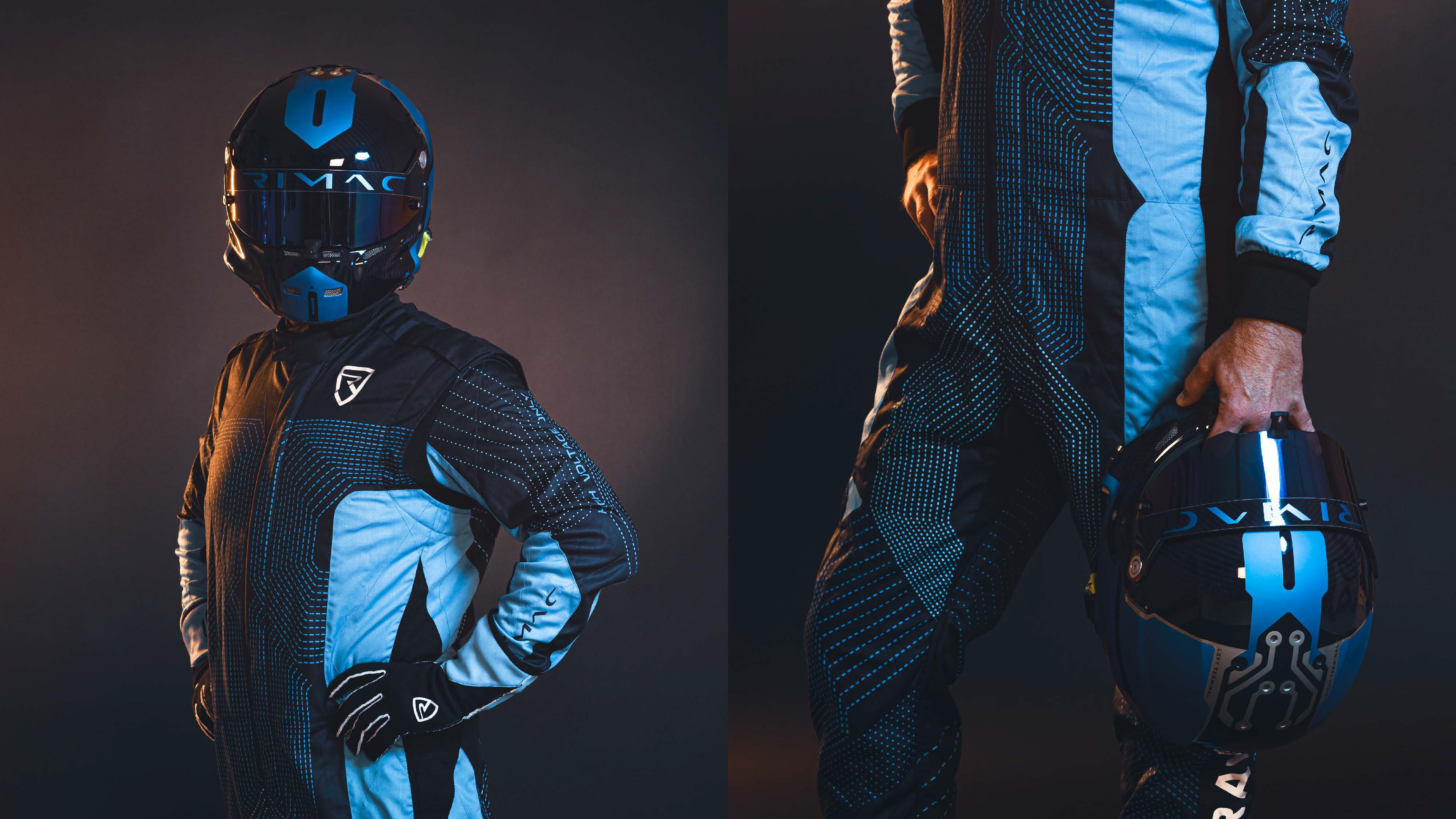
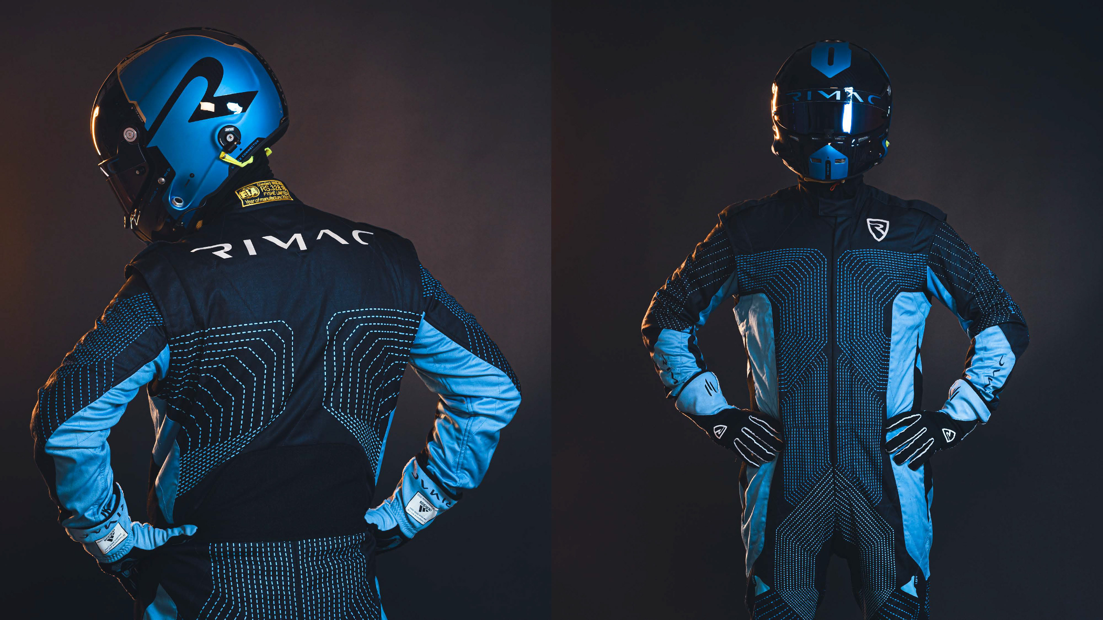
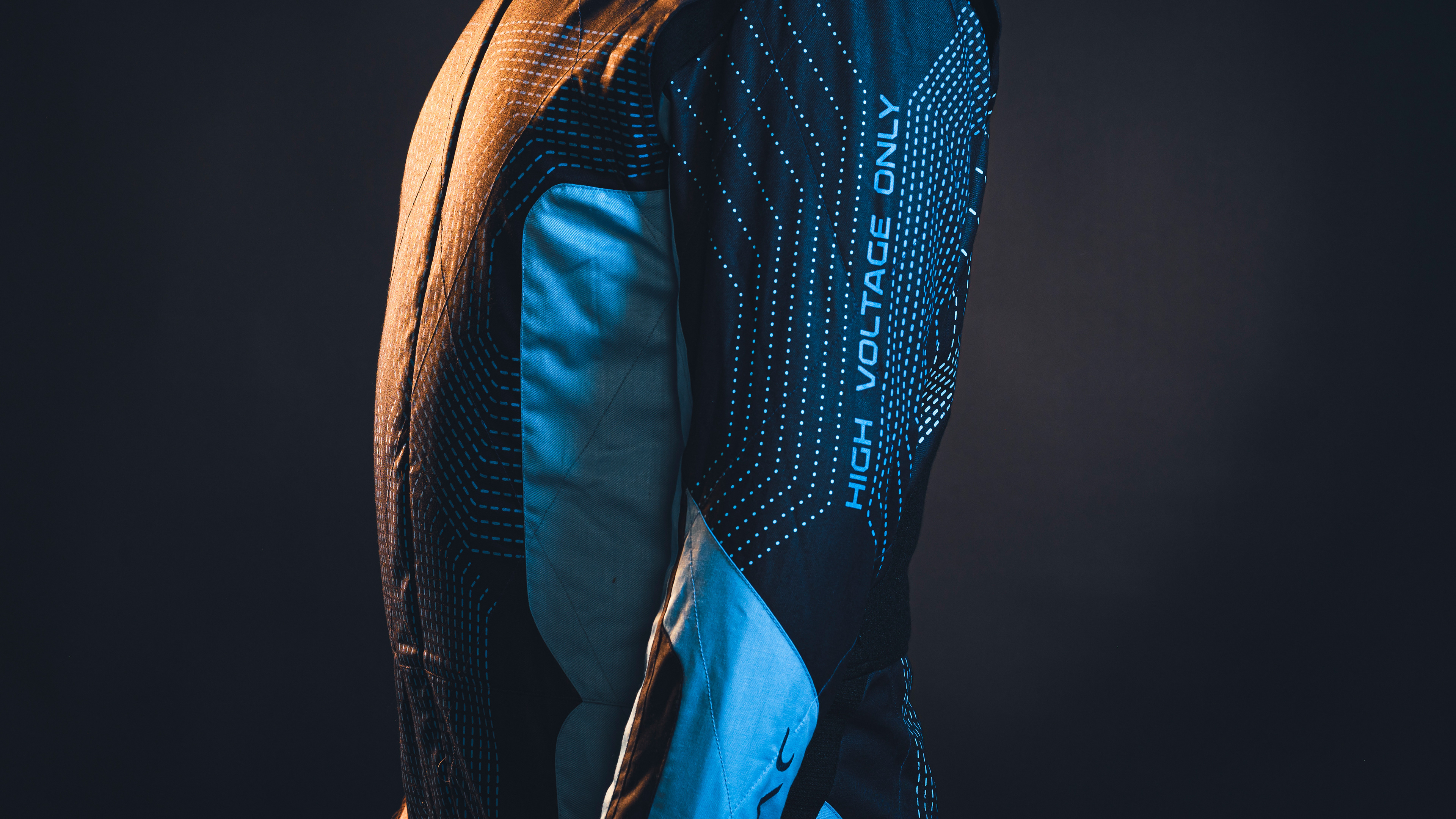
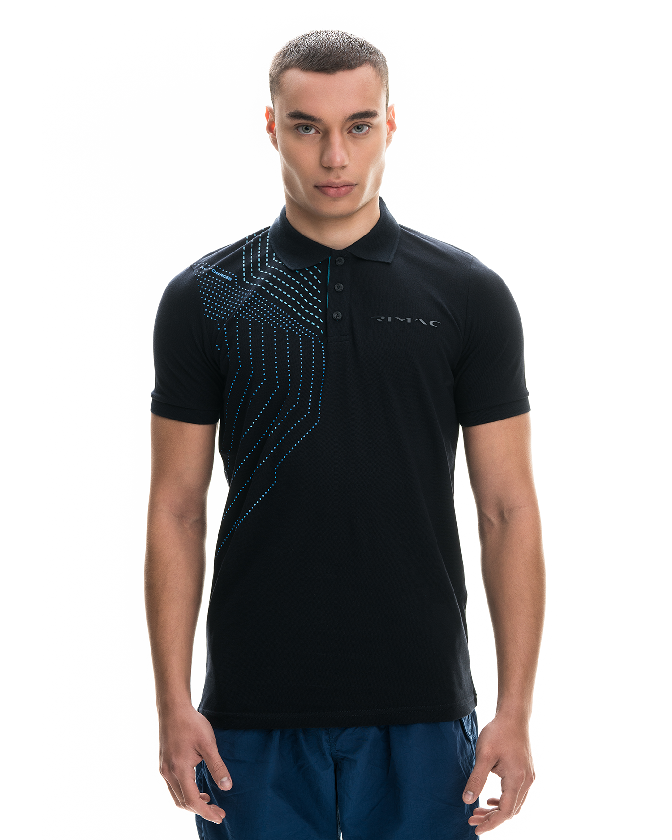
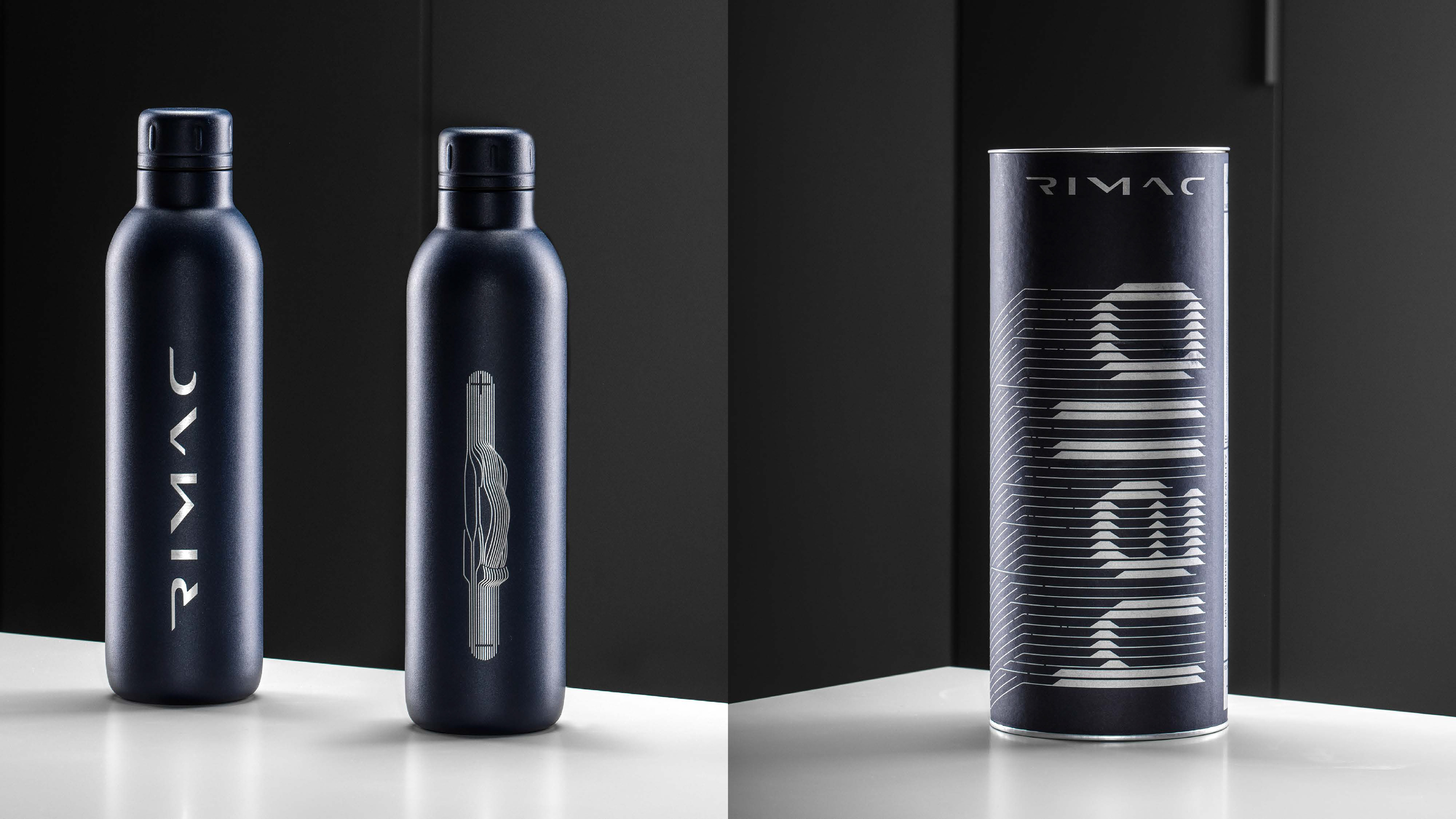
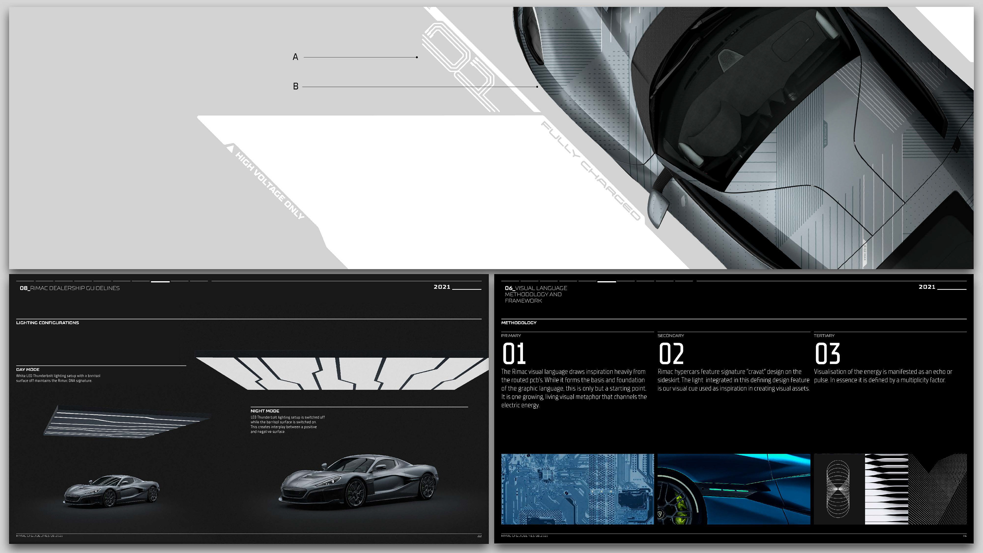
The new corporate identity language design focused on the portmanteau term luxury_tech which was very much what Rimac Automobili stood for. This was achieved by combining various assets from bespoke typeface designs, graphic texture visual systems that draw heavy influence on both a visually complex and intricate of both luxury and technology.
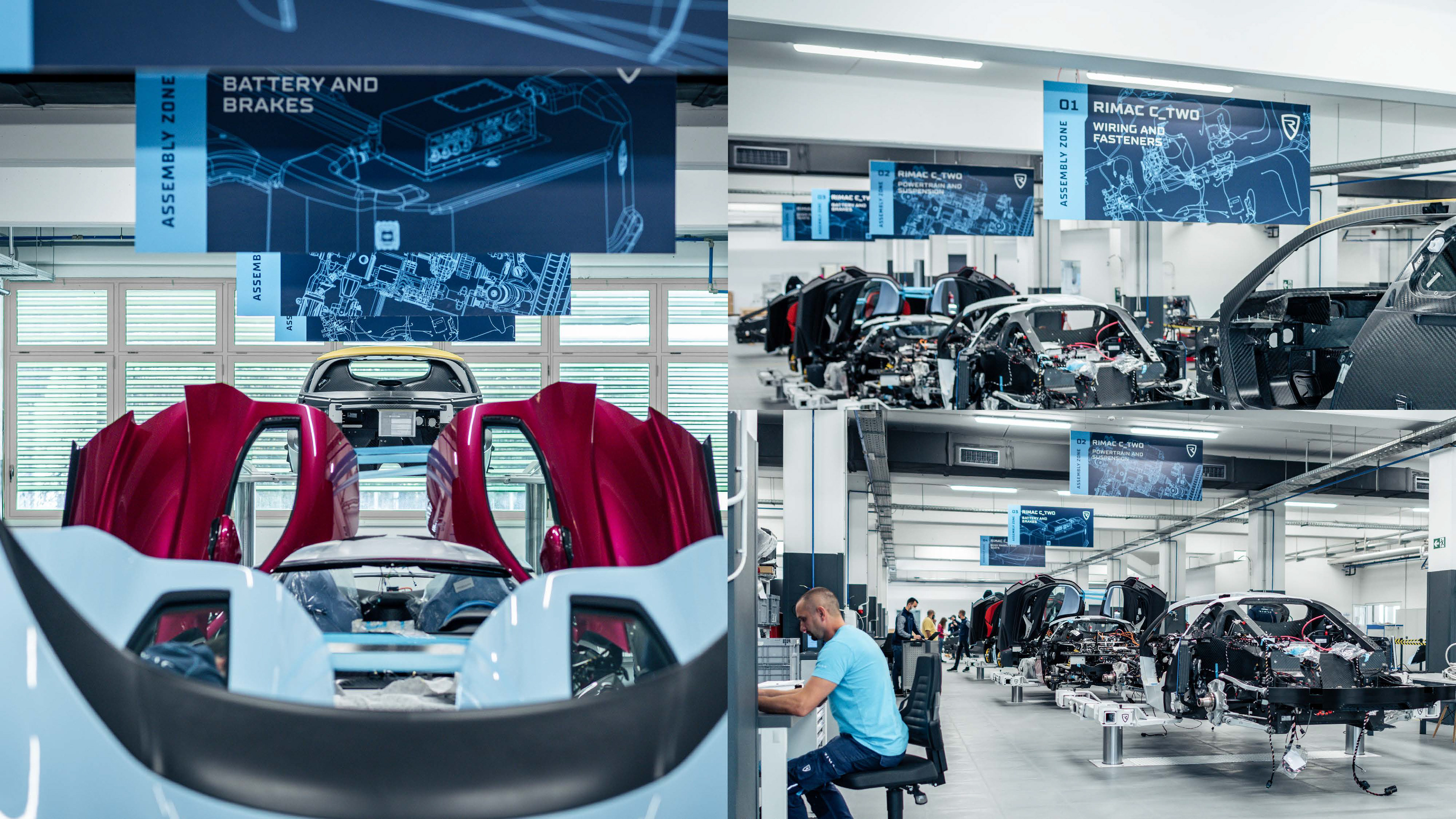
The visual standard foundations were done from scratch. One needed to consider the positioning of the brand both visually but also in terms of corporate communications. It was therefore extremely important to consider all forms of communication from the smallest part marking to the design philosophy of Rimac Automobili.
The new corporate identity language design focused on the portmanteau term luxury_tech which was very much what Rimac Automobili stood for. This was achieved by combining various assets from bespoke typeface designs, graphic texture visual systems that draw heavy influence on both a visually complex and intricate of both luxury and technology.
The visual standard foundations were done from scratch. One needed to consider the positioning of the brand both visually but also in terms of corporate communications. It was therefore extremely important to consider all forms of communication from the smallest part marking to the design philosophy of Rimac Automobili.

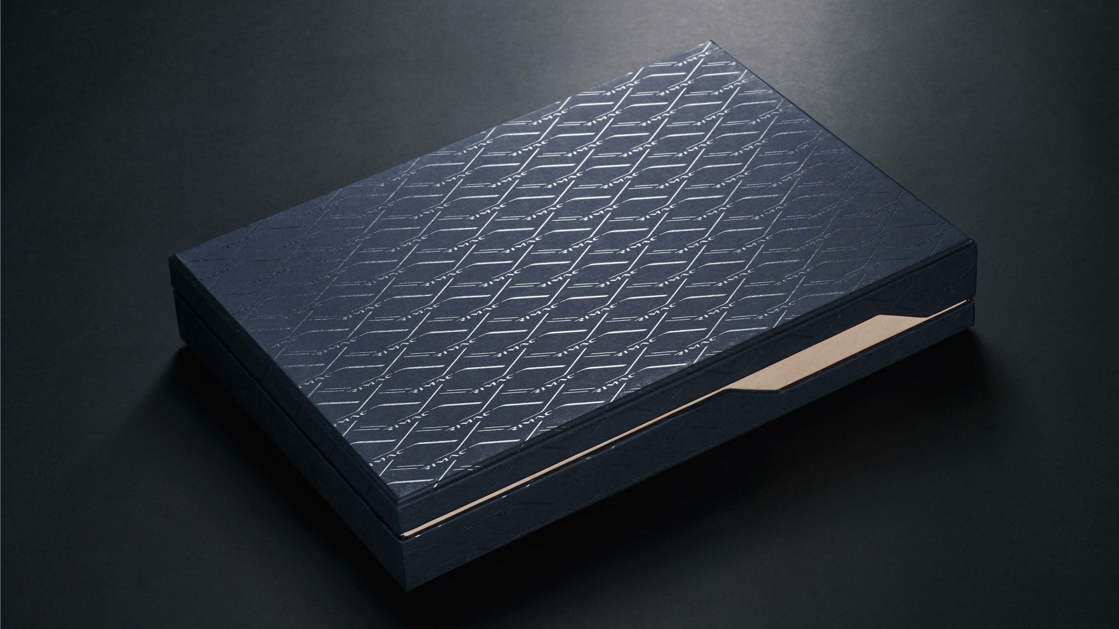
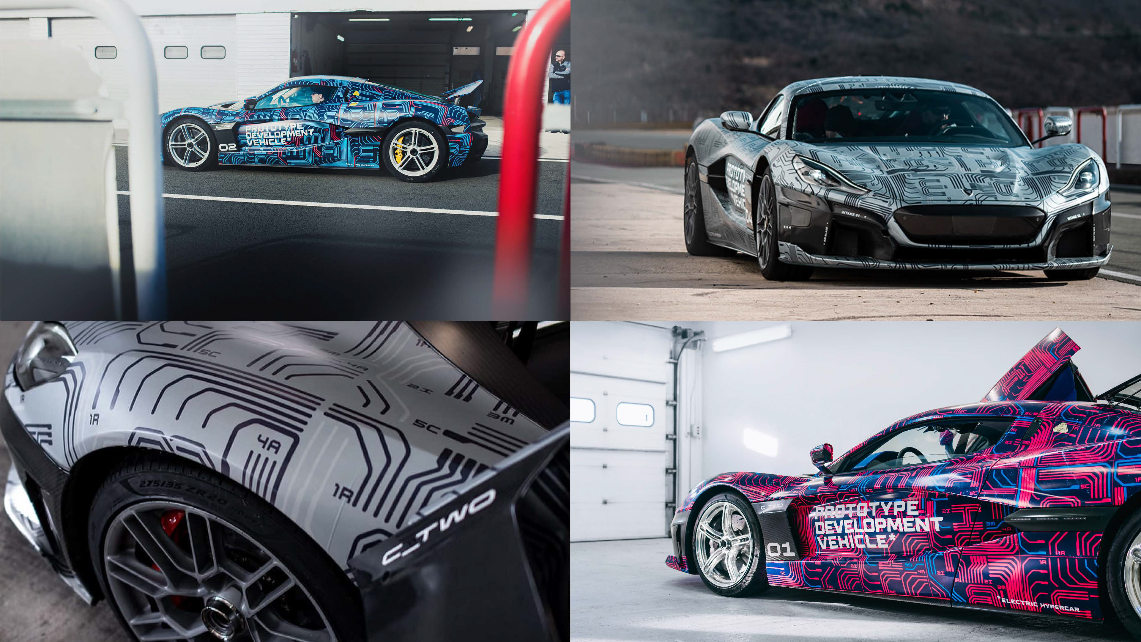
Each camouflage was designed in such a way that pattern section contained a hidden easter egg. Small lettering and numeration markings would hint at the order of the lettering spelling the word RIMAC, if deciphered.
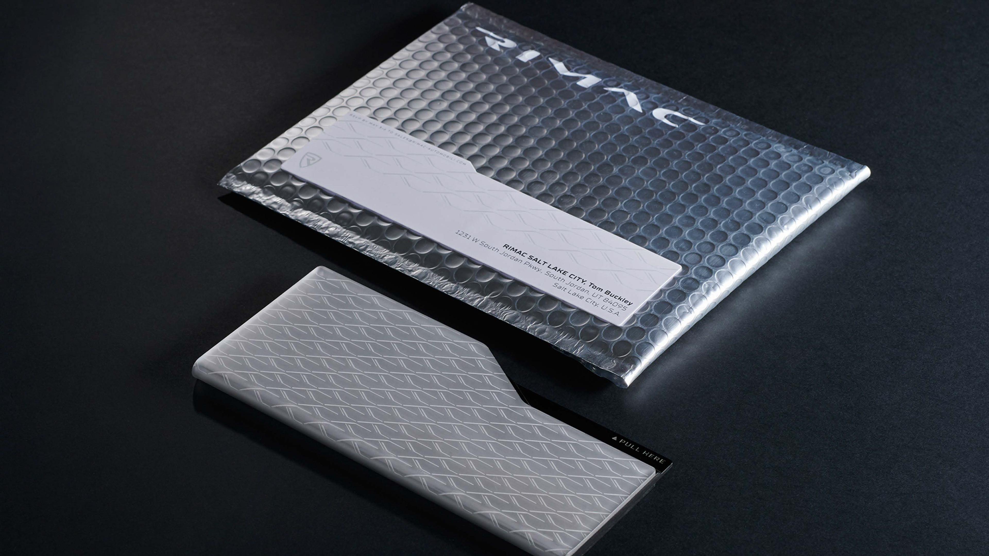
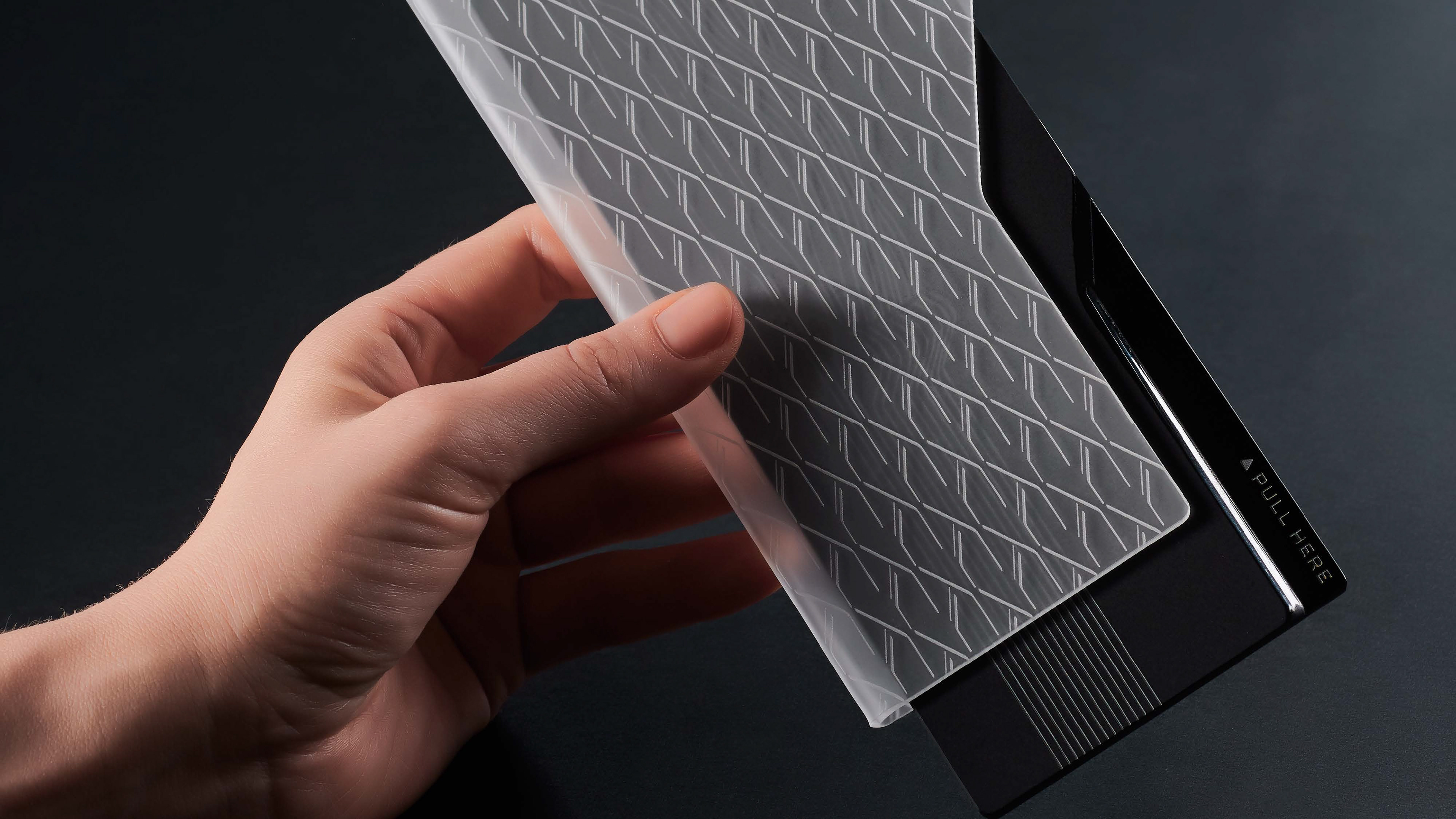
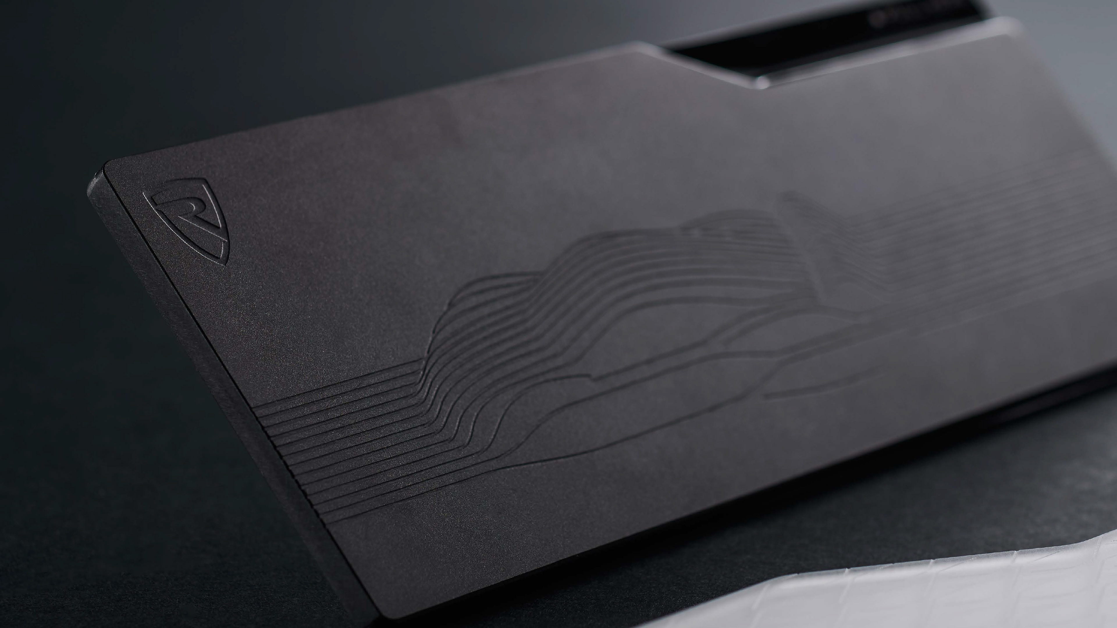
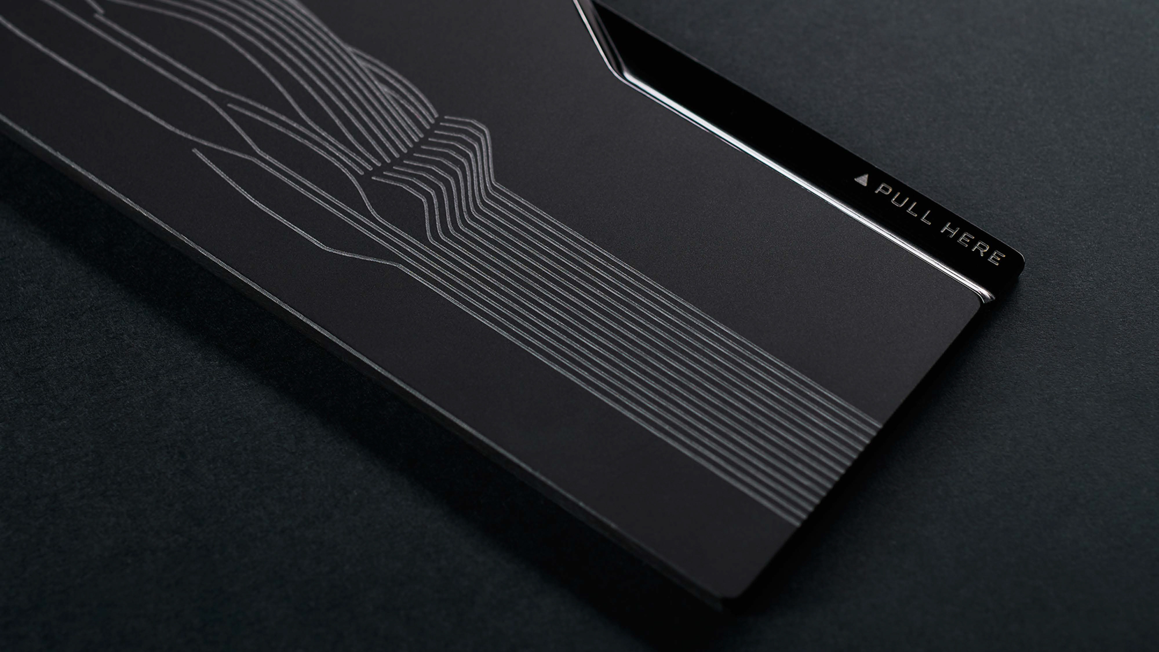
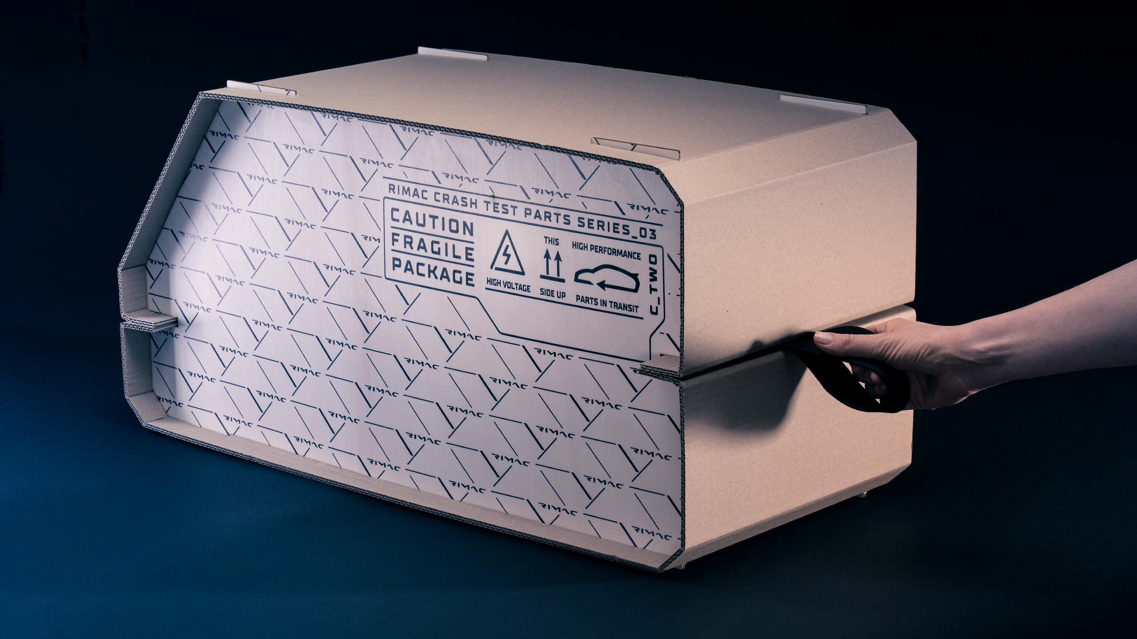
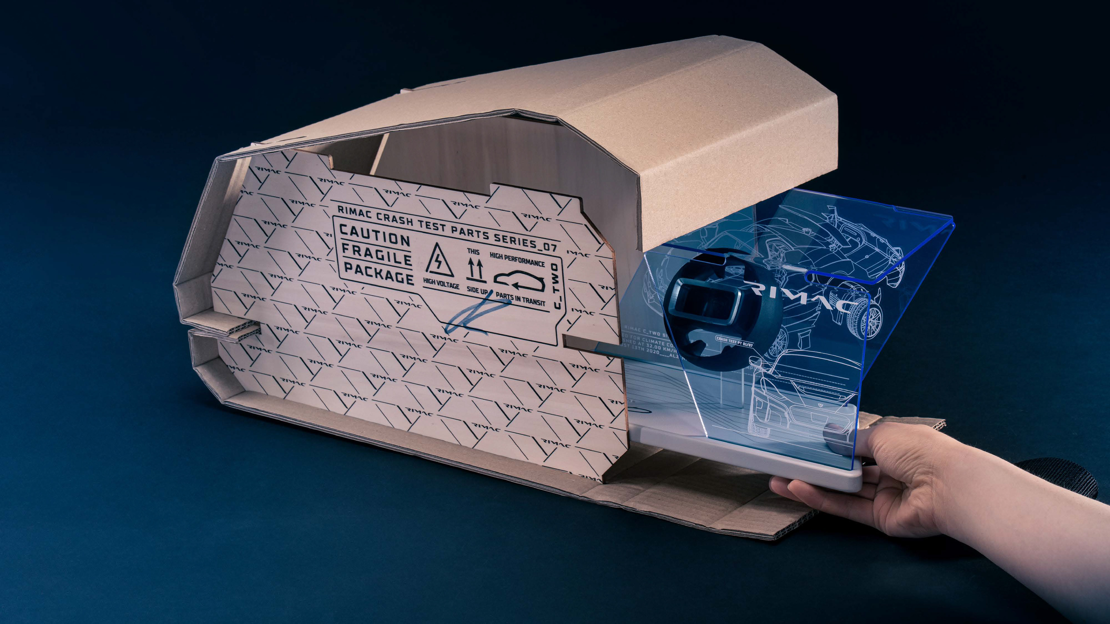
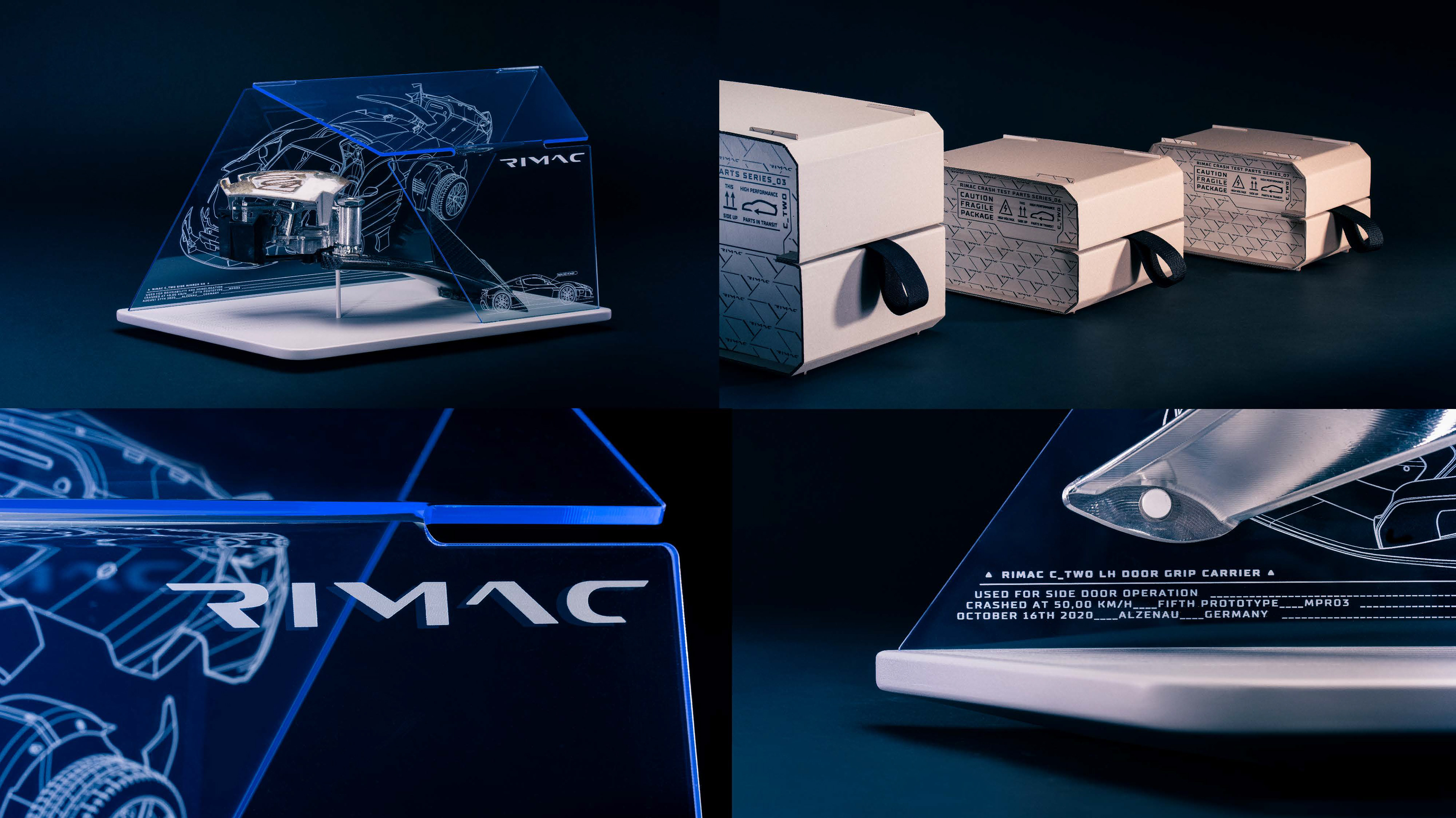
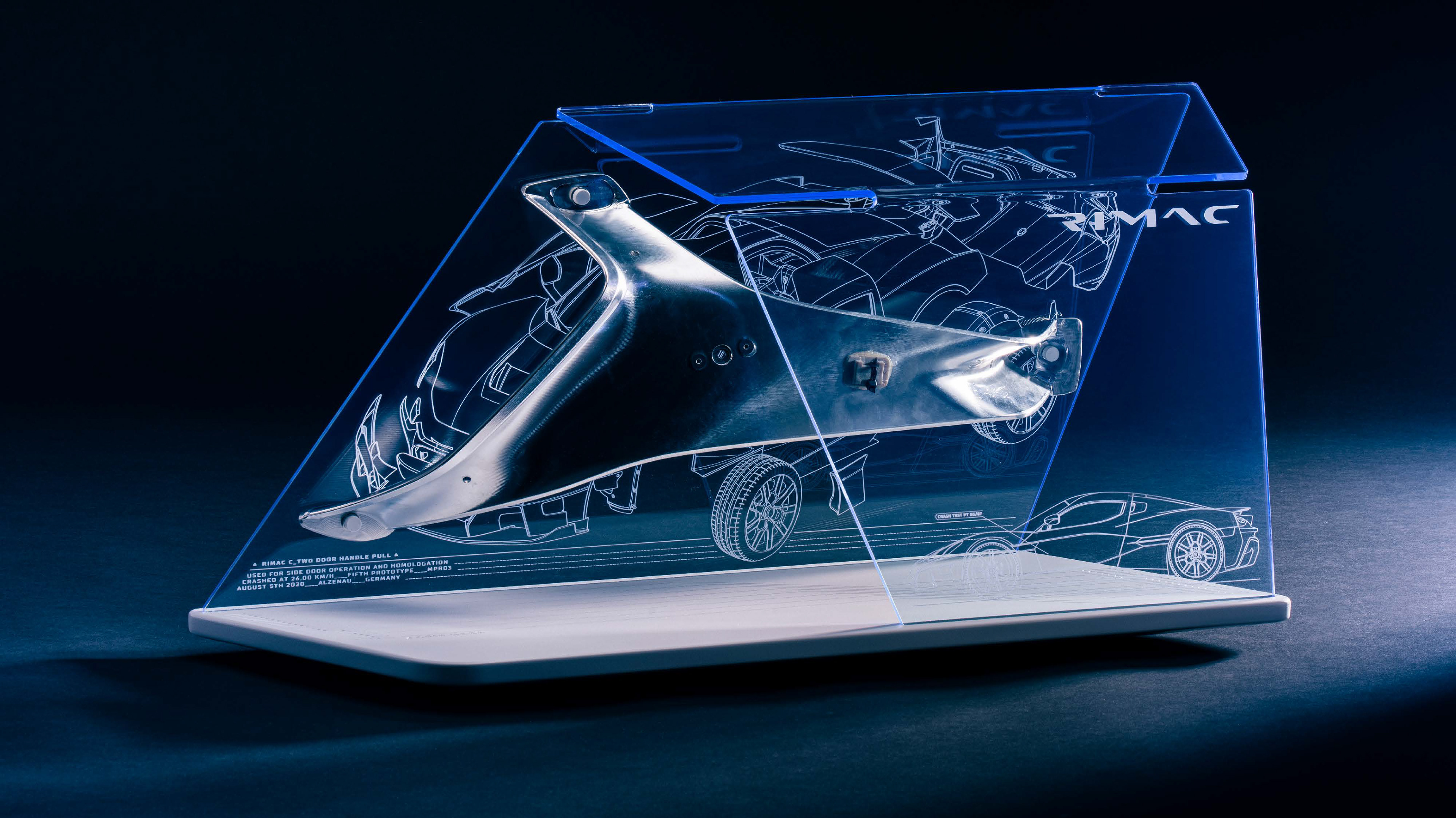
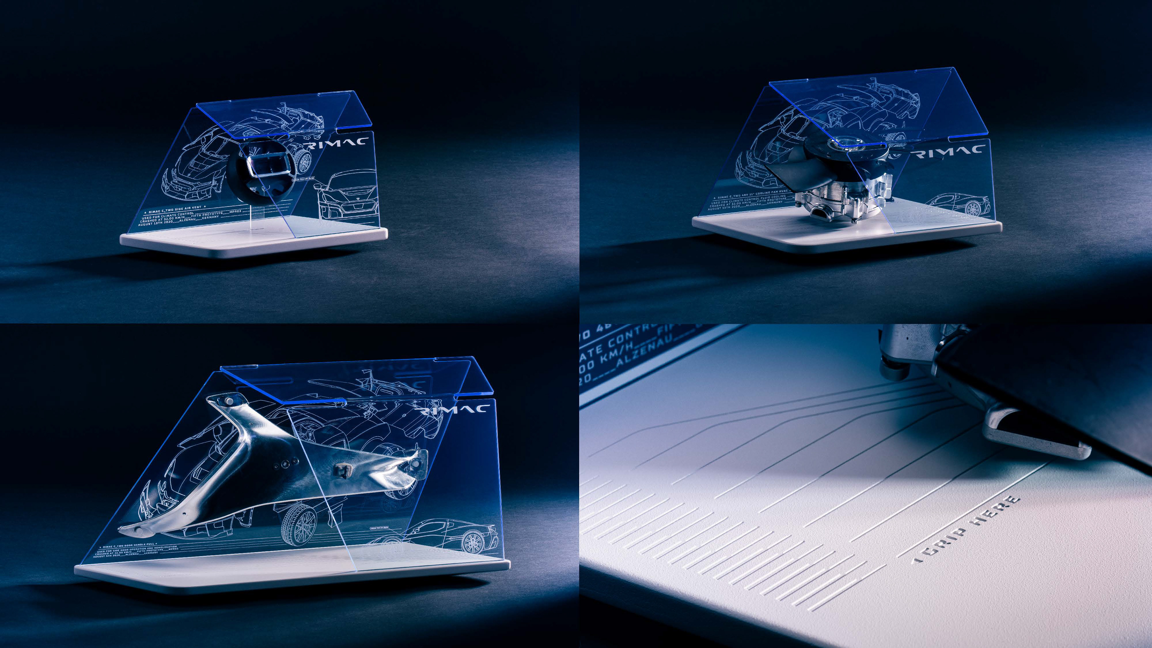
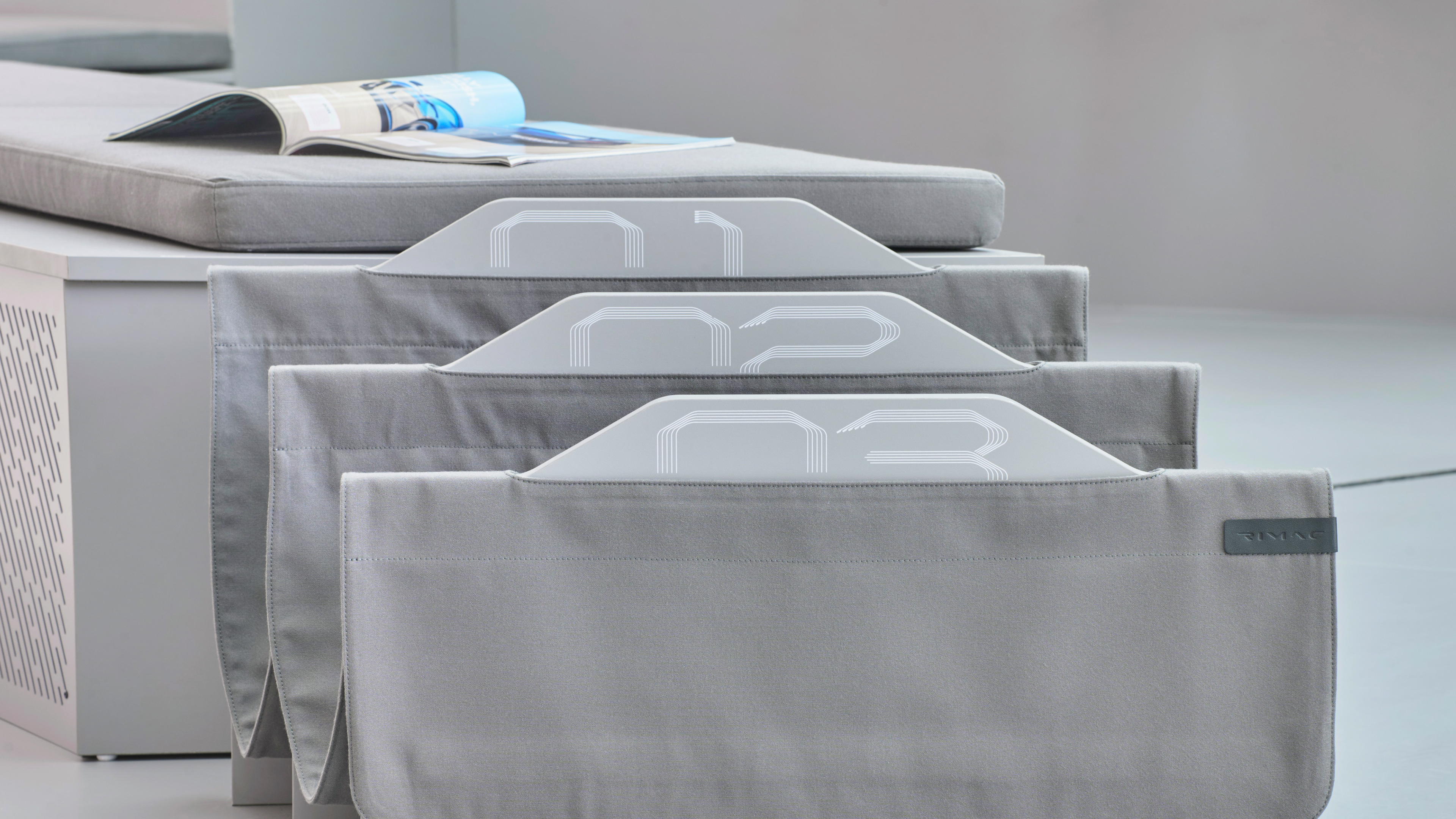
Whilst following the testing programme of the Nevera a crash tests a part giveaway present was a perfect opportunity to bring the hypercar closer to the audience and critics. This was done by sending a gift packaging of a Mate Rimac signed crash test parts to a select few customers, employees, reviewers and journalists.
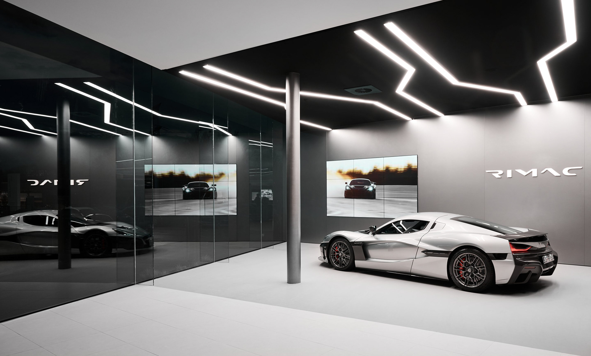
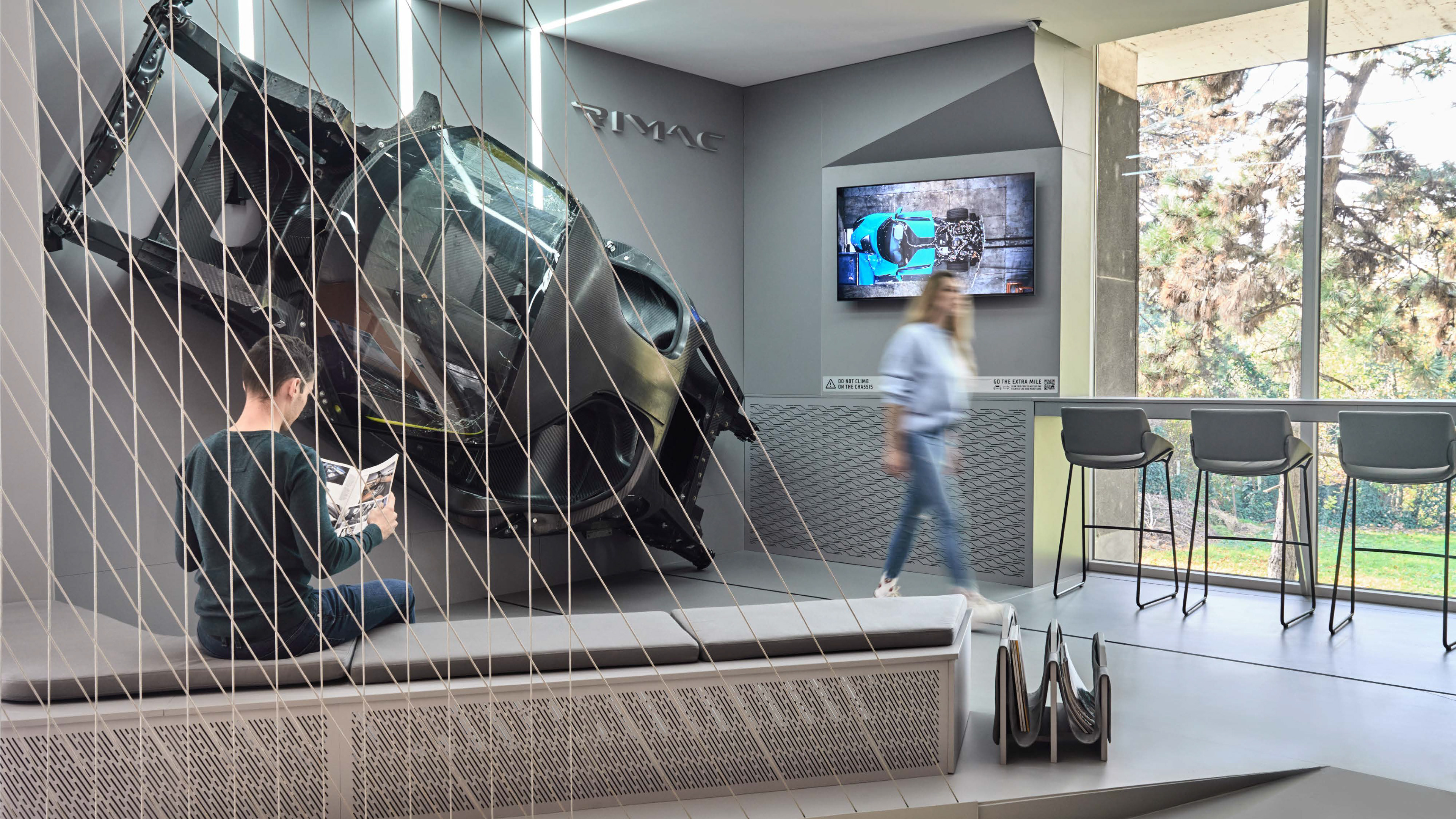
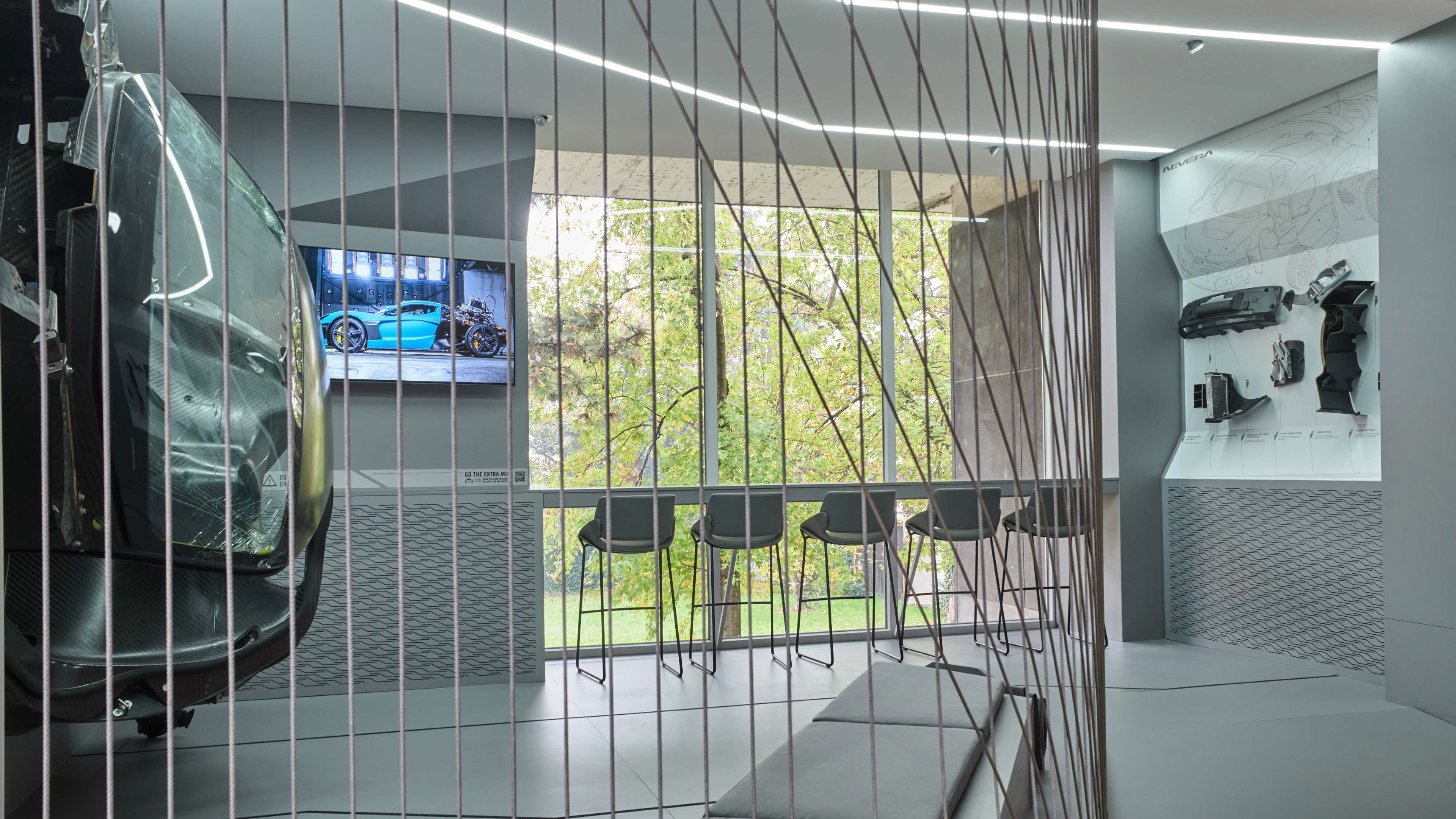
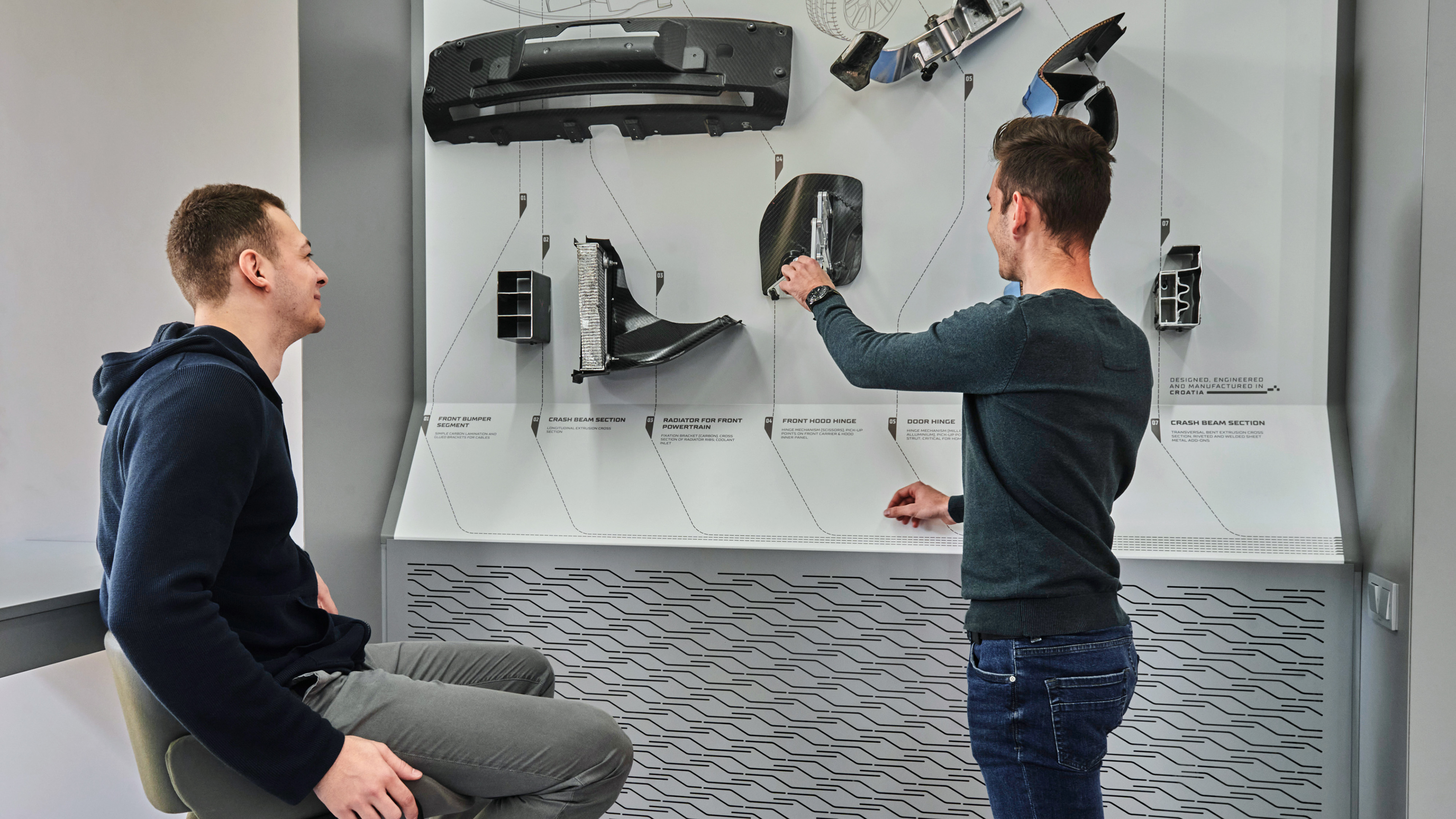
Rimac installation at the Zagreb faculty of mechanical engineering and naval architecture. Perfect opportunity to utilise the new design language in an architectural interior space installation. The installation's purpose was to generate an interest towards the students from the faculty. The space housed an entire chassis crash structure of the Rimac Nevera hypercar.


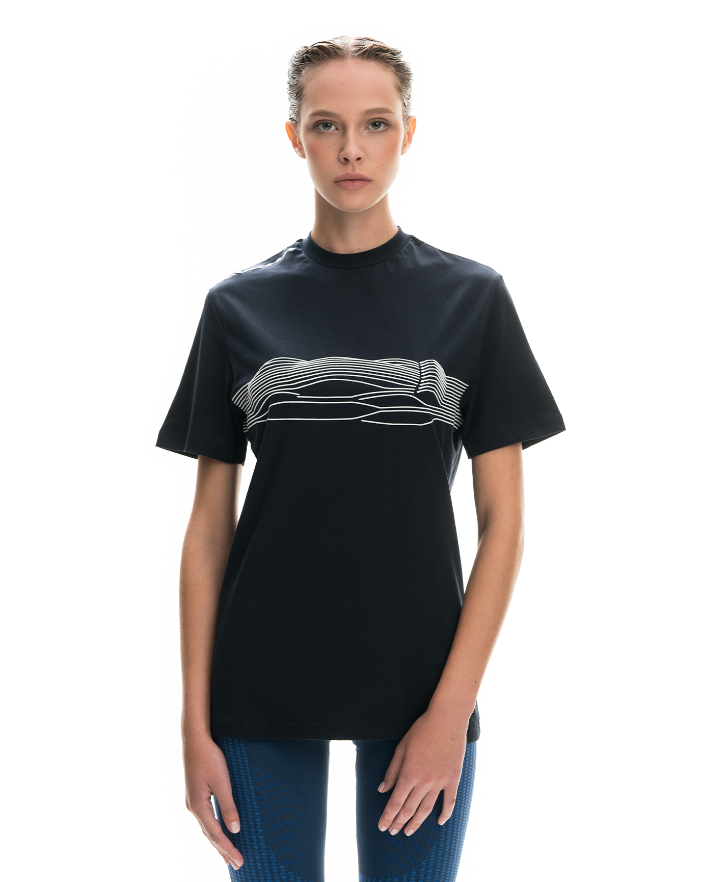
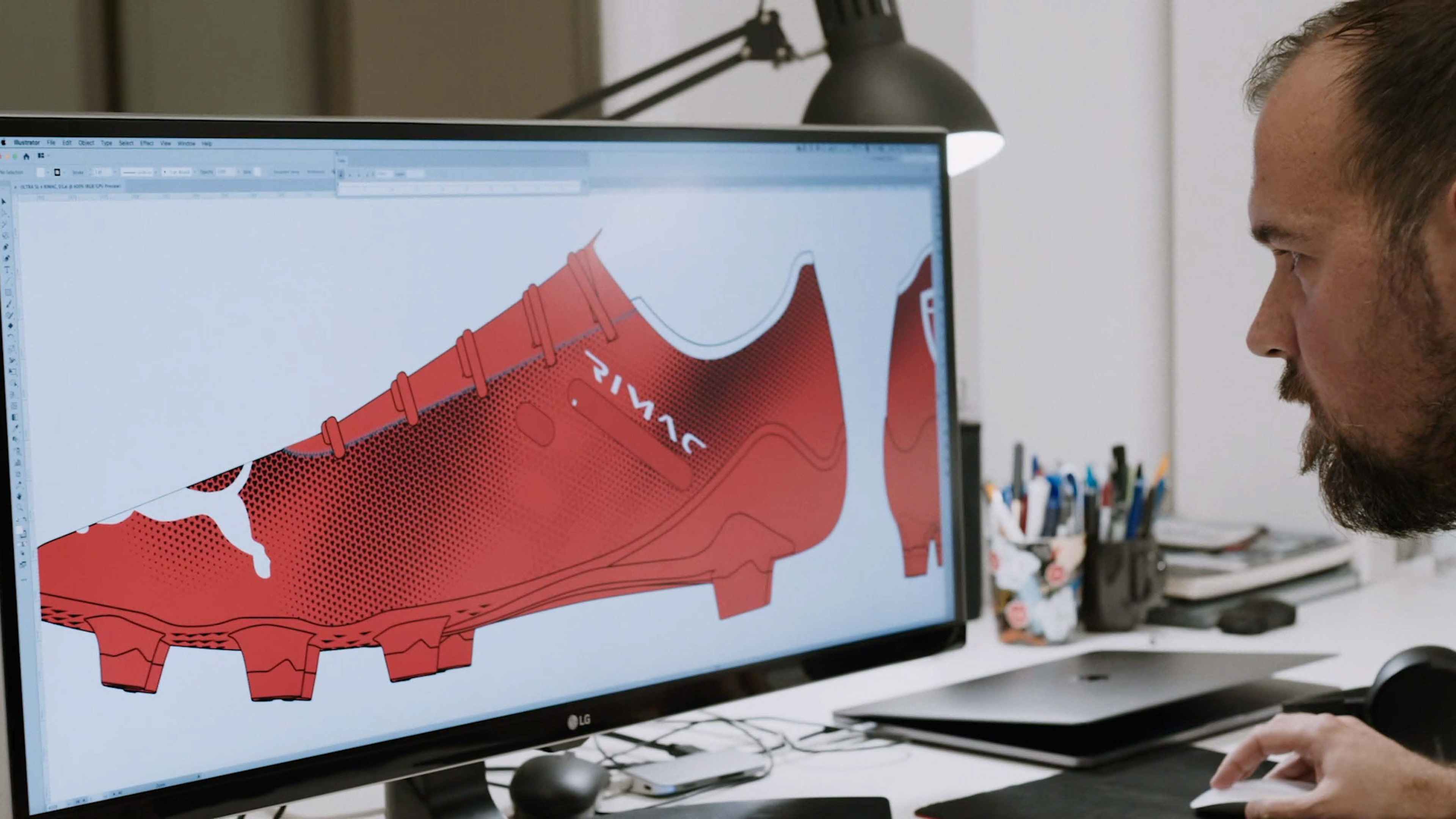
Puma x Rimac football boot collaboration.
Petar Popović
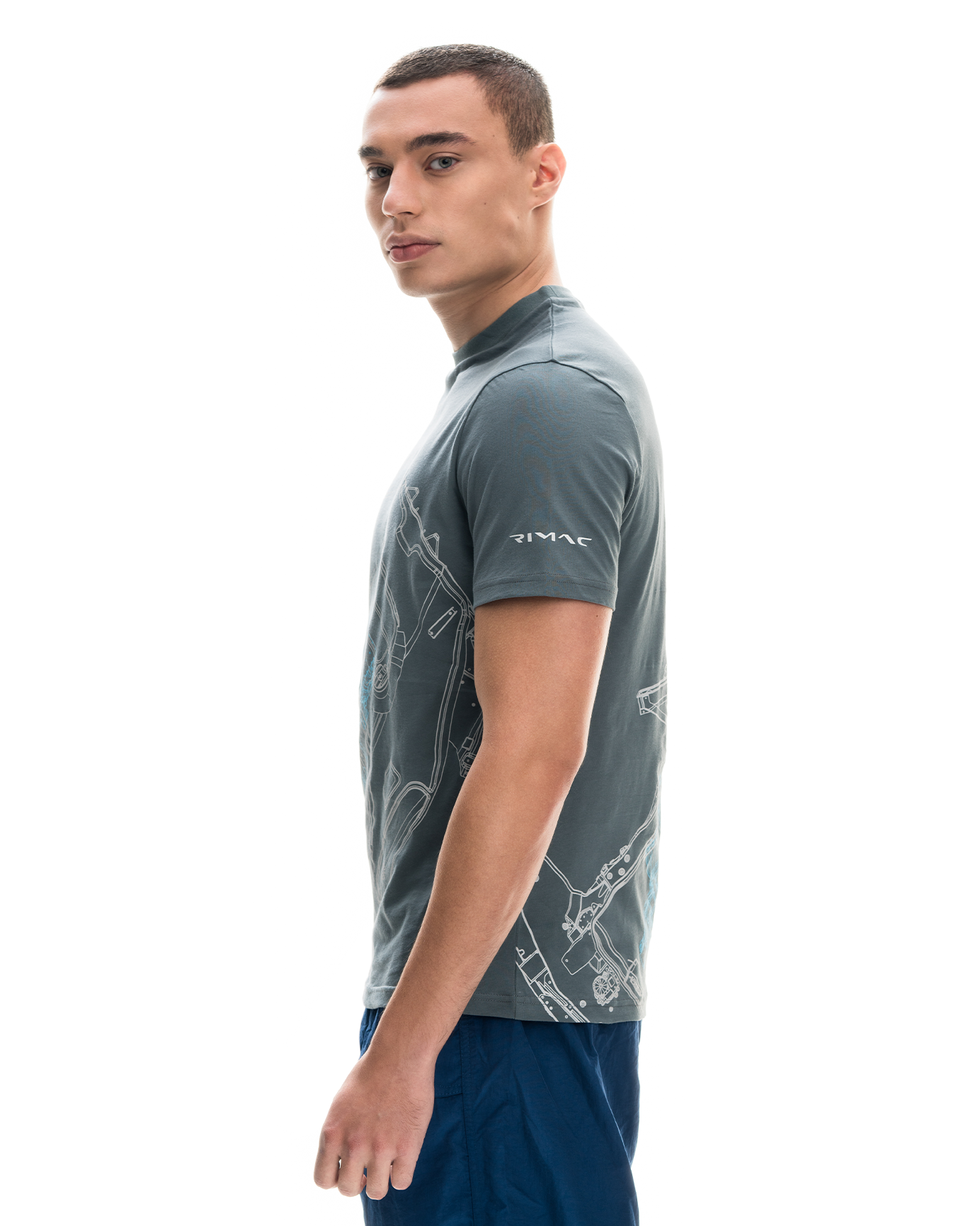
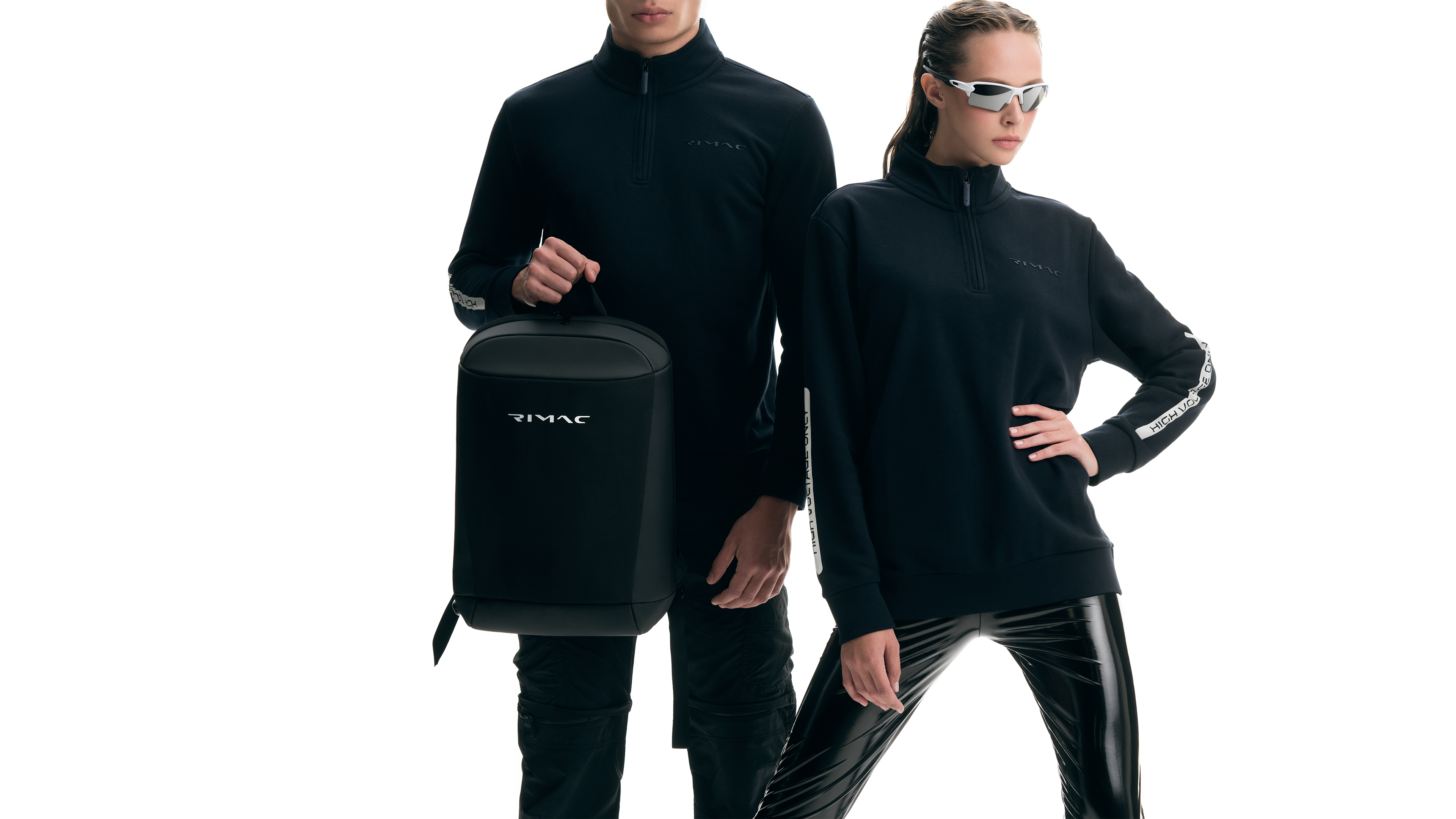
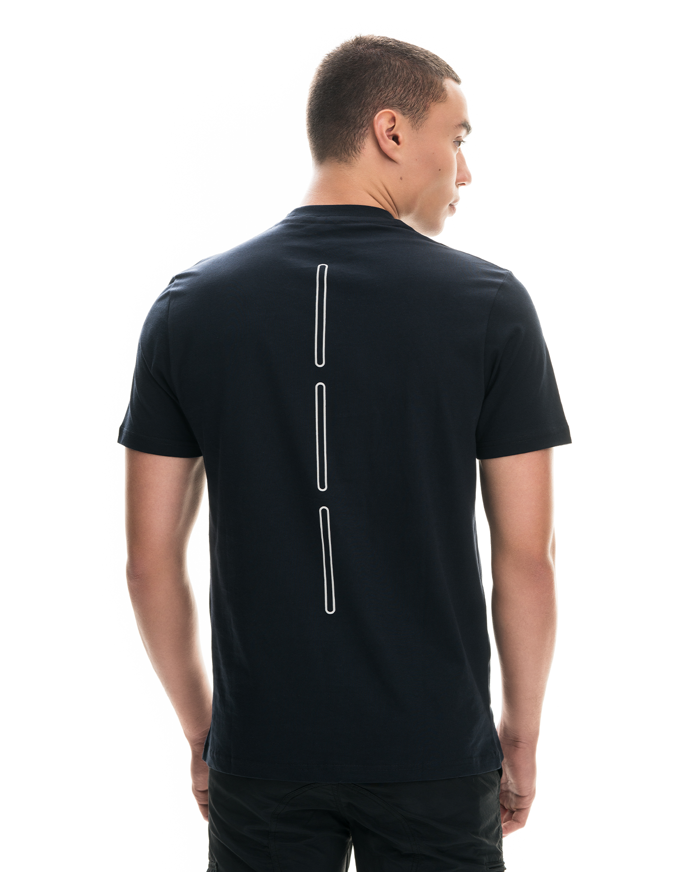
creative direction, graphic design, branding, UI concept and design, illustration, animation, typography, product design, apparel design, packaging, copywriting.
creative direction, graphic design, branding, UI concept and design, illustration, animation, typography, product design, apparel design, packaging, copywriting.
Luka Balić
graphic design, branding, iconography.
Nataša Njegovanjović
product design, interior design, packaging.
product design, interior design, packaging.
Janko Bertoša
UI design implementation animation.
UI design implementation animation.
Marko Hrastovec
Nevera logotype typographic tweaks and consultation.
Nevera logotype typographic tweaks and consultation.
Puma:
Footwear design and project lead.
Footwear design and project lead.
3LHD:
Architecture and Interior design.
Architecture and Interior design.
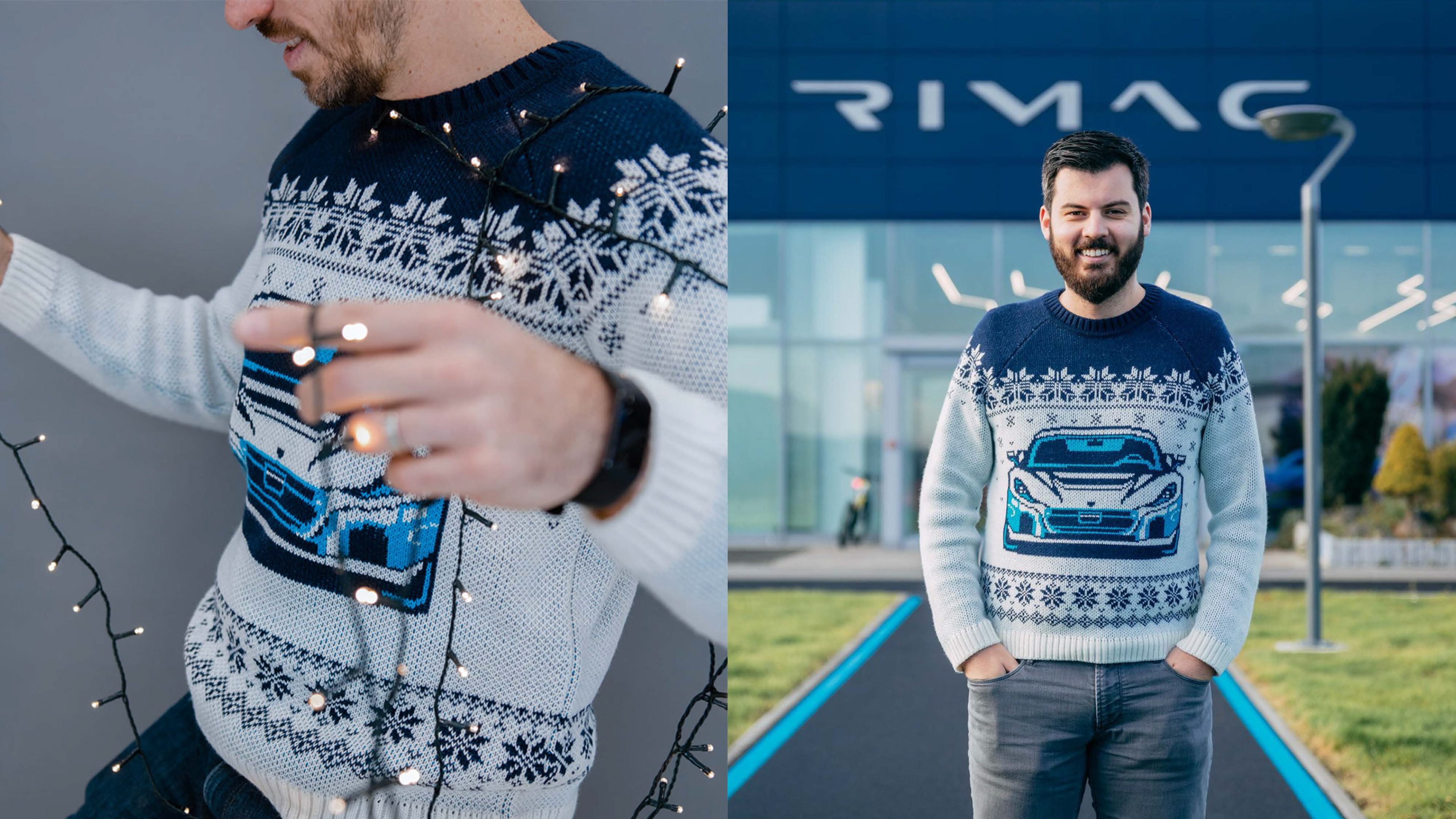
Radnja
Sweater design.
Sweater design.